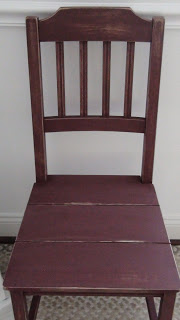
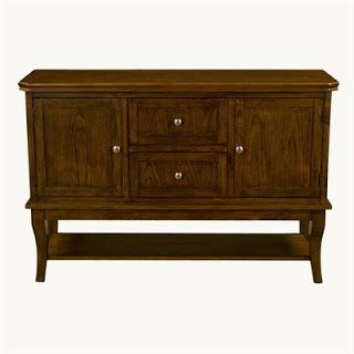
Hello, hello! I just wanted to pop in for a moment and show you this TV console that I just finished yesterday. Here is a before photo:
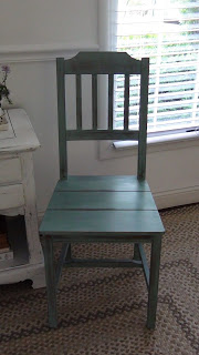
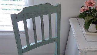
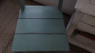
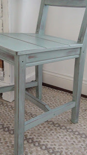
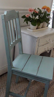
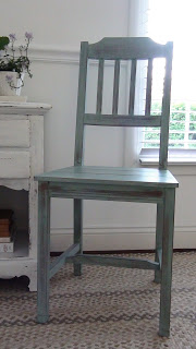
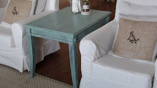
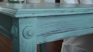
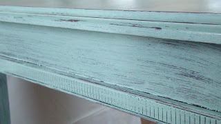
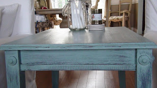
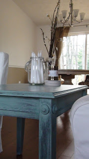
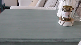
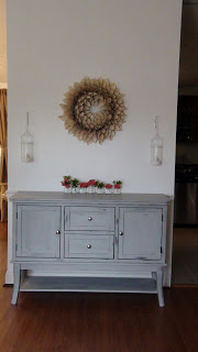
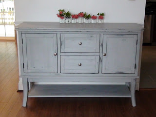
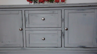
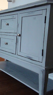
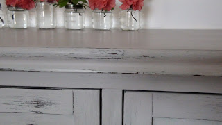
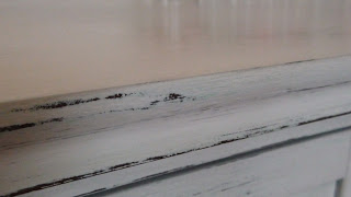
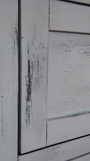
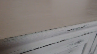
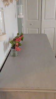
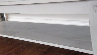
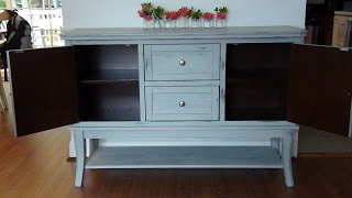
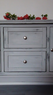
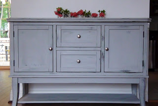
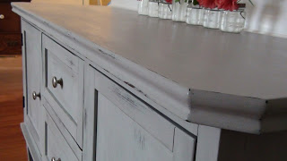
 Beautiful, right?! Such a solid and gorgeous piece to work with! Per request from client K it was first given a coat of Duck Egg blue, (by Annie Sloan Chalk Paint), and then a top coat of Paris Gray, (also by ASCP). After the top coat went on, I took a sanding block and rubbed the whole thing down, not enough to distress it, but enough to remove some of the Paris Gray and allow the Duck Egg to peek through. The contrast, though subtle, is absolutely stunning! My camera is not high tech enough to capture such subtle contrasts so you'll have to take my word for it ;) Then, I just used the sanding block gently around some of the edges of the piece and gave it a light distressed look.
What a privilege it was to work on such a beautiful piece! Definitely one of my favorite transformations thus far. And, I learned how stunning a subtle contrast in color can be! You don't always have to have 2 very contrasting colors to make a statement. Wonderful choice, K!
Thank you for popping by and have a wonderful day!
~Chelsea
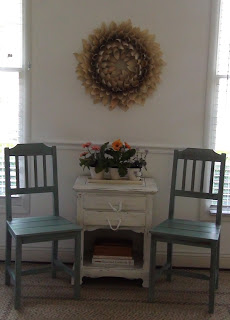
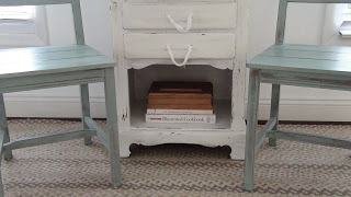
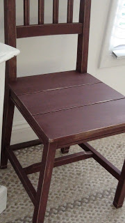
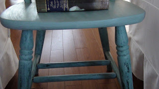
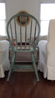
Finished product:
(click on photos to view larger)
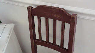
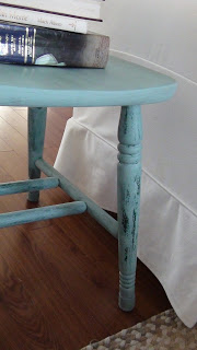
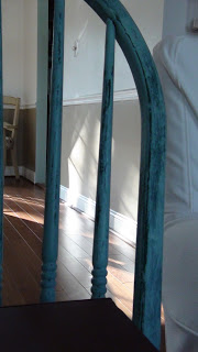
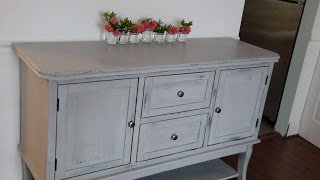
The next few are some close ups where I tried to capture the Duck Egg underneath:
What a privilege it was to work on such a beautiful piece! Definitely one of my favorite transformations thus far. And, I learned how stunning a subtle contrast in color can be! You don't always have to have 2 very contrasting colors to make a statement. Wonderful choice, K!
Thank you for popping by and have a wonderful day!
~Chelsea