After a two week hiatus for the holidays, we are baaaack with reader designs - have you missed them!? I spent 13 fabulously refreshing days with my family in Richmond, and while settling back in to the pace of DC isn't easy, I sure am glad to be back with you all!
And man, are we back with a vengeance. Allow me to introduce you to Katie and her stunningly simple Minneapolis home, photographed by her talented sister.

Katie's home reflects a couple of things: her physical surrounding - the simple landscape of Minnesota and its 10,000 lakes, which take on a total starkness in winter; her Norweigan and Finnish roots; and her own personal beliefs on what home design really means.
From Katie:
“If the room can communicate peace and invite relationships to develop and grow in it’s space, then that’s when I know I’ve accomplished what I’ve set out to do. My personal style of clean, cozy-modern is usually what gets me feeling all zen. ”


I don't know about you guys, but just seeing photos of this home give me the zen-ness I need to make it through the work week!
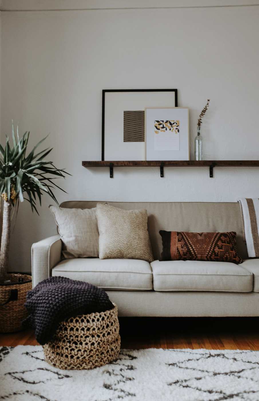
Katie and her husband cultivated this calm home using a simple, natural color scheme and items of importance -
- the granite coffee table in the living room, which Katie dreamt up and serendipitously found a slab for for only $40... take that in... $40!!
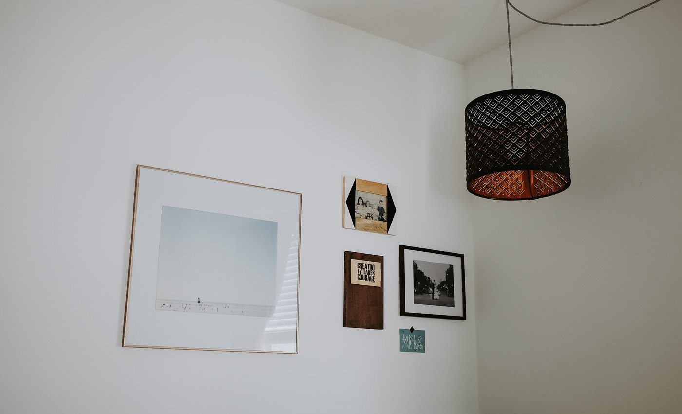
- a mountain painting that Katie decided to hang sideways, just for fun!
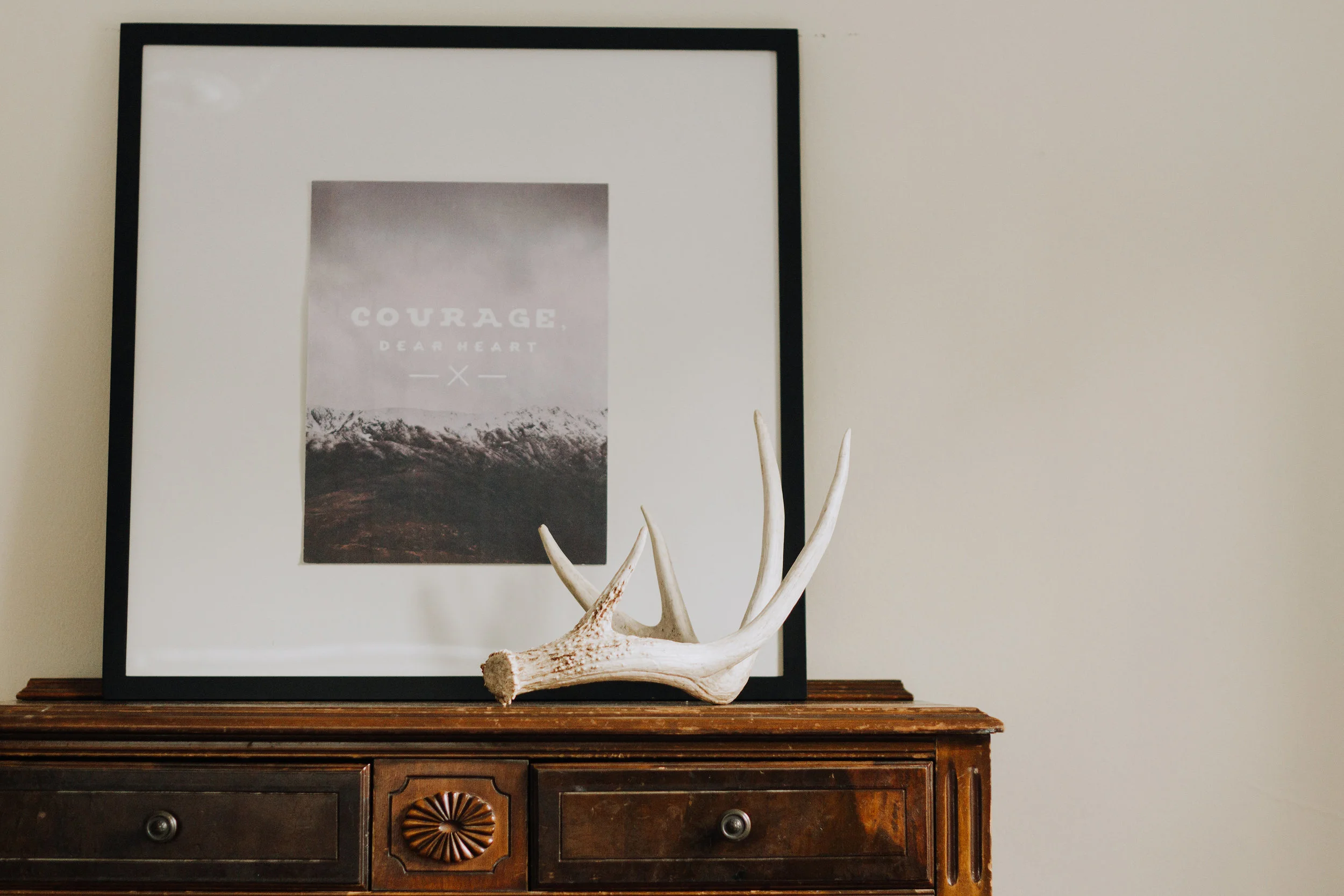
- a found item from the lakes of Minneapolis
“My husband and I were walking along one of our favorite lakes one spring evening and I found a dry piece of drift wood along the shore. Minnesota’s harsh winter had smoothed it’s surface and left it exposed. When I saw it, I immediately saw beauty. It’s so simple, yet so beautiful. I love that about design; often, it’s about being creative! Everything certainly does not need to be from a high end boutique to be the perfect piece of decor. ”


It's because of this loving curation that we hardly realize that there really isn't any bright color; and while it may not seem like an important decision to many, it's one Katie definitely considered.
“I’ve struggled with the use of color! I often want to incorporate more color...because for some reason I think I “should.” Though, if I’m honest, I back away from strong and commanding colors. Instead, I find that I prefer an earth tone palette. The more I allow myself to be “ok” with using less color (aka, allow myself to just be me), the more I love my home.”


“Trends definitely impact design. I don’t necessarily see this as a bad thing all the time. Trends can be informative; they can help lead the way to your own personal expression and/or galvanize new and different creative ideas. With that said, I believe that beautiful spaces are created when one simply trusts their gut and decorates in a way that is most authentic to oneself. My sense of personal style arises from my gut and is also informed by the endless source of inspiration that comes from interior design blogs, Instagram, as well as beautiful spaces I encounter out in the world. ”
Katie, we applaud you for owning what makes you happy and centering your home - your most special and protected place - on those things.
For more inspiration, follow Katie on Instagram.
