Hello, friends! I won't even bother trying to hide my excitement for today's post - it's a design project I've been looking forward to sharing with you since JANUARY! And in January, all I was looking at were these photos:


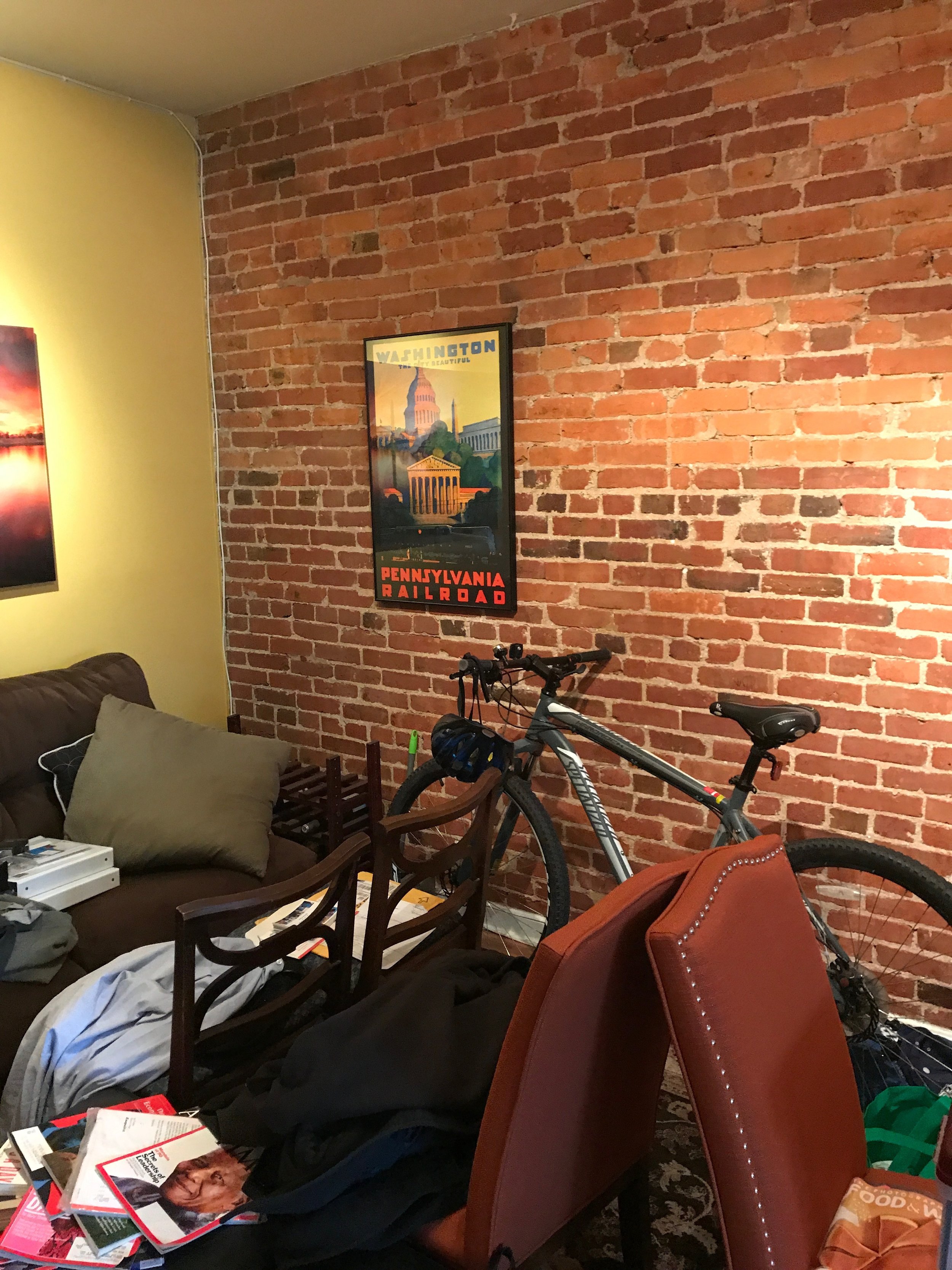
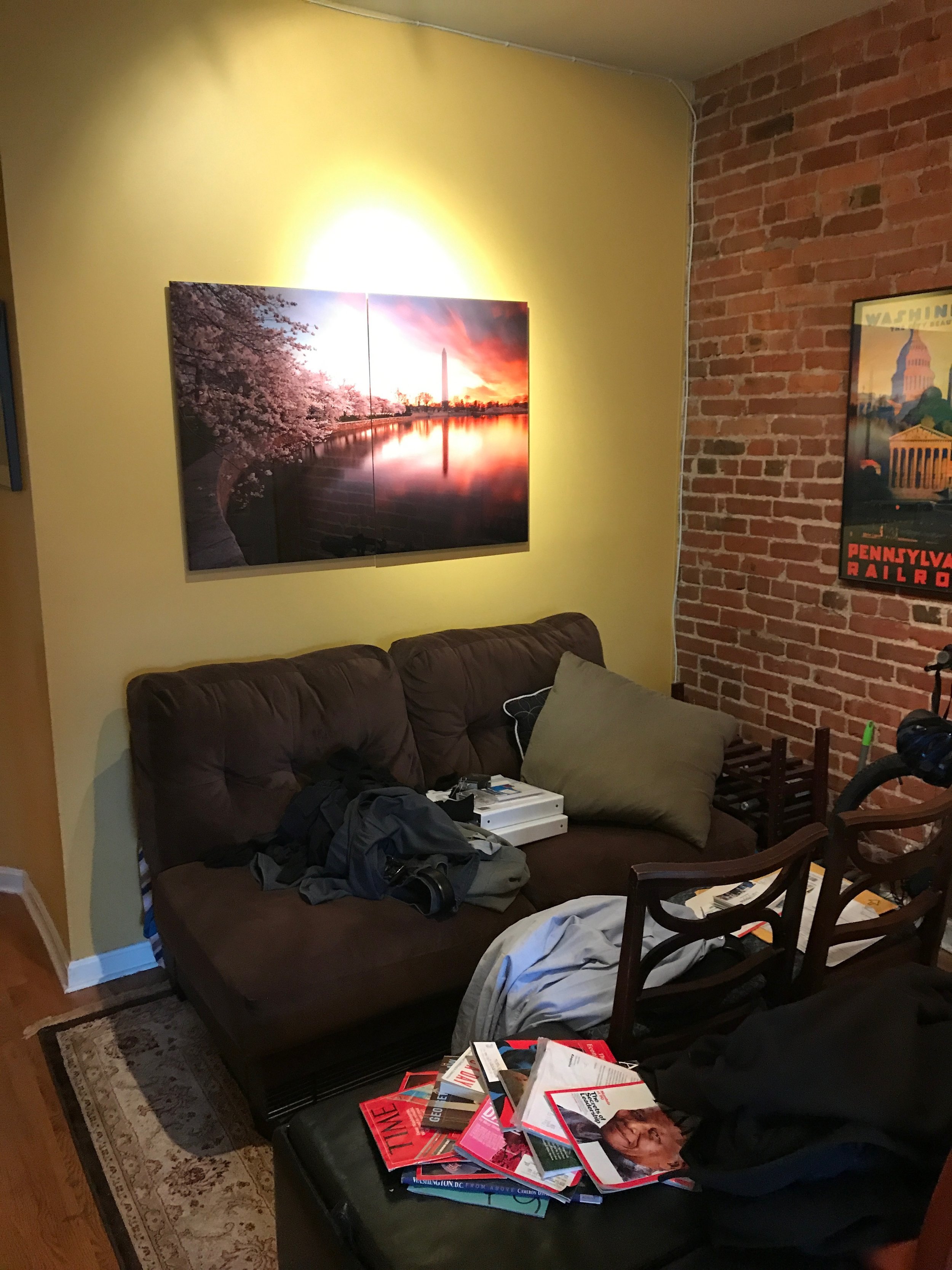
While these images represent a DECADE of dudes on rotation moving in and out, the potential had my heart fluttering at first look. But not just because of the potential for some really fun design - this is the second time getting to work with our dear client, Ali! You may remember Ali's Navy Yard condo, (bedrooms here)? Ali was absolutely amazing to work with the first time around - she let me dream big and come up with risky ideas that required HER execution! She's a total go-getter and when she's happy with the design, she will make it happen. So I knew going into this one that we could do some big fun things!
But the very best part of this particular design project is that it represents an incredibly precious new chapter in Ali's life. Ali moved into this space with her fiance, Brian! They tie the knot in about 6 weeks and we sure couldn't feel happier for these two lovebirds. Brian has lived here for 10 years and when Ali came onto the scene, she wasted no time transforming this long running bachelor pad. But combining two full lives under one roof proved quite the challenge! Their many, (maaaaaany), books needed ample storage space, their desire to entertain and host friends needed room to do so, and even the task of joining their individual styles together required some creative thinking. Brian prefers warmer colors, (hence the mustard yellow walls and red rugs), while Ali enjoys a lighter, airier space with room to breath. We used a lot of neutrals and blue tones throughout her previous condo and she expressed early on that she didn't want this home to look just like her last.
Let's take a look around!
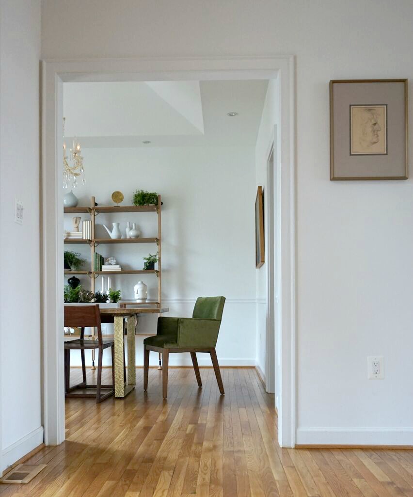
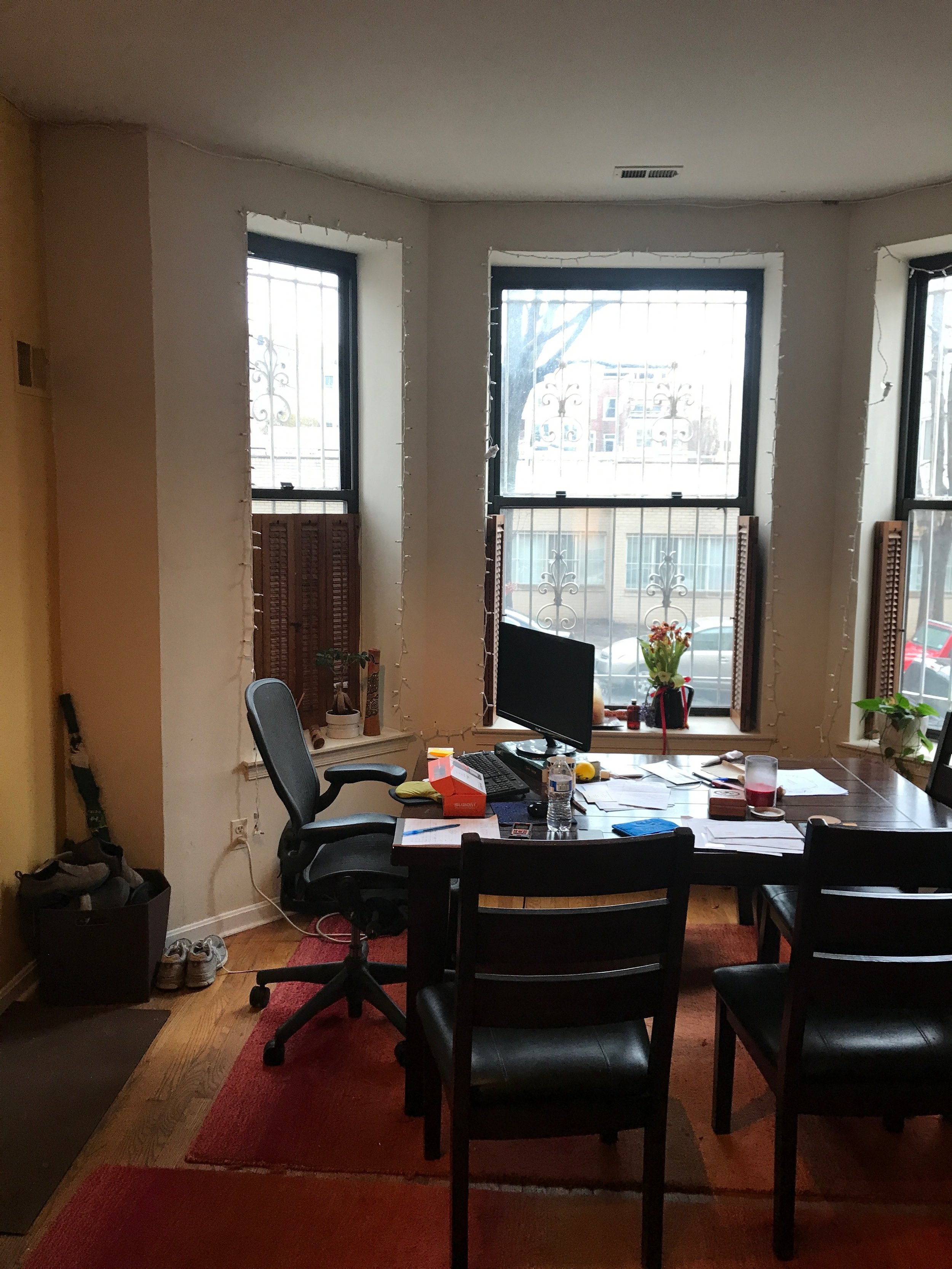
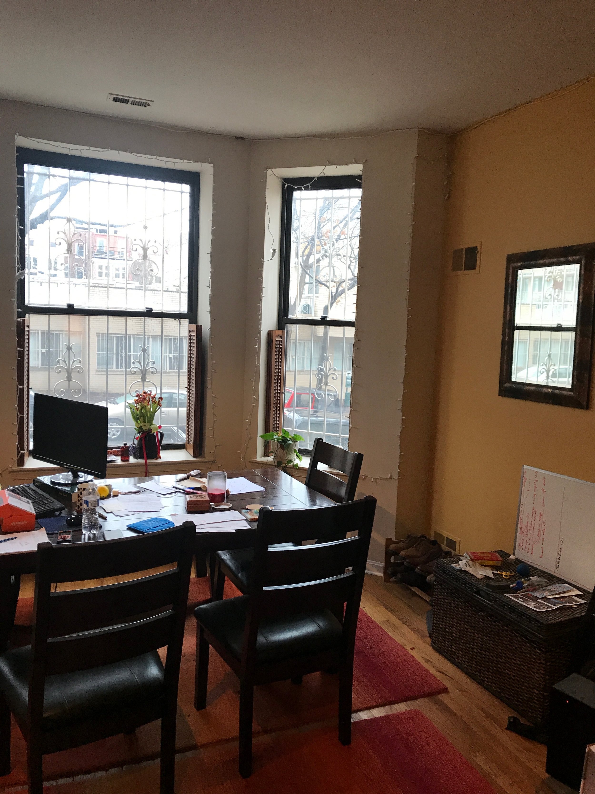
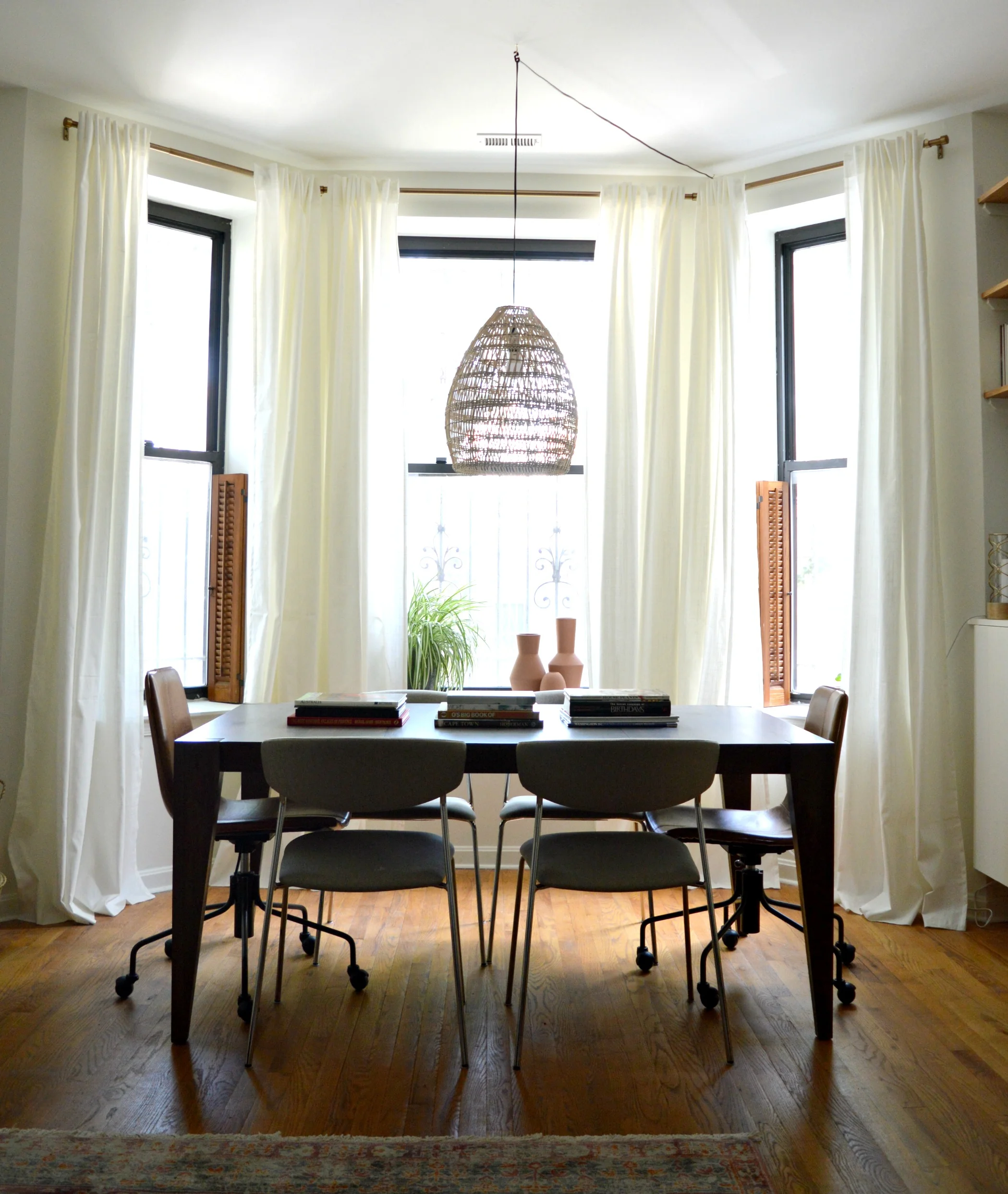
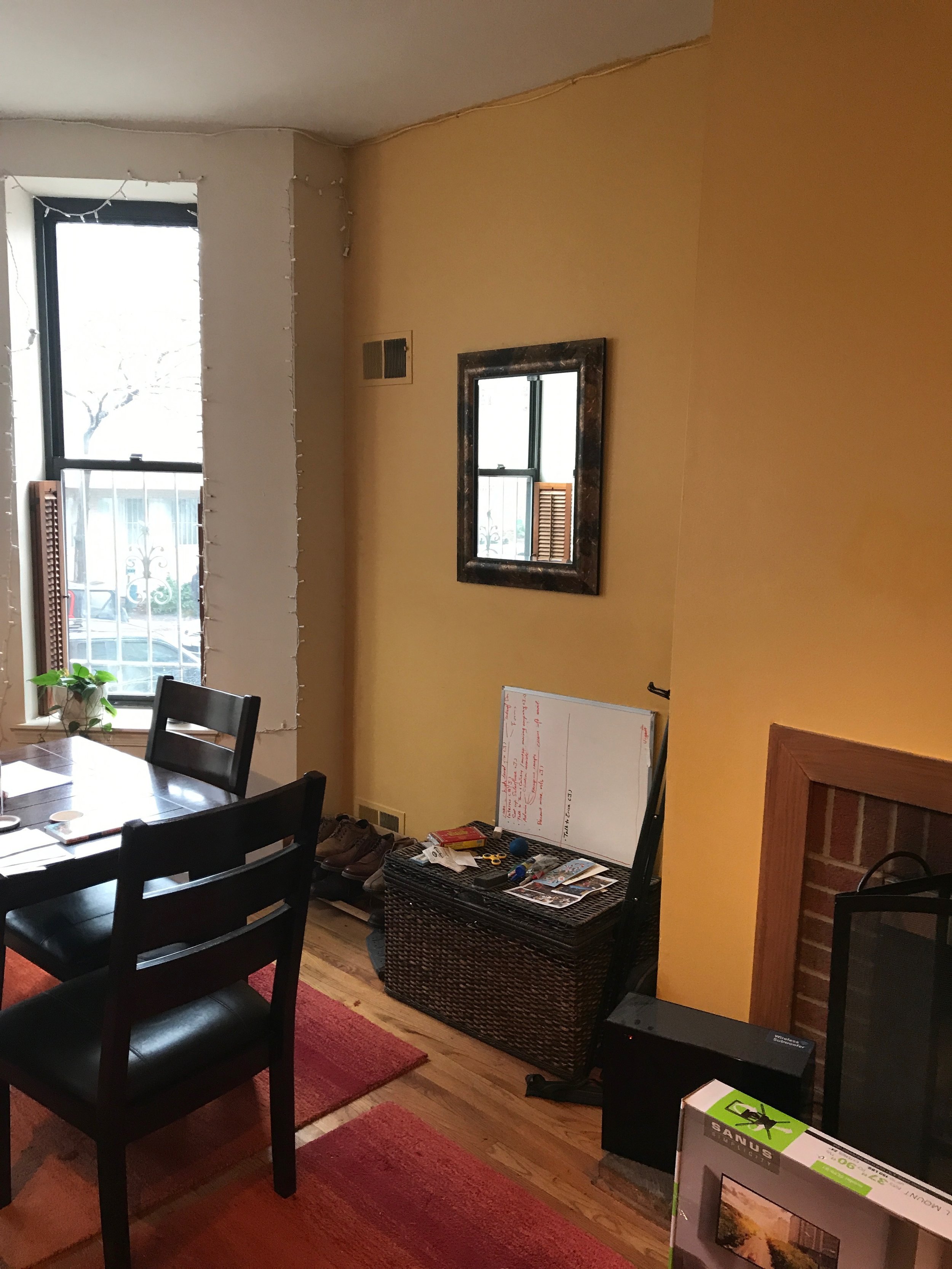
Brian works from home a good bit and uses the bay window in the living room as his office. So while table space and comfortable seating for his meetings were important, we were also weary of the space looking too much like a dining room. It can certainly double as dining space when need be, but thoughtful chair selection and styling was crucial in executing this space as a definitive work area.
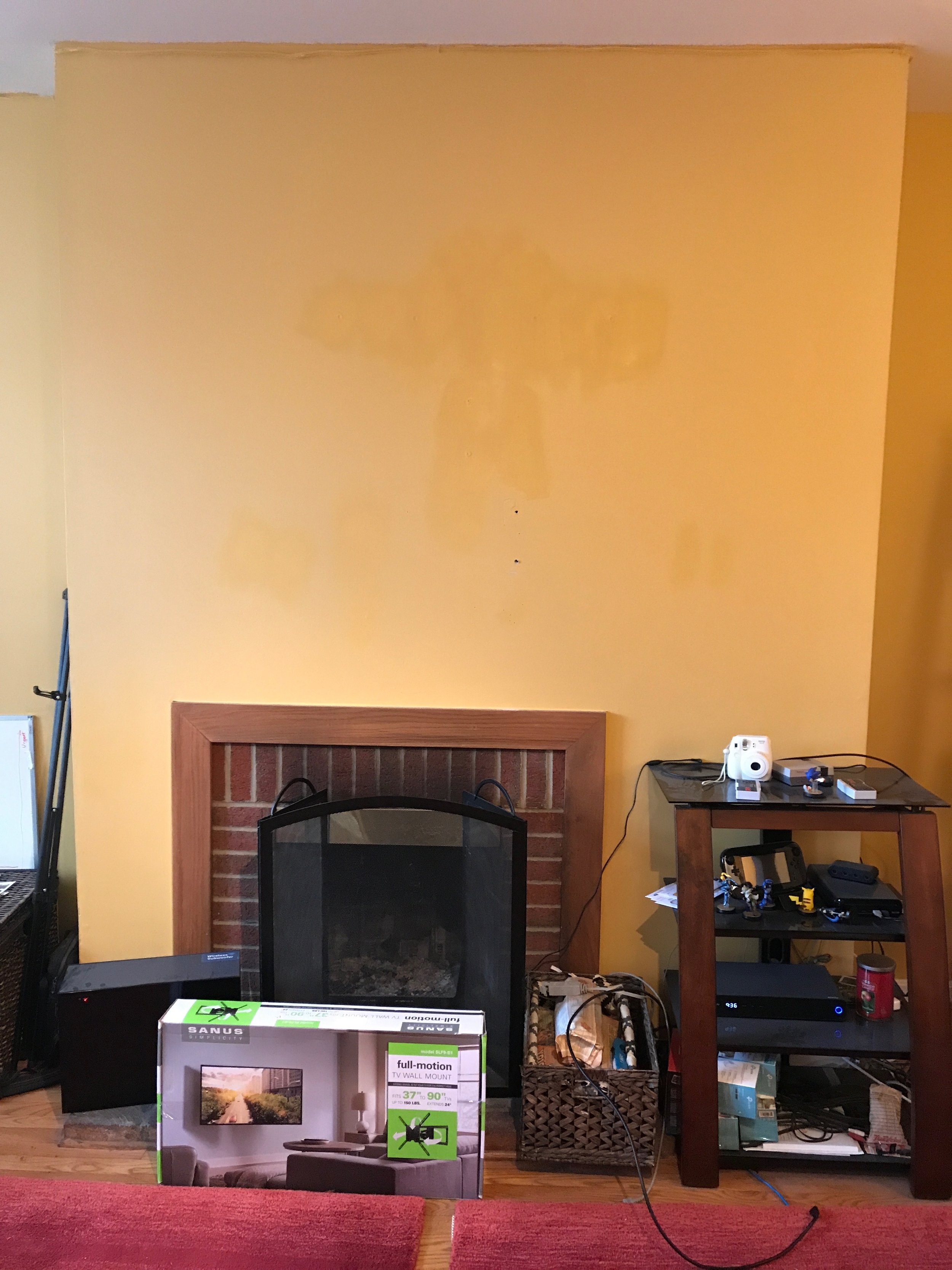
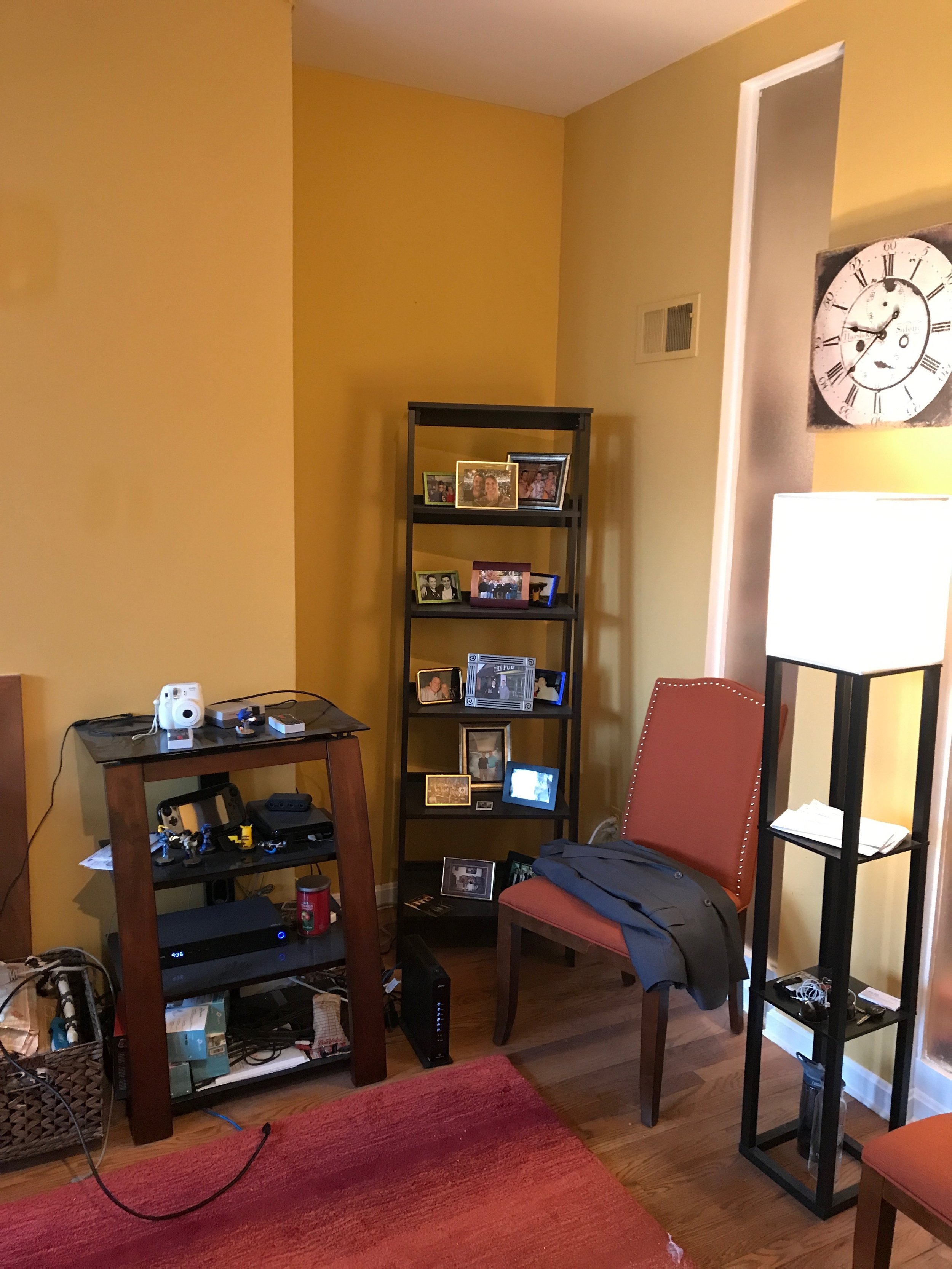
Before


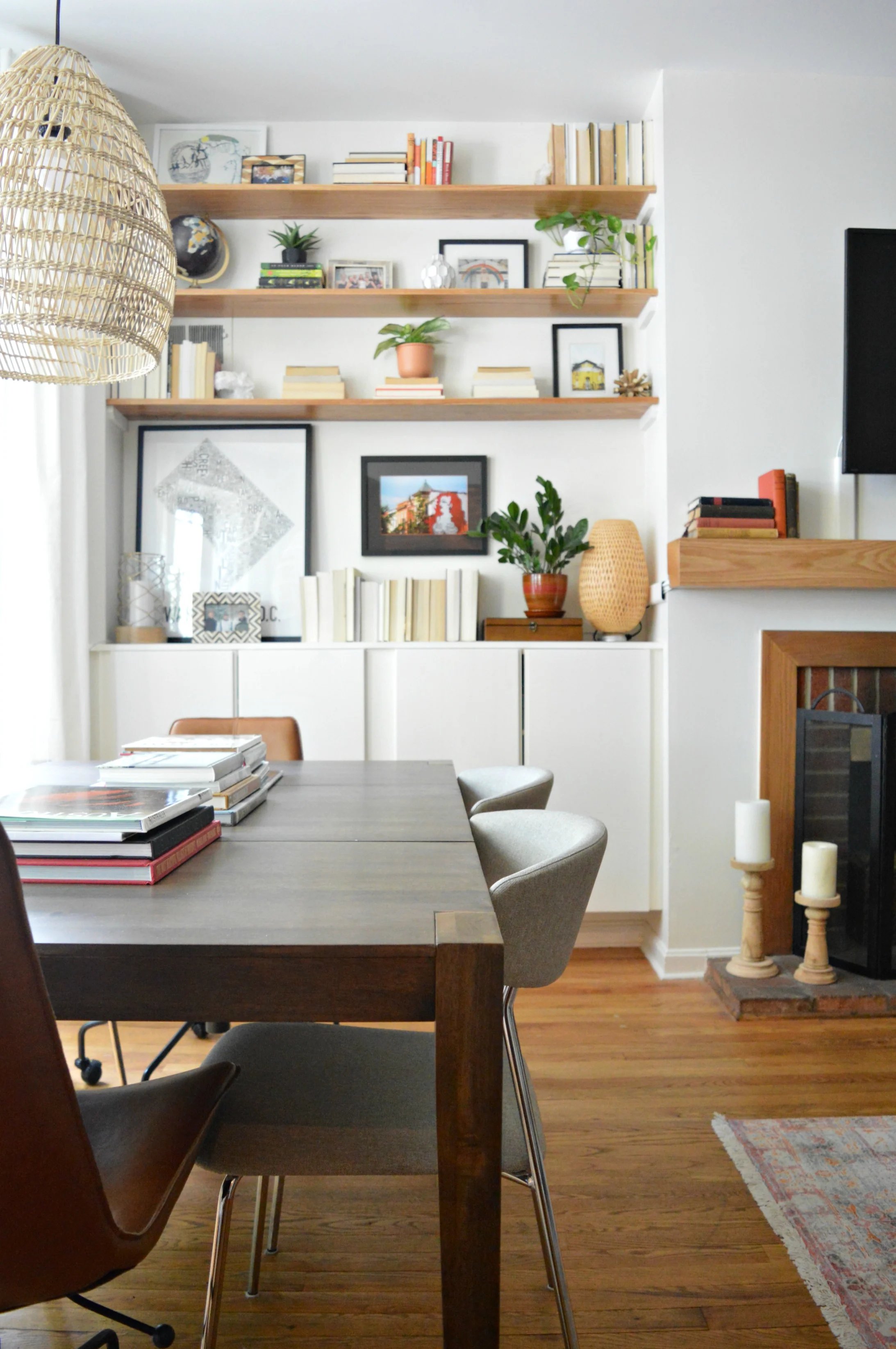
I am the LUCKIEST girl to have a business partner like Cate who can come in with fresh eyes and style these spaces out on shooting day. There were some odds and ends to finish up here before we got pictures and it was such a relief to know Cate would bring the shelves to life with her thoughtful touch. We've done this enough times now that she understands my style, she's prepped on the vibe of the space, and works her magic to create groupings that make sense in the surrounding room. There was A LOT to work with in here and she hit the nail on the head. It doesn't hurt that Ali herself has acquired some really fun goodies to play with! Not only does she have the greenest thumb among us, she has a careful eye for art, photography, and pretty little things. It was a lot of fun to be hands on in this space after 7 months of selecting everything from paint to picture frames!

The first thing I started brainstorming for this space was storage. I knew I wanted to add storage to both sides of the fireplace, (which is, indeed, off center - your eyes aren't messing with you), but one side is narrower than the other. Asymmetry doesn't bother me in the least so when I plugged two side-by-side IVAR cabinets from IKEA to the left side in the digital floorplan and saw that they were a perfect fit, I decided to just run open shelving up the right side. This solution makes absolute sense given that Brian's work area is on that left side and he really needs the extra storage space there. I wanted to have the IVAR cabinets floating over the floor by about 8" for a modern, custom look, and cannot express enough how much I love, love, love how they turned out! Ali and her handy Dad hung the shelves and they created the mantle from a DIY tutorial we found on Pinterest, (which they brilliantly added a notch in from behind to hide cords)!


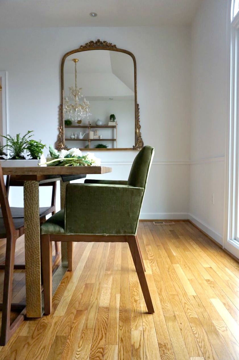
If this isn't your first StyleMutt Home design reveal, you might be noticing a recurring element - moody mossy green, and specifically green velvet, (examples A, B, C, D - walls and sofa for a double whammy, E, F - you get the point!). And those are only a few that we've photographed so far! As a young designer with an itty bitty portfolio, it can be risky to reuse an element over and over. Will that signature move be well received or turn people off? I've used this element both subtly and obviously in various jobs and it's just my favorite! Dark green was first inspired by my love for nature and the beautiful shades of green I see right outside my window. I view it and use it as a neutral and love how it adds a touch of earthiness! It's not right for every space, but somehow it finds its way in to quite a few!


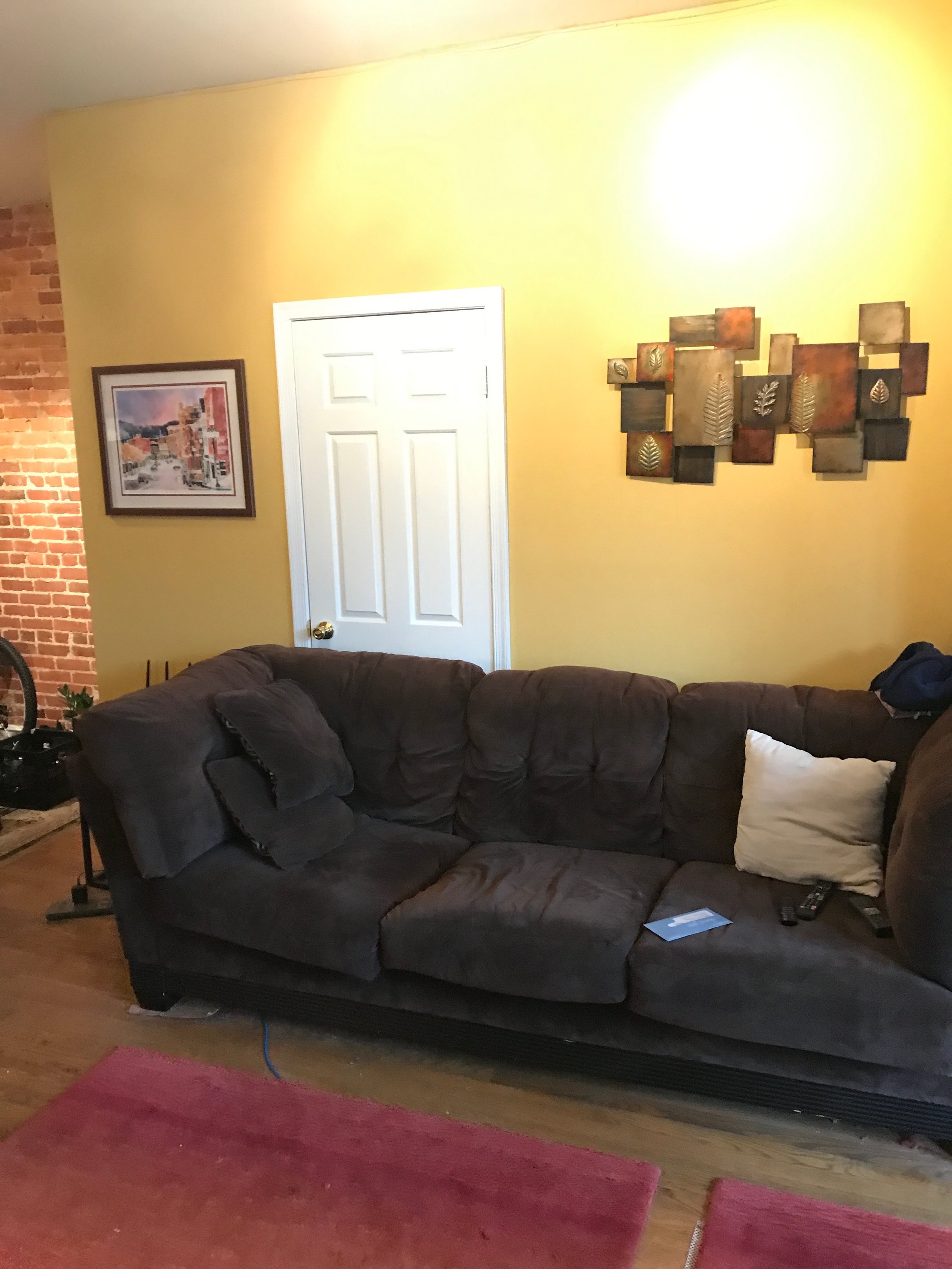
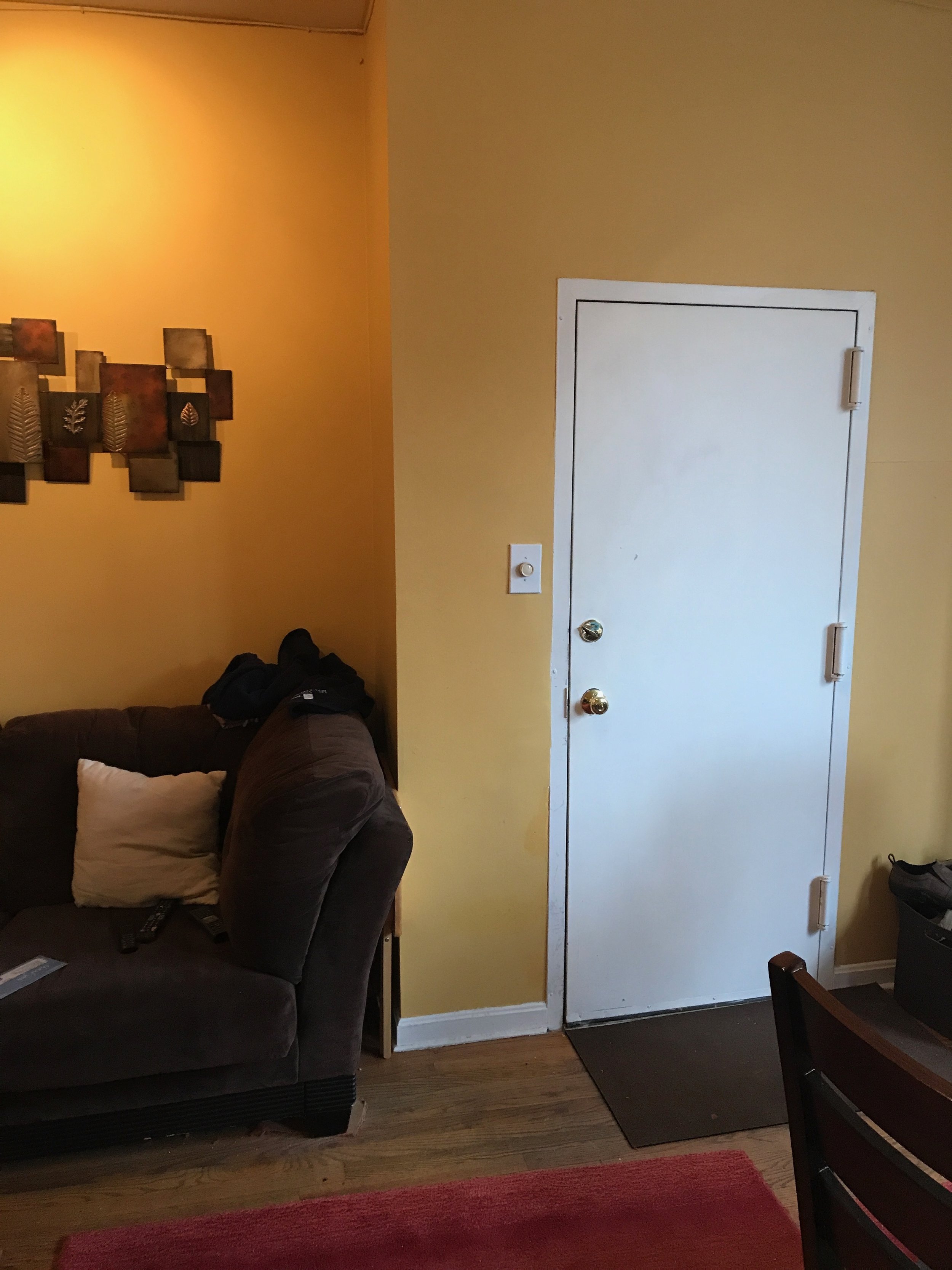
When we got down to the final details and Ali was ready for pillows, I got a little carried away! But with all that we had going on across the room on the shelves, I wanted to balance the space with some weight on the sofa. I had A LOT of fun with the pillows. :)
And if you want to know what's behind the door that the couch is blocking, you'll need to take that up with Sweden. Apparently this old building in DC belongs to them LOL!!! All I know is that no one needs access to that door and it's the only wall in the room to place the sofa, (and with the dimensions of the room, floating the sofa is not an option). I only tell you this because I have already had one designer question this layout with a comment: "Sofa in front of a door?" I get it, it's not ideal, But this is DC living, folks. Old, quirky buildings with odd elements that you just have to work with. I worked with it by adding an oversized mirror to one side of the door and mounting a good sized sconce to the other. When the conditions are not ideal, you can always fall back on scale and at least get that right.


Before


Recognize the art? It was over Ali's sofa in her last place! She took that photo in Cambodia and framed it herself!!


This sweet alcove is right off the kitchen and is perfect for dining and game nights. Nailing down exactly how Ali and Brian wanted to use this space was crucial and I had a couple different ideas for it. But when comfortable seating and dining height table space became priority in this narrow space with only two walls, it made sense to add a banquette and round pedestal table. A Craigslisted cabinet stores games and defines the space, along with a cozy rug and soft leather chairs. And more pillows - I'm telling you, I've never had more fun with pillows!


The bedroom is a quieter extension of the main living spaces - layered texture and pattern take on a more neutral vibe with the strong statements being the brick and green velvet covered headboard.
Before


There are pleeenty of gorgeous lush green velvet headboards out there, but with a perfectly good headboard already in place and a willing Ali to recover it herself, I found this delicious mossy velvet on Etsy for her to use - this is a much more cost efficient solution but the results are dramatic!


One of the sweetest surprises in here was when they removed the makeshift desk that had been built over top of the window seat! It was something we had spent quite a bit of time discussing when they gave me the Facetime tour during our consultation, and at the time they weren't sure it could be broken down. But they made it happen and it completely opens this room up! I have a special place in my heart for window seats so this element just puts a smile on my face.
Before


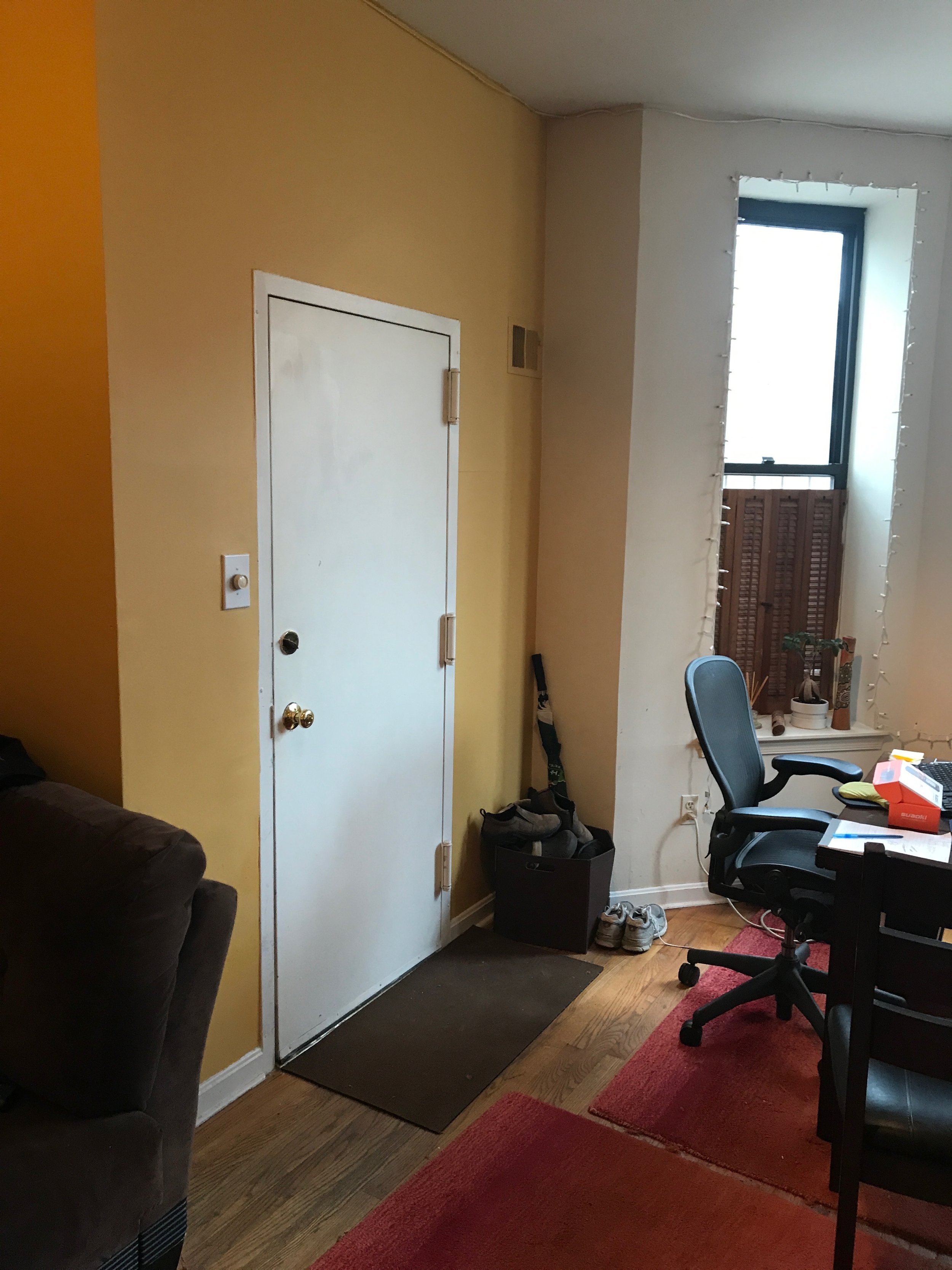
The last stop of our tour is the back room which doubles as Ali's office and their guest room.
Before


A rolling desk floating in front of some Billies, (bookshelves from IKEA), make this an easily transitional space when guests come in town.


It's bittersweet to be at the end of this amazing project and to be done working with Ali and Brian. I cannot express enough what a gift it's been to get to work with them, (and with Ali TWICE). I said this last time, but she makes us look DARN GOOD! It's so hard to get projects to the finish line as things come up in our client's lives, (as we, too, experience and more than understand), so connecting with someone who cares just as much to see things through, even moving mountains to do so, just means the world. Fortunately we have had the pleasure of working with several like minded clients this year, so this reveal is the beginning of a short chain of finished projects we will get to share with you! We hope you enjoyed this one and we can't wait to share more soon!
Thank you so much for stopping by today!