Design Reveal: Full of Surprises Master Suite

Make a boring room less boring
Play with fresh colors
Mix styles
Find unique pieces
Make surprising design choices
Experience someones joy when they really love their home

These are a few of my favorite things!

Most of my work revolves around main living spaces - living rooms and dining rooms. Then comes entryways and kitchens. But bedrooms might be my most favorite room, for no other reason than this is truly the retreat space. No one is worrying about flexible seating or kid friendly pieces as much. Its an opportunity to strum a different tune in your home, if you so wish. It’s your space; truly yours. This master suite is particularly interesting in that it has an adjoining sitting room and a nook, so I wanted to create something really cohesive without making it all feel too matched. It’s a really large space and I felt like things would get lost if it was too much the same throughout.

Sitting Room

Beige on beige on beige! A quaint pass-through room like this is easy to forget about. Used for lounging with a book in it’s fantastic natural light, it truly didn’t need much. But this is the room you walk through to get from the main hallway to the master bedroom, and I just didn’t want it to feel overlooked.

In this adjoining sitting room we just had fun! I wanted the walls painted Cavern Clay by SW as we had used the color in the clients dining room and LOVED it. So we brought it up here, too!

Denim blue + clay just felt right in here. It’s so fun but also feels really organic to me…like colors you’d see just looking outside! A few winks of black peppered in through the hanging bells and vintage rug just create a striking contrast - something I always enjoy incorporating! A touch of black in any space goes a long way - many people I work with think it will make things feel too dark, but it’s the use of contrast that actually makes things feel lighter and brighter!

Vintage rugs and kilim pillows are a staple in much of my work. I just love the hunt for the perfect pattern and colors that will bring a space to life!

Bedroom

The first order of business in here was getting the walls right. This is a really large room and the former beige made it feel incredibly heavy. So we went white on the walls and used a light putty beige color for the window trim. Next, I found the rug. I knew there would be several rugs within steps of one another throughout this space and I wanted them to reflect each other in subtle ways. What I loved about this rug was the spice color along the edge. It echos the Cavern Clay on the walls in the sitting room and ties the spaces together without being obvious.

My beef with the former sitting room was all the beige - but I’m not anti-beige! I like it as a soft contrasting element. Three colors of beige were incorporated here - the window trim, curtains and upholstered bed. The trick is not using the exact same color; subtleties in saturation (some lighter, some darker), help break things up and create depth. If you scroll up and see the original dark curtains with dark headboard, it kind of looks like one dark area without any movement. Layering lighter with darker tones is a great way to prevent an abrupt and heavy visual presence in a space.

It’s a lot of green but gosh I love this color for the duvet! It’s got a lot of gold which is what caught my eye.

The leather bench is one of my absolute favorite elements, (as leather often is). The footboard by itself felt too flat; like the whole bed was stopping short. Adding the bench strongly compliments this amazing bed and pulls the whole space together beautifully.

This curly-Q light is just a dream! It’s an interesting but simple design, which is great for this room which is holding quite a lot!

This whole project was nothing if not a work of moments. There were so many moments to create! The trick is balancing stronger moments with softer ones, like this ‘his’ dresser. Even the art, by my friend Holly Young Art, is subtle.

Nook

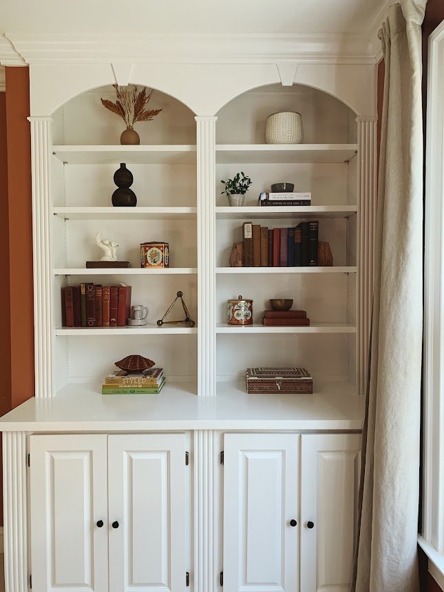
The windows in here inspired the putty colored trim - I’ve used this color trim before but not often! It really highlights these beautiful windows and anchors this area so well. I had them bring the putty color all the way down to the built-ins to pull the whole wall together.

And when was the last time you saw a papasan chair?! It’s super comfy and defines the purpose of this area all by itself. It’s the perfect place to curl up and read (the tv angles toward the bed, which is a better distance for it)

A closer view of the bedroom rug

Bathroom

We replaced a lot in this space, but a big drop in the salvage bucket was having the vanity painted. We kept the counter and floor tile, as well as the tub and shower. Everything else was updated with reasonably priced finds, including this gorgeous vintage rug!

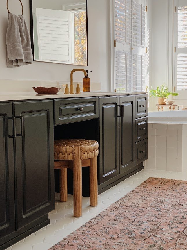
Kitchens and bathrooms are such utilitarian rooms with a lot of hard surface, I really love incorporating softer, natural elements and textures wherever I can that makes sense in the space. This seagrass stool and vintage multi-colored rug are useful, but intentional selections for this room.

This is the last design reveal for this year and it’s truly been an exhilarating year of design. We got to do some wildly different projects and use all kinds of creativity! Thank you so much for your encouragement and excitement around these jobs - it’s such a pleasure to get to share them with you!

Chelsea

Design Reveal: Color, But Make It Sophisticated

It’s a design reveal day! These are among my very favorite days of the year. The precious day when I get to share the fruit of many months, sometimes over a year, of work! I don’t share all of my work - 10% of it, in fact! So these projects that make it are truly special to me and I feel so humbled to get to share them with you friends.

Speaking of friends, the amazing client who owns this home has been an acquaintance for many, many years! Her older sister, Lori, was my Young Life leader in high school! In fact, it was Lori who suggested this effort together in the first place. Sure enough, Jenny and I hit it off right away and now is a sweet friend!

When we first connected, she wanted to completely transform her main floor, which includes a family room, dining room, den and kitchen. She had been saving up for this and was ready to hit the ground running! The main objective was to fill her home with color but make it feel grown up - whimsical yet sophisticated. Jenny realized she had gotten about as far as she could with the assortment of hand-me-downs and random pieces she’d found here and there, but (like many), the more she added to her home, the further she got from her vision.

Family Room

It may seem counterintuitive to get your walls white when you love color so much, but this was a move I really encouraged from the beginning. But not without a vision of what would come next:

I don’t think white walls are the answer for every single project, but I knew that it would be the game changer for this home; the defining factor that would enhance all the colors we were about to explode. Now, this home glows like a sunset!

I mean, it absolutely GLOWS! And there was no laying out samples of patterns and fabrics together to come up with this. I stayed in the general family of jewel tones and then ran in every possible direction. Jenny wanted allthecolors so there was really no holding back. Of course, playing off the color well are very grounding elements like the black and white rug and the camel leather ottoman. It’s all about striking balance where it matters most!

Let’s shift to the dining room!

Dining Room

Since the dining room and family room are literally side by side, I wanted to carefully craft a TOTALLY separate space that felt as exciting as the family room, without making it feel like it was a completely different house. The objective here was more cohesion than matching. A playful but black and white pattern on the walls creates a balance to the family room, while the chairs and cabinet echo the jewel tones. Again, there was no matching or looking closely to be sure that the colors ‘went’, but it was staying in the jewel tone family that I knew would be enough.

There is not a dull line of sight from any point in this home!

Den/Kitchen

Like the other areas around this main floor, there was already quite a bit of color going on. Yet, the heavy wall color and the varying tones of color between the rug, chair and decor were all competing to make this room feel very heavy and dark. The strategy in here was the same as the other spaces - get the walls a nice clean white and then build up the color using jewel tones, balanced by beautiful uses of wood and leather.

Replacing the two lower floating wood shelves with a simple white cabinet decreased the visual weight of the space, providing a relaxed balance to the assortment of color used in the pillows and rug. I have never loved fuscia more in my life! I LOVE this rug in here!

The kitchen is still in a bit of progress until tile backsplash is installed, but painting all the lower cabinets and this accent wall in a saturated teal just creates the most incredible contrast to the freshly painted white uppers (with saturated teal knobs). And just look how rich the leather stools are against this color. Oh my word! It’s just stunning.

I absolutely delight in the work I get to do and feel so incredibly grateful to be trusted with peoples homes. To be given the opportunity to work on a project SO unique like this is just such a treat. If you’ve been a part of this community for any amount of time you know this is unlike any other project I’ve shared - and that’s what I’m feeling particularly proud of right at this moment. To go all out and deliver my best work in a style that is different from my own is what I love about design! Trying new things and having so much fun playing around! I don’t like feeling boxed in or delivering only what’s expected of me; rising to a challenge and even showing something surprising satisfies so much of who I am as a person.

Next week I get to go shoot my last project of the year! It’s another doozie, just a heads up :)

Thank you so much for coming by today!

Outdoor Living (+ ditch the mosquitoes)

Welcome to Spring in Virginia! Specifically, our backyard. Spring around here is lush and fragrant as the foliage surrounding our home fills in, and the aromatic perennials come back to life. With temps lingering in the mid 60s-70s, it’s truly a beautiful time to bring every day living outside.

When our twins were around 1 year and we were pregnant with our third, we build our deck with great hopes of spending those long days with young kids outside. We bought a cheap outdoor table and chairs at IKEA and I did indeed spend quite a bit of time with my littles out there! We played, crafted and ate our way through all the pretty days outside together. Fast forward to the kids starting school, and we just stopped using it like we used to. Partly the natural course of children growing up and starting to have their own activities and schedules, and partly, the mosquitos got TERRIBLE! At the advise of a friend we got a canopy structure with zip-up netted curtains so we could enjoy at least dining outside without the buggers. But, if you have spent any time in Northern Virginia in the last 5 years, you may have noticed how windy it’s become. Our home has survived several tornadoes despite repairable damage to our home. A semi-permanent canopy is just asking for trouble! So, now you’re all caught up on the evolution of our deck, and up until two weeks ago, this is what it had become:

Blank 2000 x 2000-1.png

It’s been a sad, unwelcoming extension of our house that we had every intention of enjoying. It was time to reclaim this space and breath some fresh life into it!

B9338949-847A-466F-8724-B0084E2BC3B2-DDC2C1DA-B483-4D7D-A05C-9F57A80C7A18.jpg

We swapped the dining furniture for lounge furniture as that just fits our family better. We have already enjoyed dining out here as a family, entertaining friends, and Albus and I hang out here when I’m getting work done during the week. The versatility of this space now is just what we need!

6B73150F-4964-4FCF-8C35-511A81B3EABF-915DA23C-D0BF-4F17-8F23-B7A55F6BAFD5.jpg

I found a few outdoor pillows at Society6 to add a little color…since I wouldn’t let Matt get the sofa in Caribbean Blue ;)

7FA555A4-5D60-45DB-B04A-BB73847B9B73-A0838BA7-2087-475B-95C7-CB9DD7D185AF.jpg
AAC9DCF0-5953-475B-A9B5-C7D55C21440B-0C457C32-3103-4EA7-991C-6DD0409254A7.jpg
B0529B31-AE9F-47F9-AED1-EDE798E83E11-6D51631B-976D-4C19-A47F-23F8243B439B.jpg

To address our mosquito issue (we are nestled into the woods and have a creek on the opposite side of our property), I went to the web in search of naturally repelling plants. I found some great recommendations, took a trip to my favorite Merrifield Garden Center, and put together a planter that would be visually striking AND go to work for us!

0C133CE8-BAC9-4396-9253-8773CB5F9FB5-230D9738-B401-4587-BA46-53CBD5E5226E.jpg

Whenever we go out here we rub a few leaves between our fingers and then wipe our necks, arms and legs. So far this is working amazingly well! I can tell a significant difference between the mosquito quantity in our front yard to our deck. Listen, I have that blood type that attracts those suckers, so if I notice a difference there’s a difference!

Here’s what I planted:

7A93C379-D16D-4A23-98F5-8ABDE64D6D65.jpg

And a big pot of mint! Mint is very invasive but effective. Highly recommend it, just in its own pot!

C6B5BD01-6F72-4F6C-9992-F5BFBC6AF073-7B68C425-7941-48AA-BFA5-8CD5323A84E7.jpg
CEA30A0E-88C3-42DC-A24D-2F72DA161987-462B7074-1E72-4279-976A-47C03D213D77.jpg

The wood is for Albus. He’s a real chewer and loves wood. You can tell when he’s been out here as there are wood chips covering 94% of the surface.

On a whim I decided to paint the frame around our sliding door. First I painted it a pale blue-green color (Shire Green, in fact), but Matt thought it blended into the siding too much and once he stated his opinion I couldn’t get him out of my head. (Love you!) So I went over with some leftover exterior black paint I had used on our shutters and garage door because I know it will hold up and I really can’t resist a strong black+white+wood moment.

14D57306-DE48-4B1B-B5ED-913175148001-BEA50A01-7537-40EA-899D-FC5B017285AB.jpg

Now available: Albus’ homemade mulch!

C9BBCBF1-B120-4E21-AC6F-732AC0758392-C115B774-F177-470E-AF61-C1E890B8F6E4.jpg
751693E6-3978-40E5-8271-969BE4E87502-B6DEA2F0-039D-4284-9590-463AECEA2224.jpg

There you have it! This space feels like a retreat once again, just as we intended it to be 10 years ago. Let me know if you try your own mosquito repelling planter! The true test will be in the Summer when they get really bad, but I’m feeling optimistic!

Thank you so much for coming by!

Chelesa.jpg