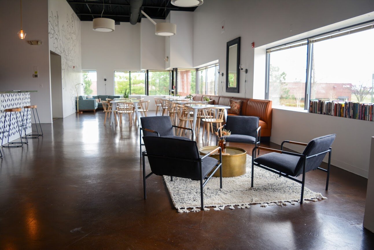
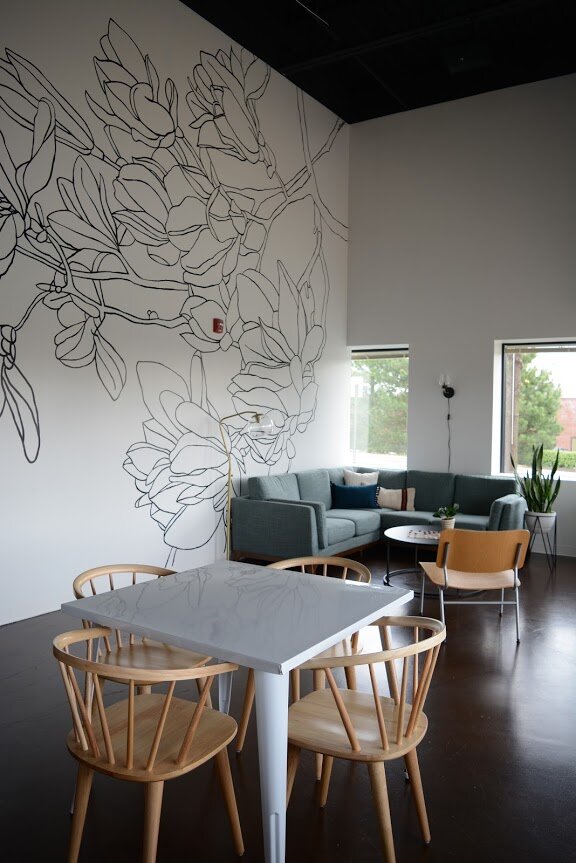
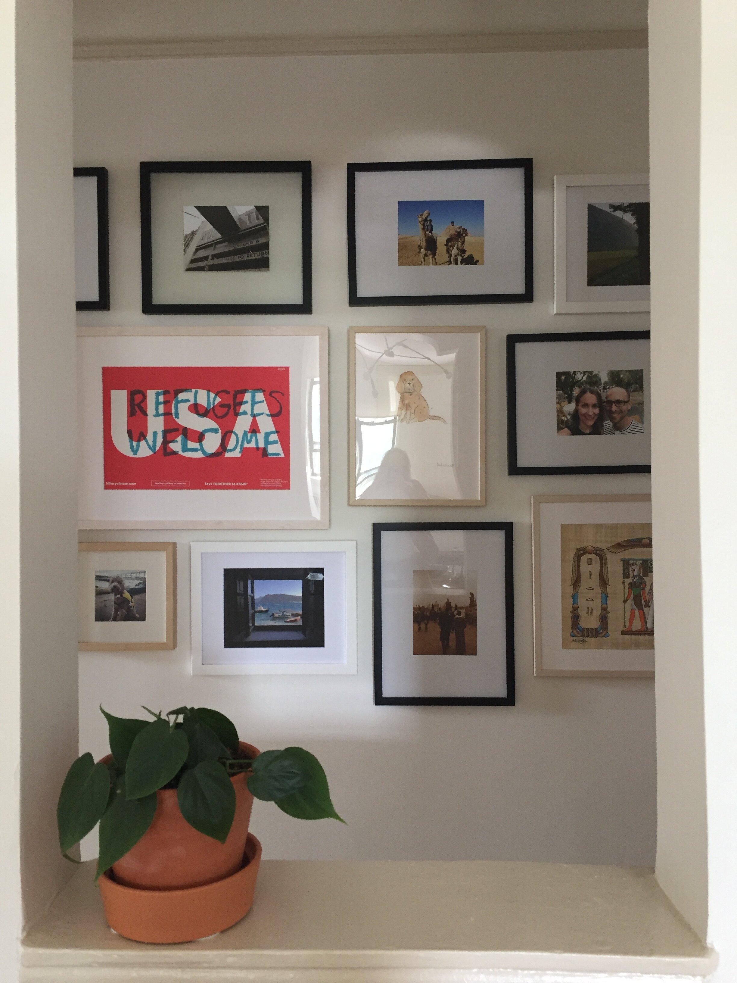
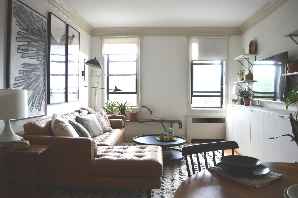
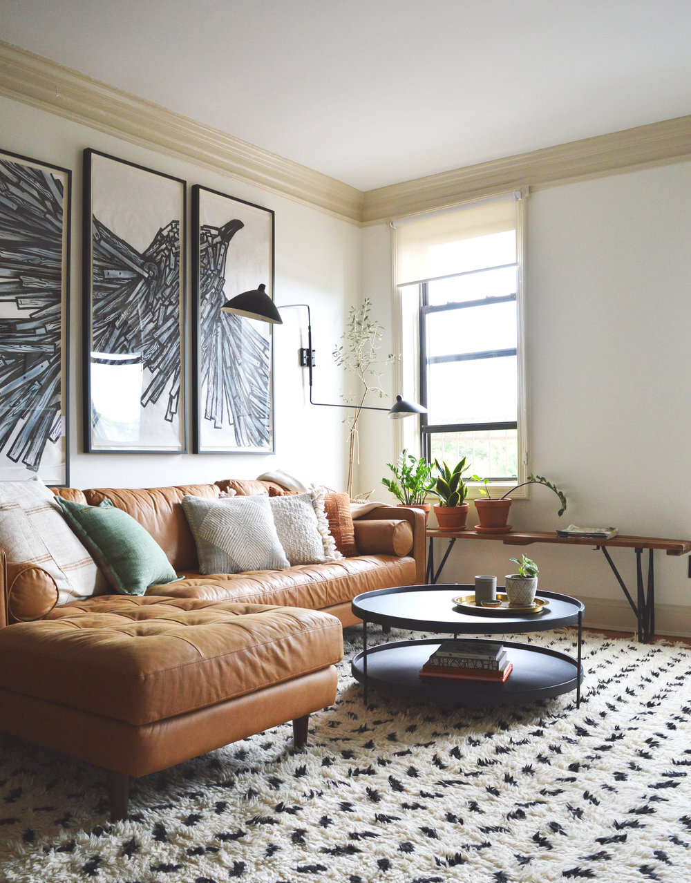
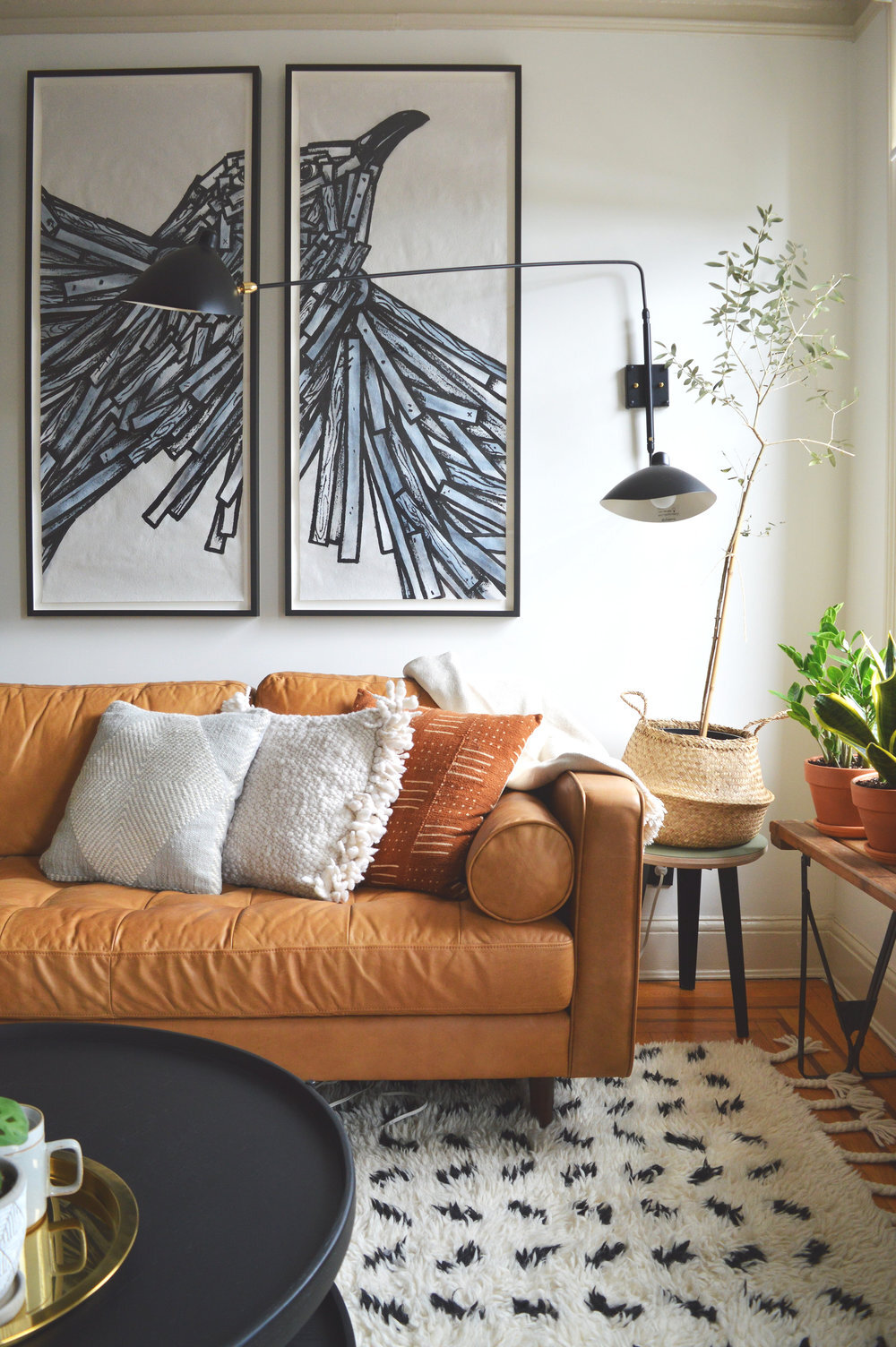
It’s weird times, indeed. I know every single one of you has had to adjust your regular way of life in some way, shape or form. If you have been fortunate enough to still have your job, there’s a good chance that looks a lot different now than it did 6 months ago - So many companies are figuring out how to continue their operations remotely and out of office. While I have always done my design work remotely, there is one aspect I’ve thoroughly enjoyed doing in person - finishing photos! I’ve shared before that I only get to take photos of about 15% of my completed projects, so when the opportunity arises to take pictures it feels like Christmas morning!
About a year ago one such project was wrapping up just beautifully in Brooklyn, NY, and I was hoping to make it up to take pictures along with another project in the Chelsea neighborhood. As it happens, COVID struck before I made it up there and I was sorely missing this project in my portfolio (and getting to share it here with you)! So I reached out to the client who I’ve been in touch with by the natural evolution of friendship in the process, and she was totally open to taking the pictures for me! We even scheduled a virtual styling session, which looked a lot like this for an hour:
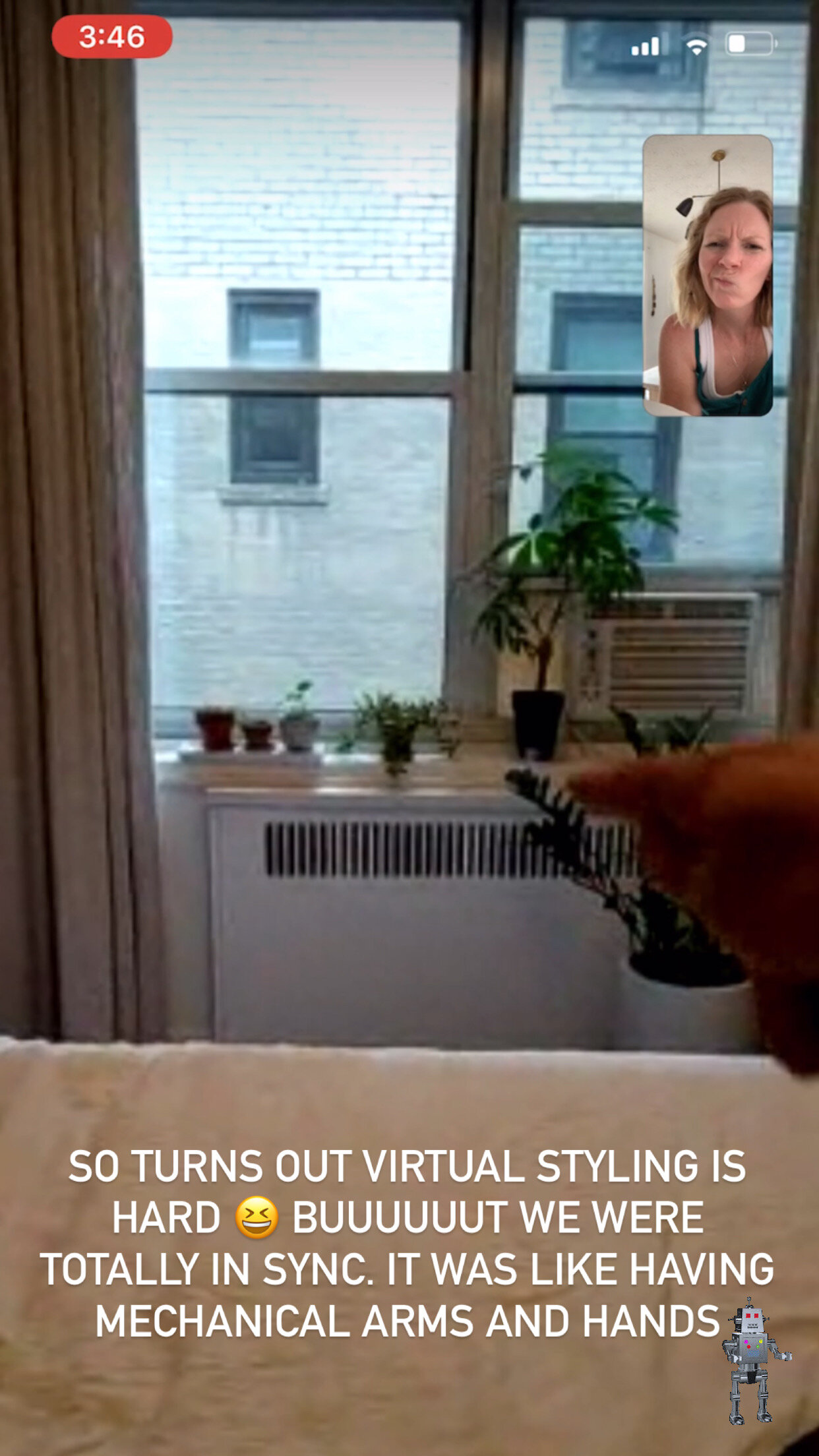
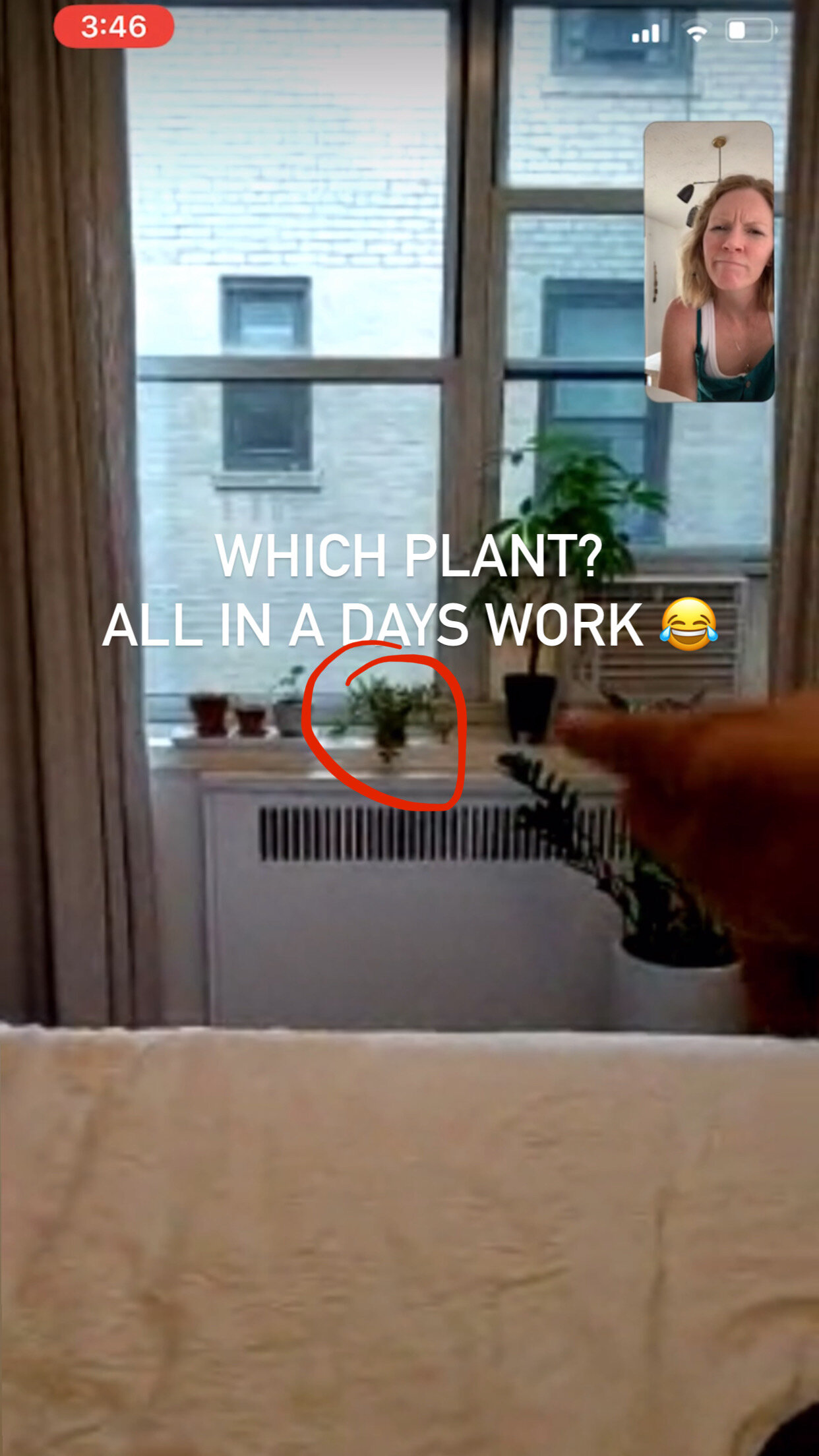
Despite my face it really was a lot of fun! Hah! Having someone else take pictures was such a good practice in letting go of something I normally like to have control over, and boy am I glad I let go. She absolutely knocked it out of the park! I sent her the same photography tips outlined in our Interior Design Starter Guide, and she nailed it.
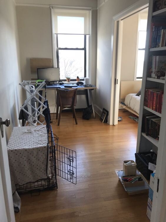
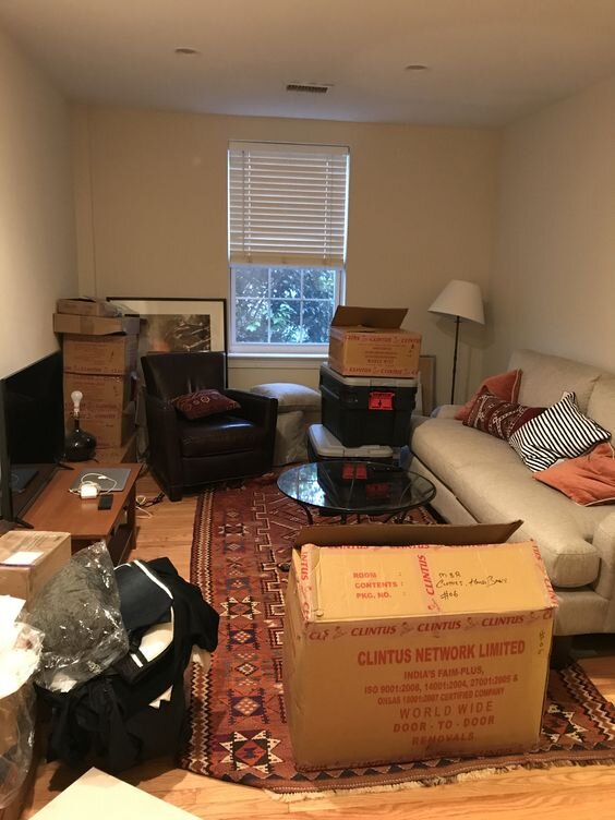
Before I show you around let’s take a look back at what this room started as. Now, I have nothing against lime green walls. In fact, our design assistant, Joy, absolutely rocked this StyleMutt Home project with lime green walls. But when this client and I were discussing her ultimate vision for this space, her bedroom, the lime green walls just didn’t support the end-goal.

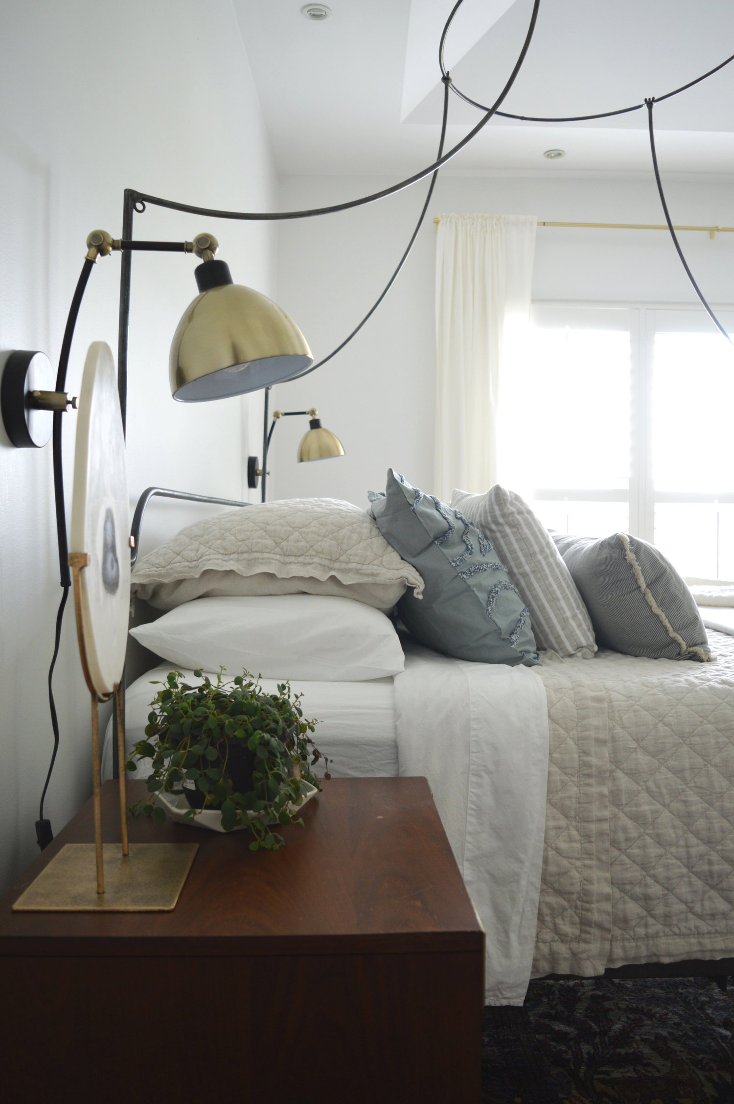
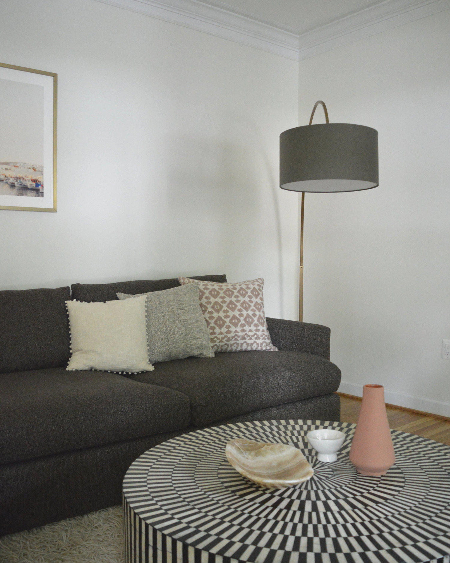
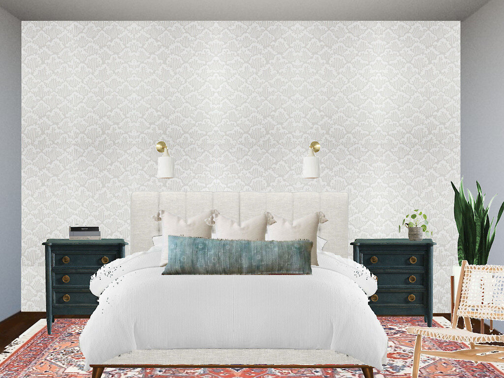
The plan, shown below, was to create a really soft and soothing space using various neutral textures and patterns, contrasted by just a few grounding elements. We wanted to create a sophisticated retreat that represented the client’s fun and joyful personality.
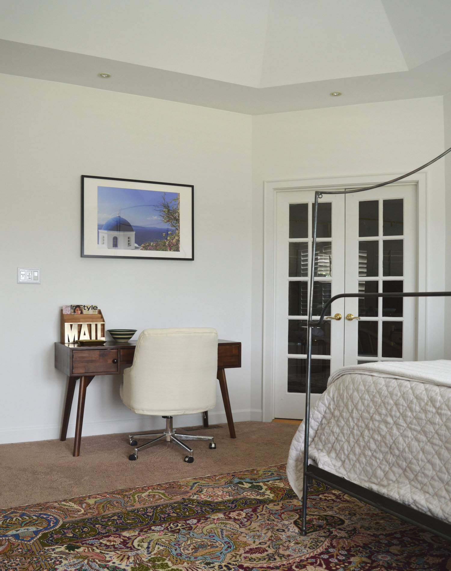
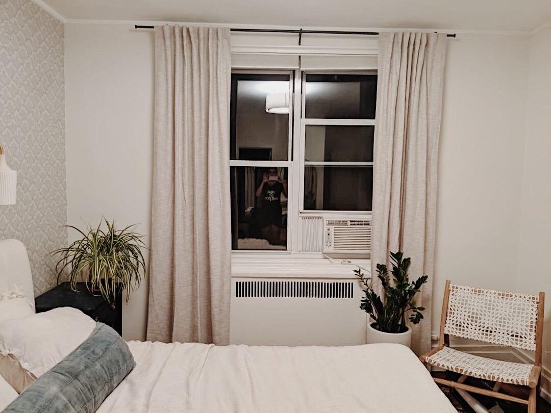
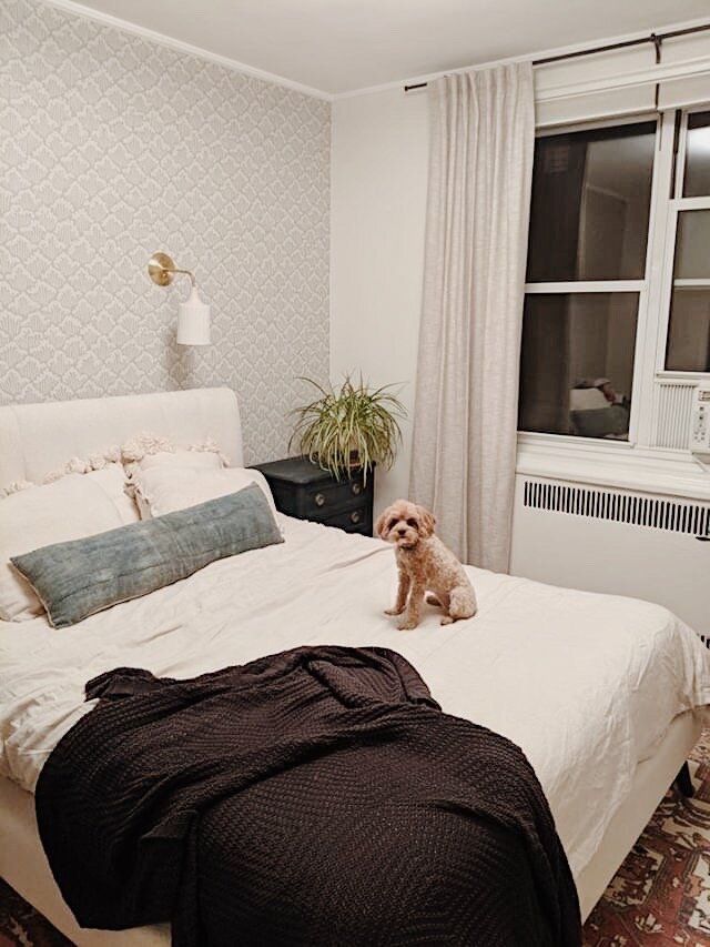
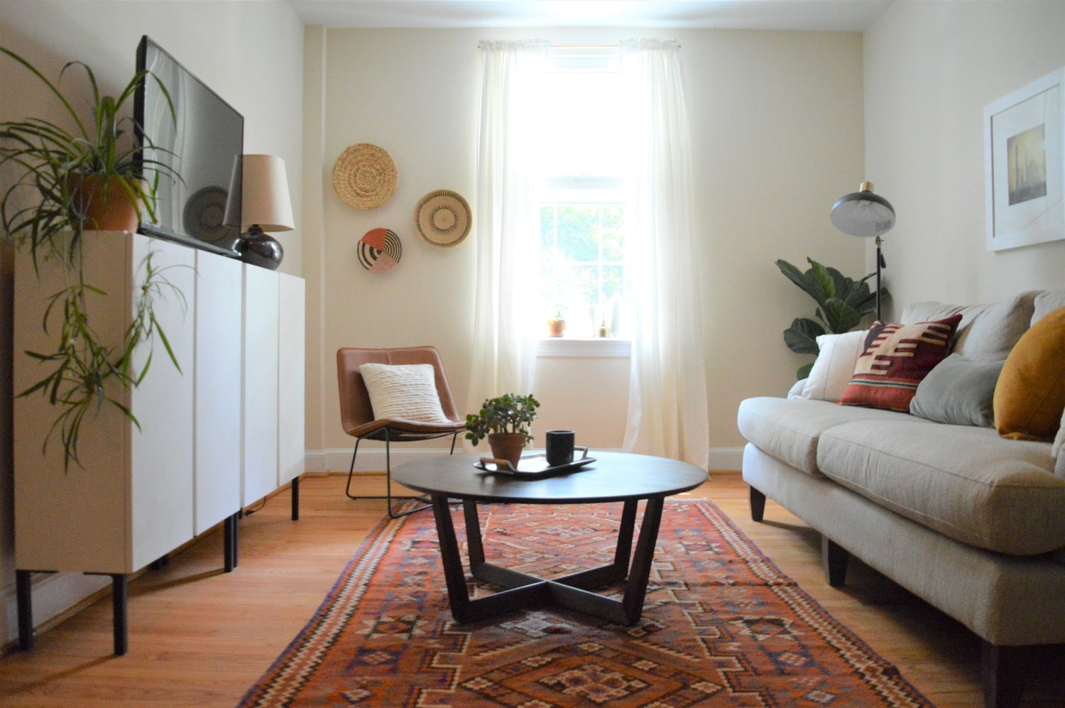
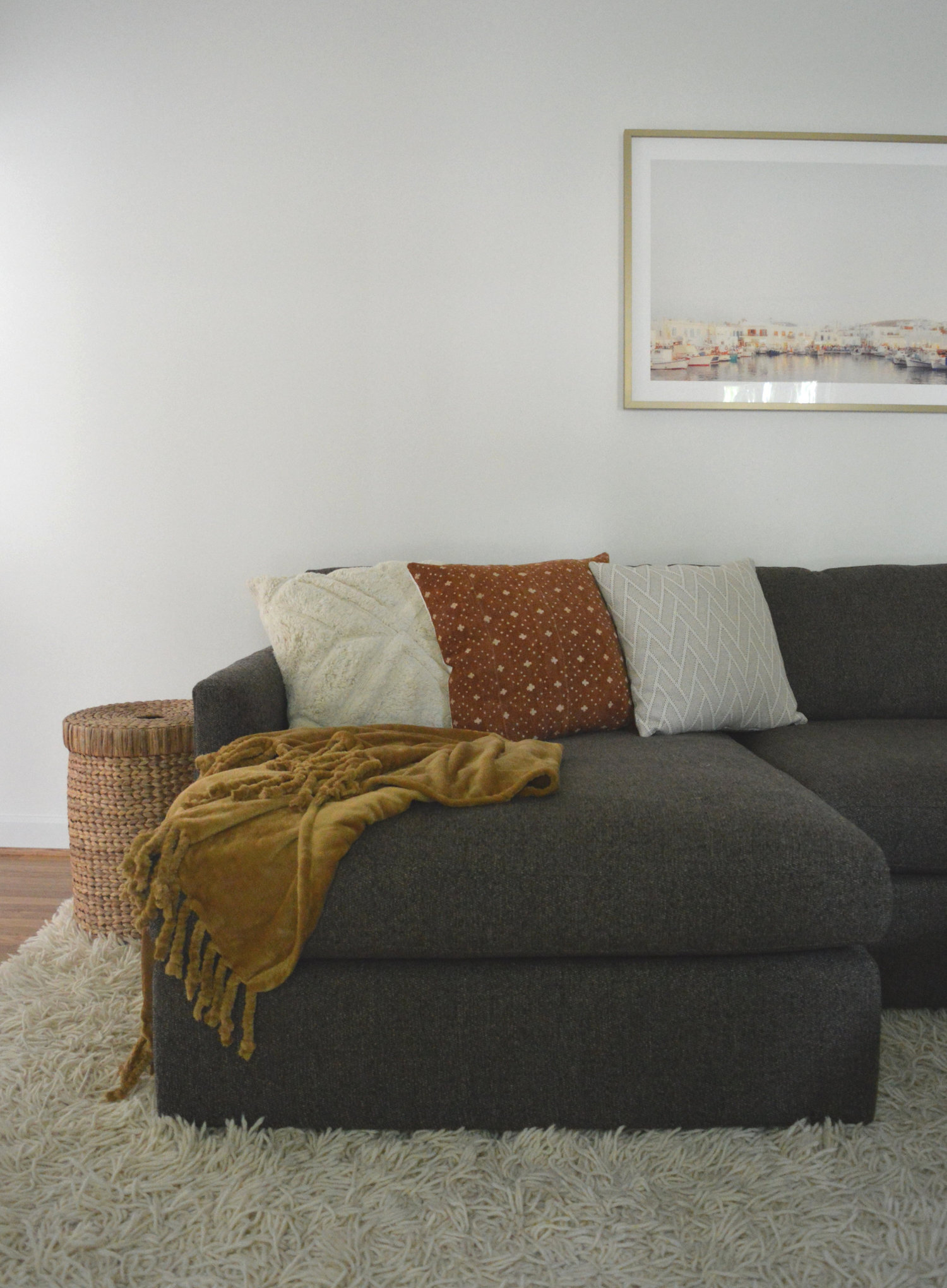
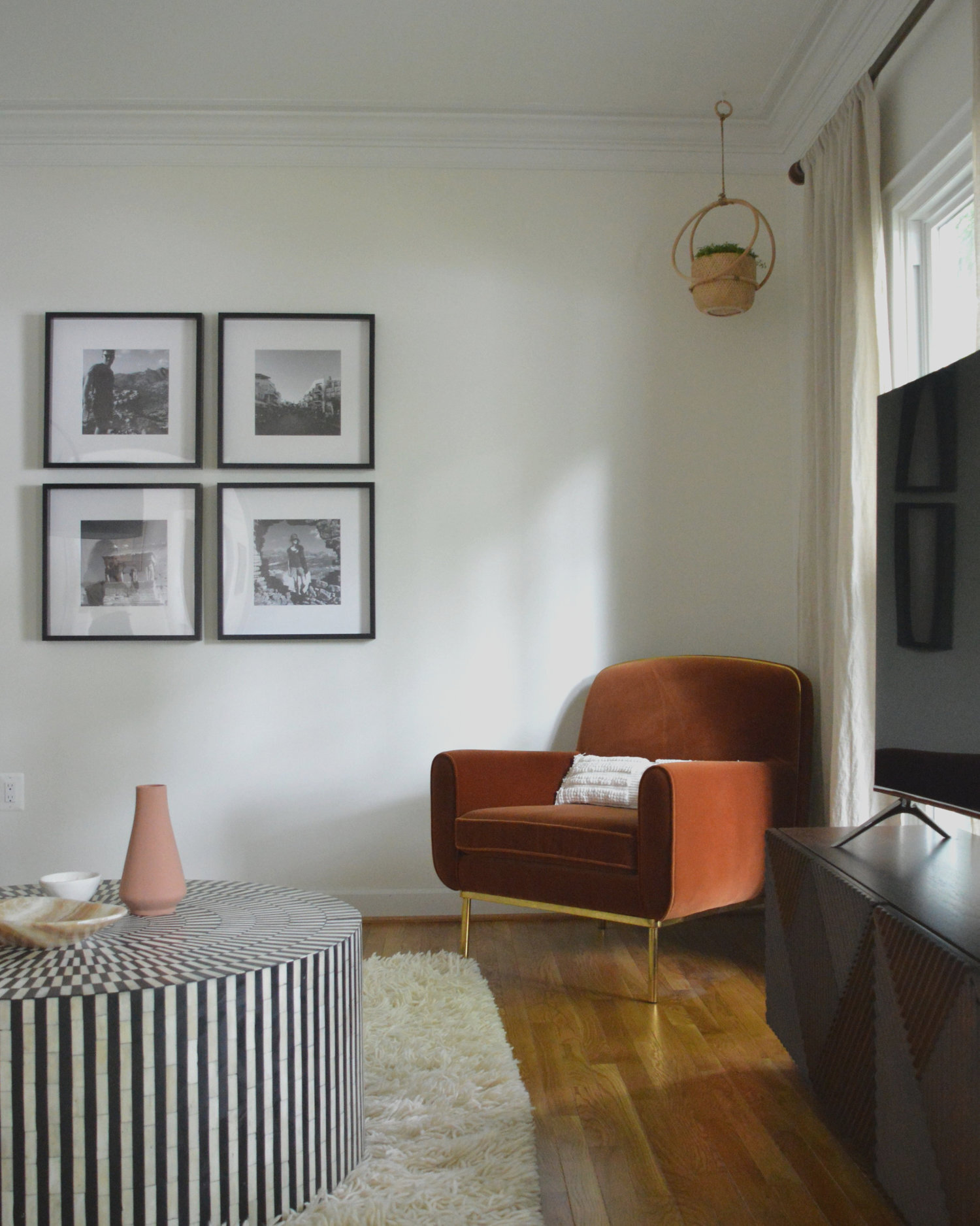
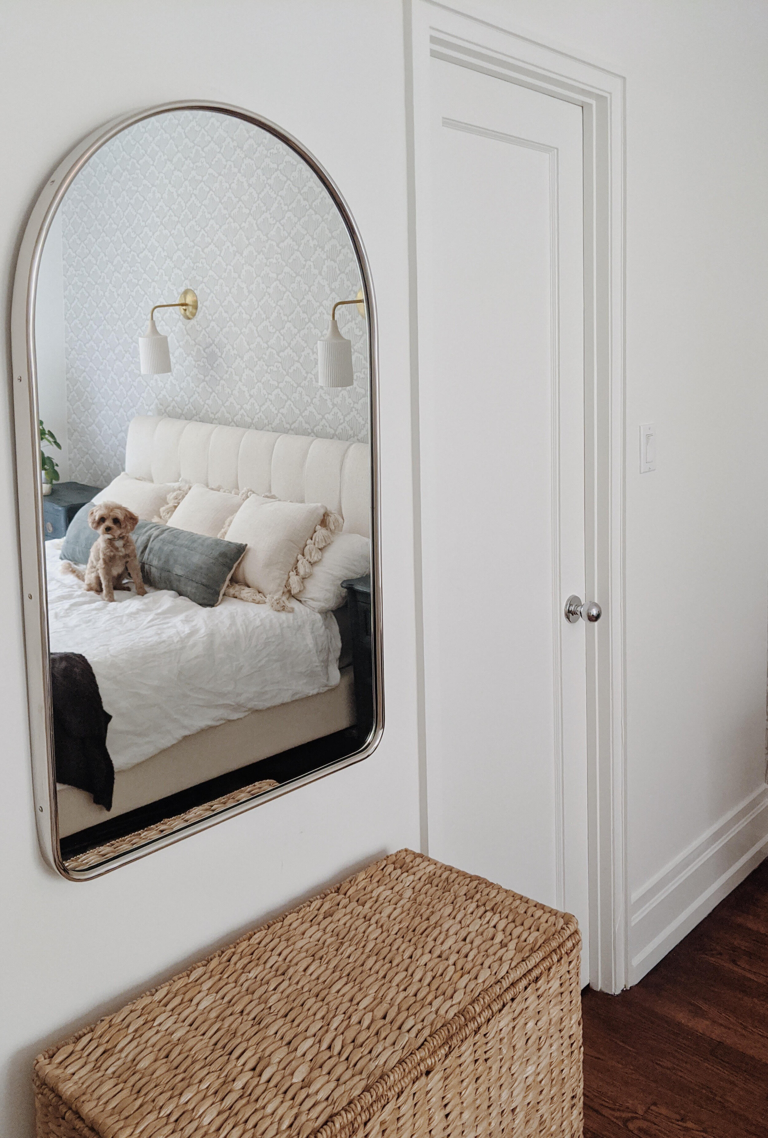
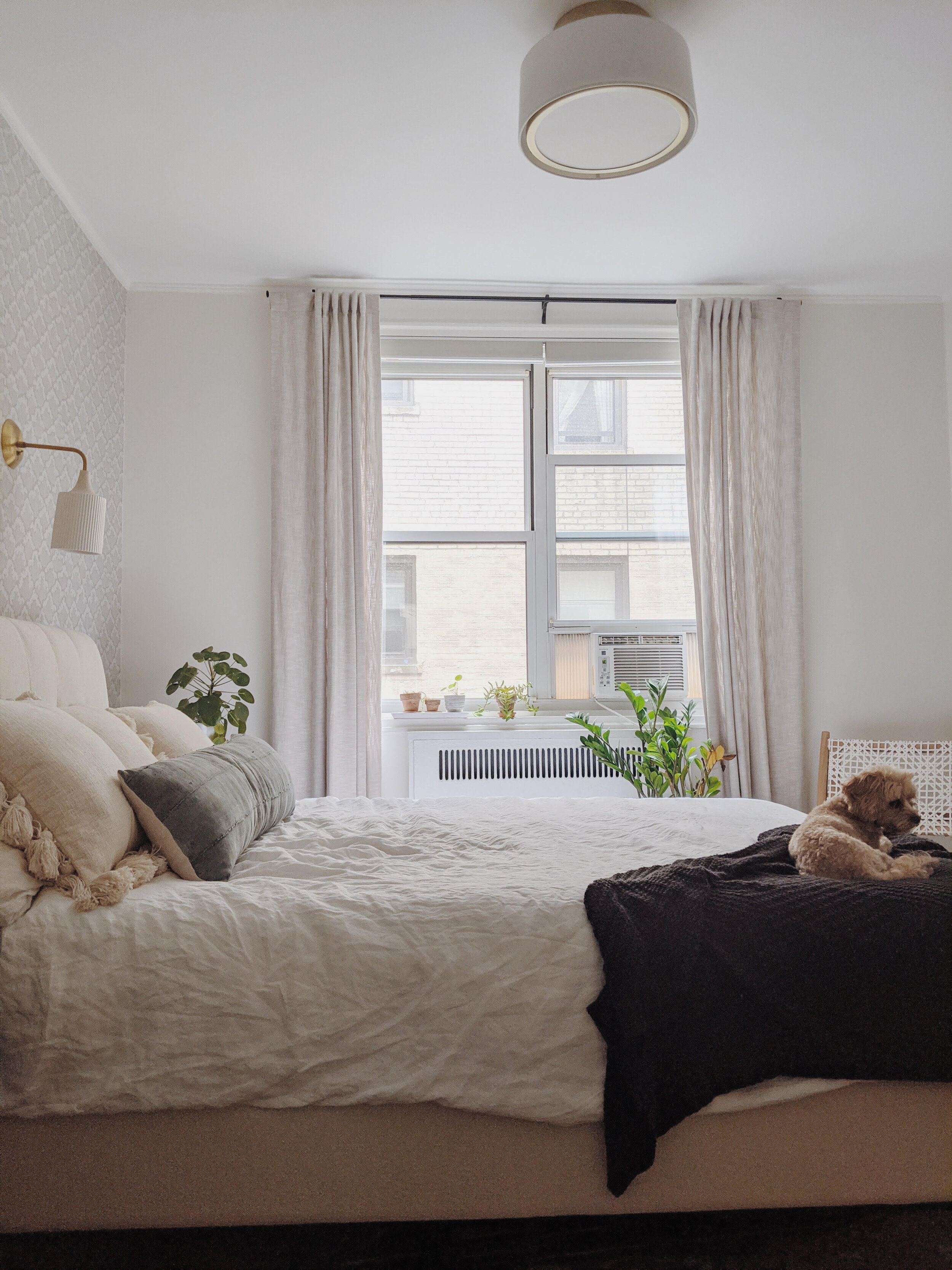
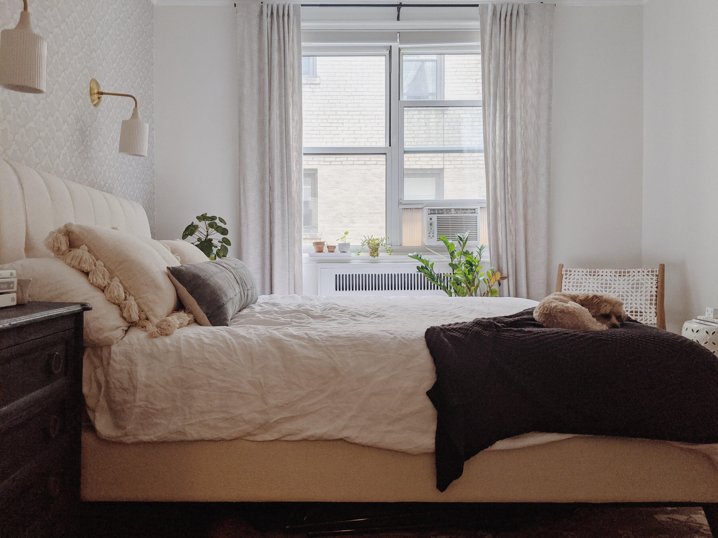
And here is our plan brought to life! ALL pictures are in huge thanks to this sweet client. Her pup, Peggy, seized the opportunity, for sure!

Another look back at the beginning:

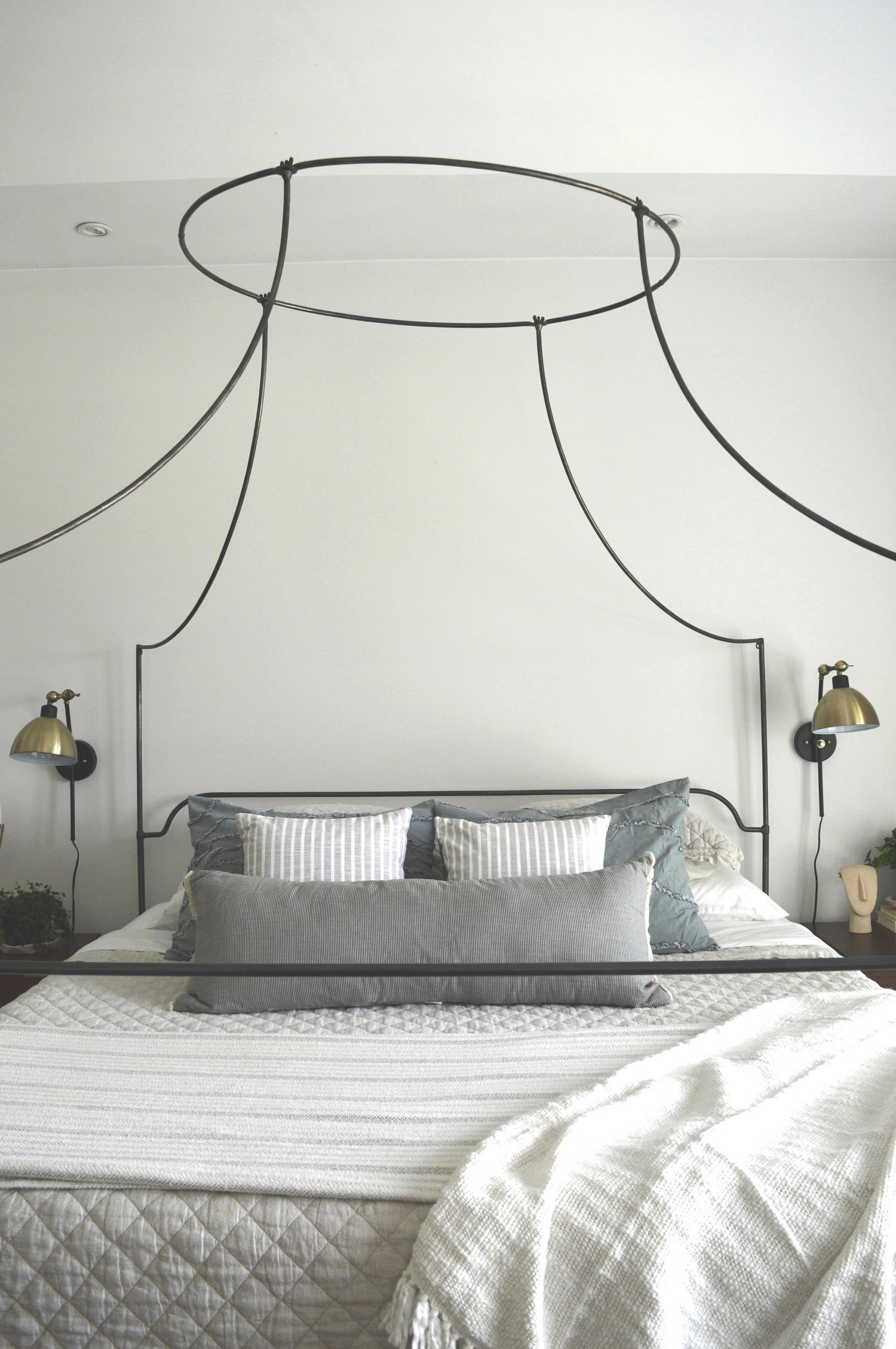
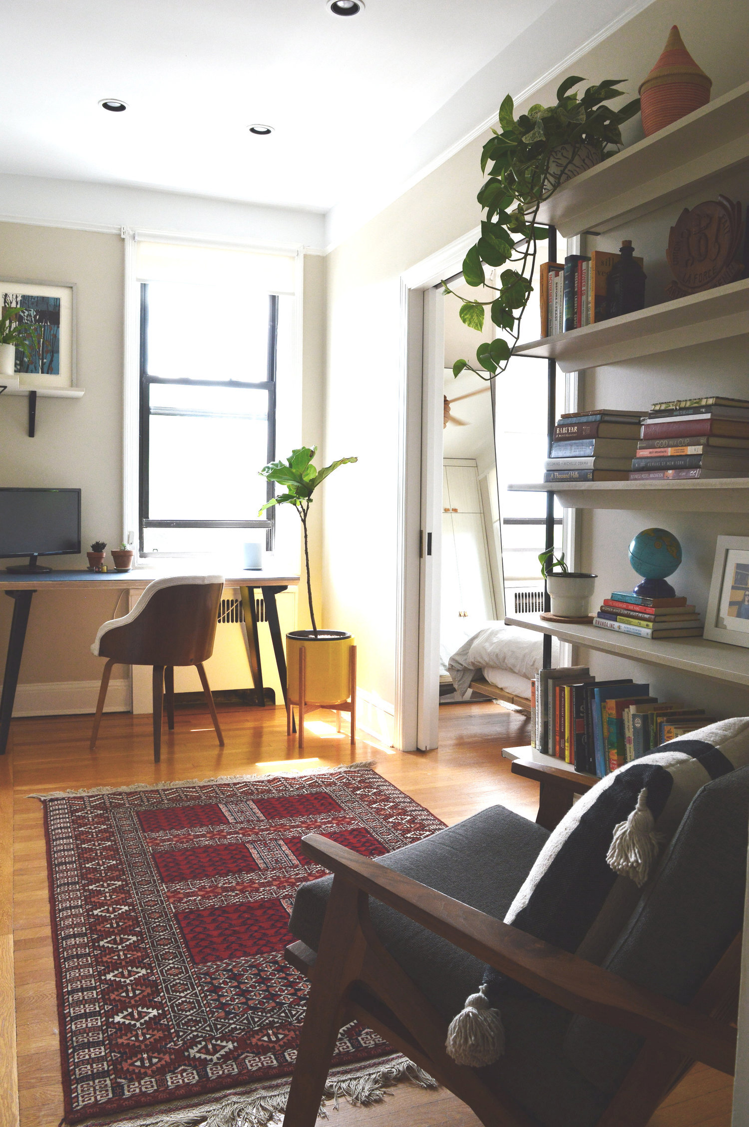
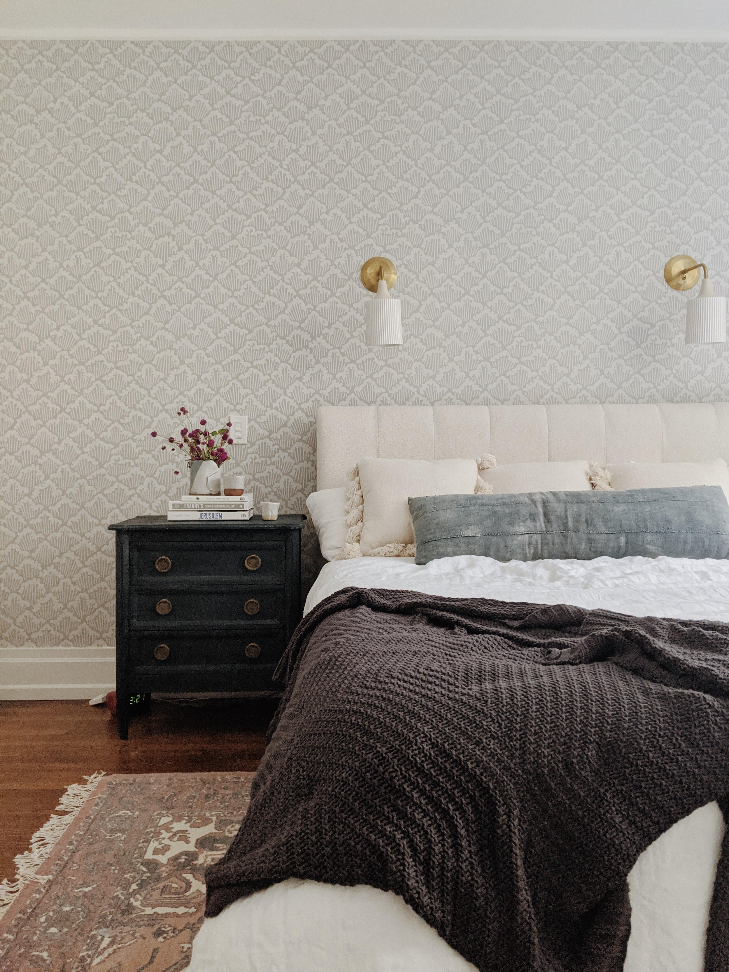
One of my favorite aspects of this project was getting to source from some small businesses I’d had my eye on for a little while. The sconces and overhead fixture by Cedar and Moss really make this room feel special. They were an opportunity to use something a little different from the mainstream. All by themselves these lights fold in that sophisticated vibe we were looking for, but they’re still unique and fun.
Hey, over here, Peggy!

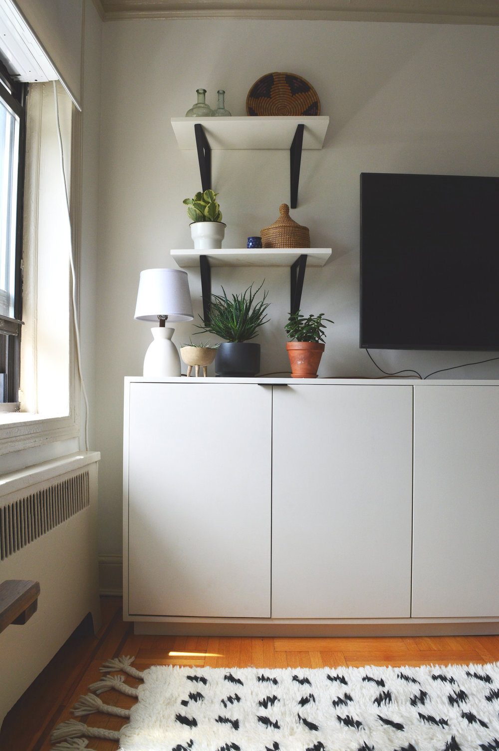
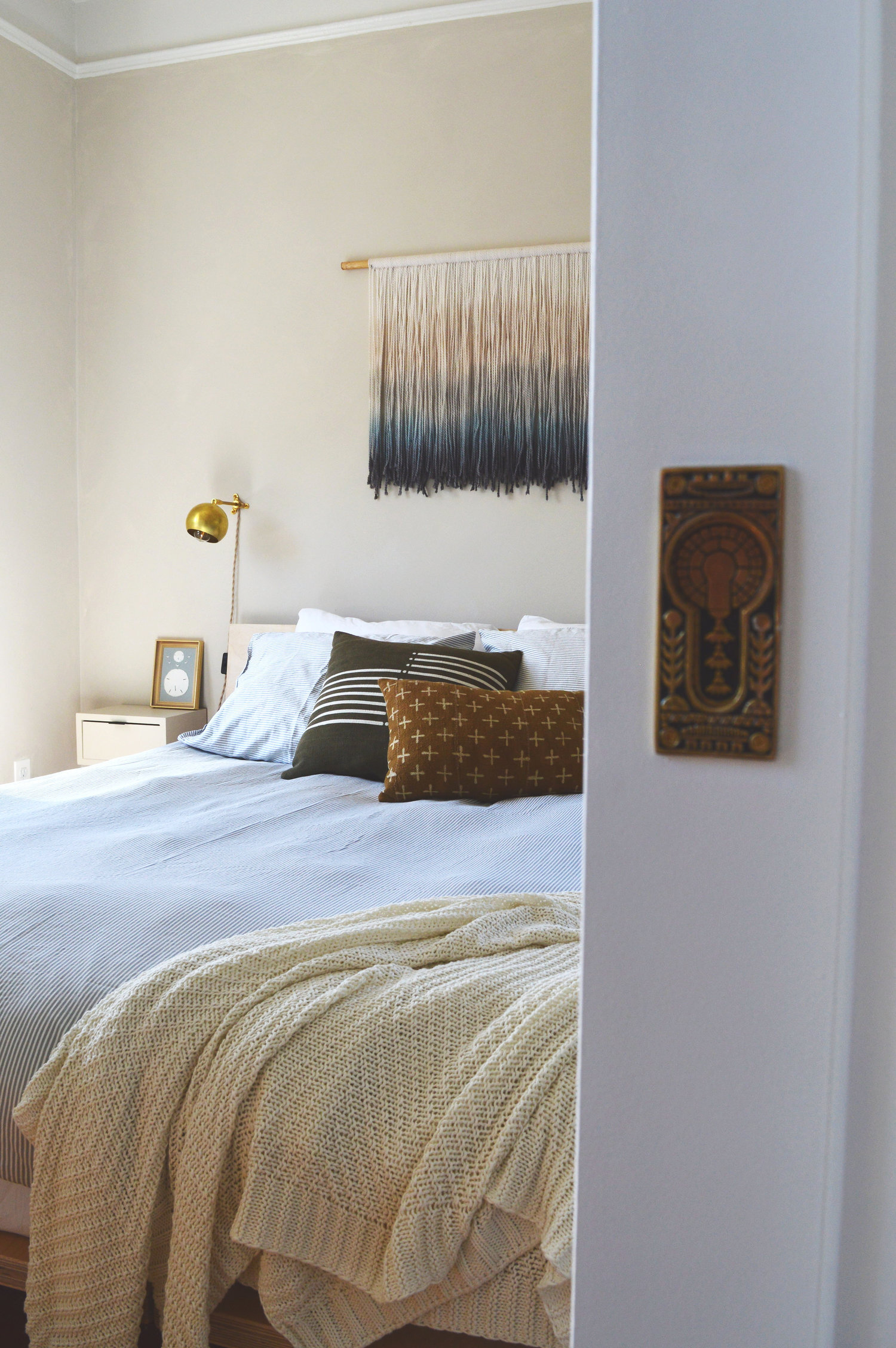
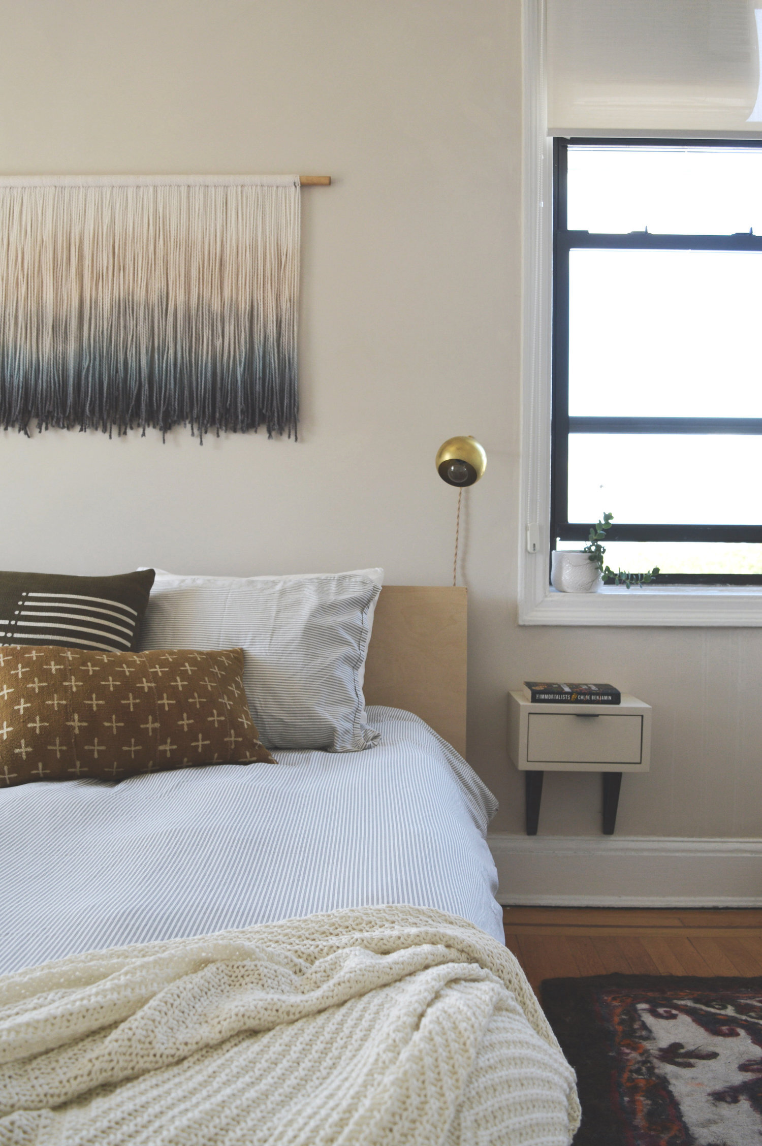
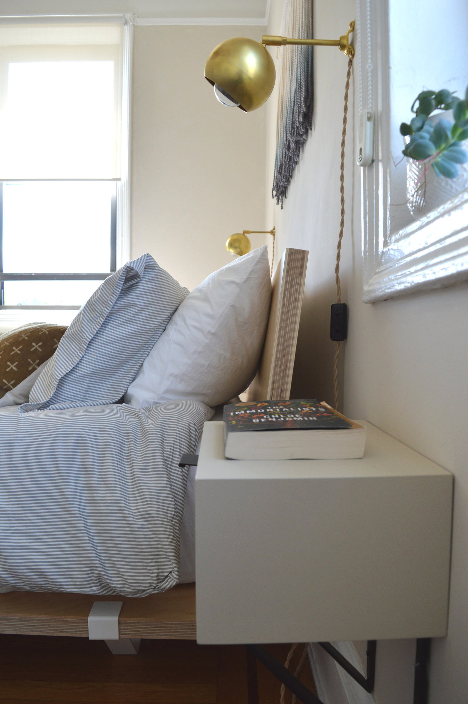
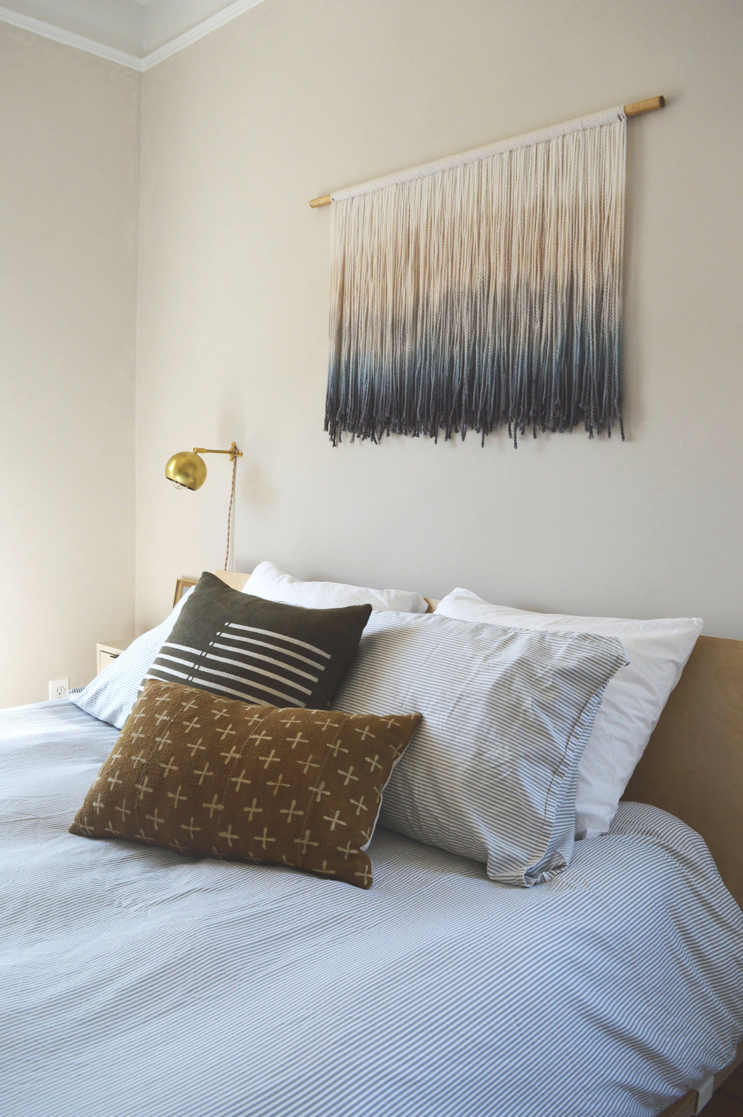
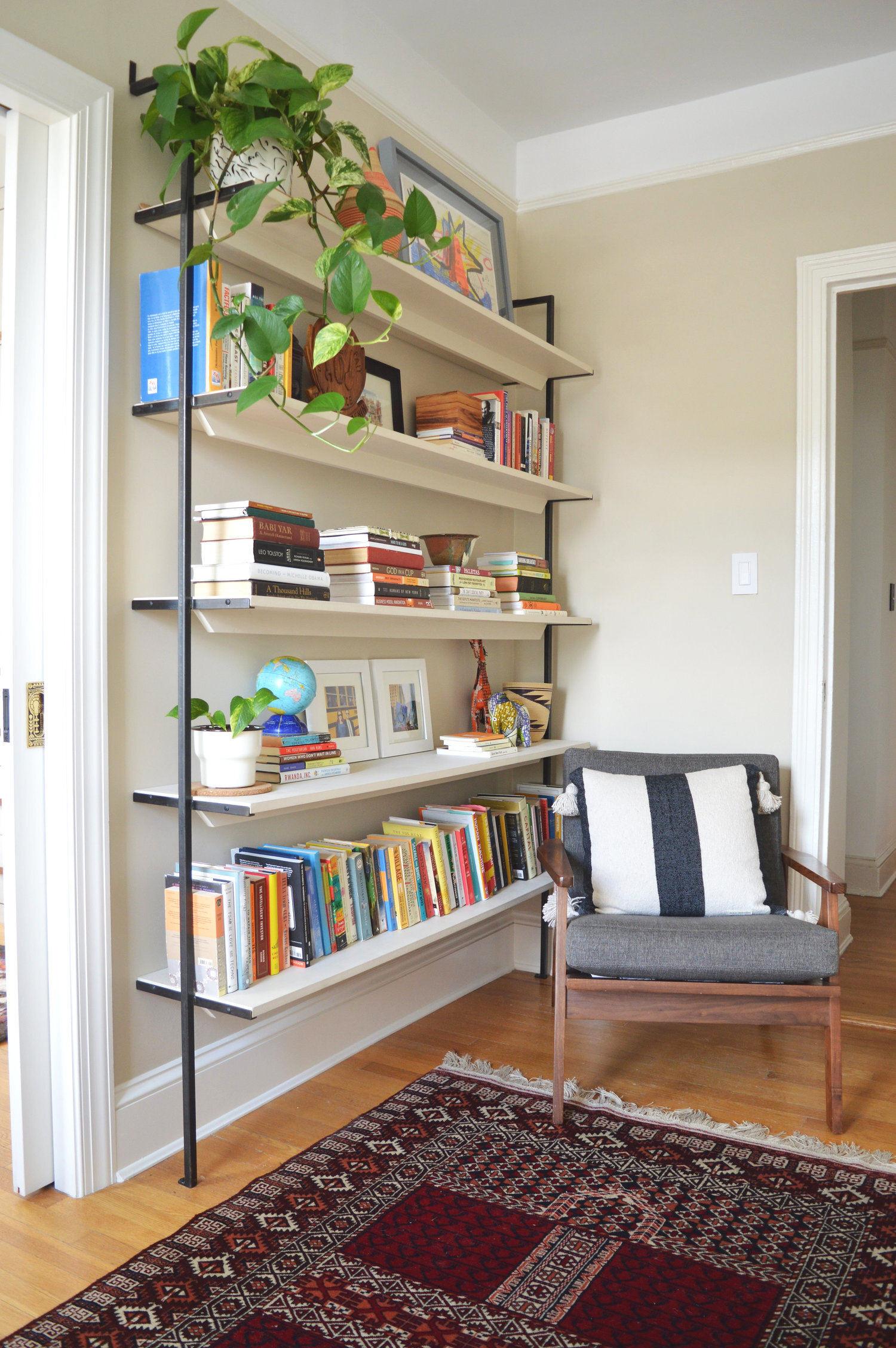
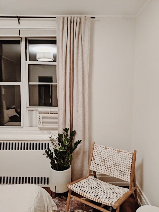
This is such an awesome example of how to make a neutral palette visually interesting. Breaking up a monochromatic palette with varying textures and patterns and elements brings a room to life.
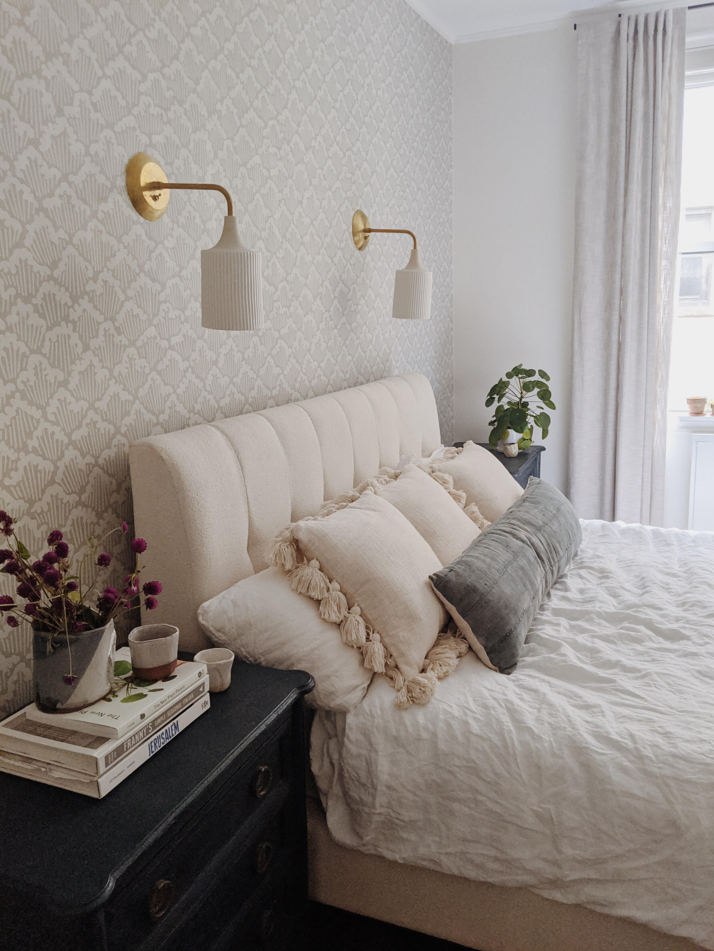
And then adding in a few contrasting elements in deeper, saturated tones grounds the space, and actually helps in making the whole room feel lighter and airier!
The beginning again,

and now.

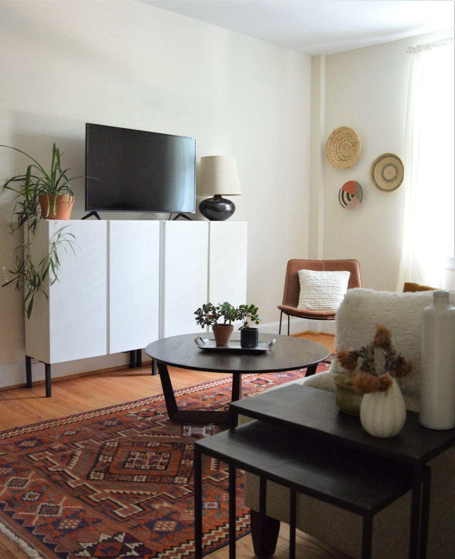
One more time:


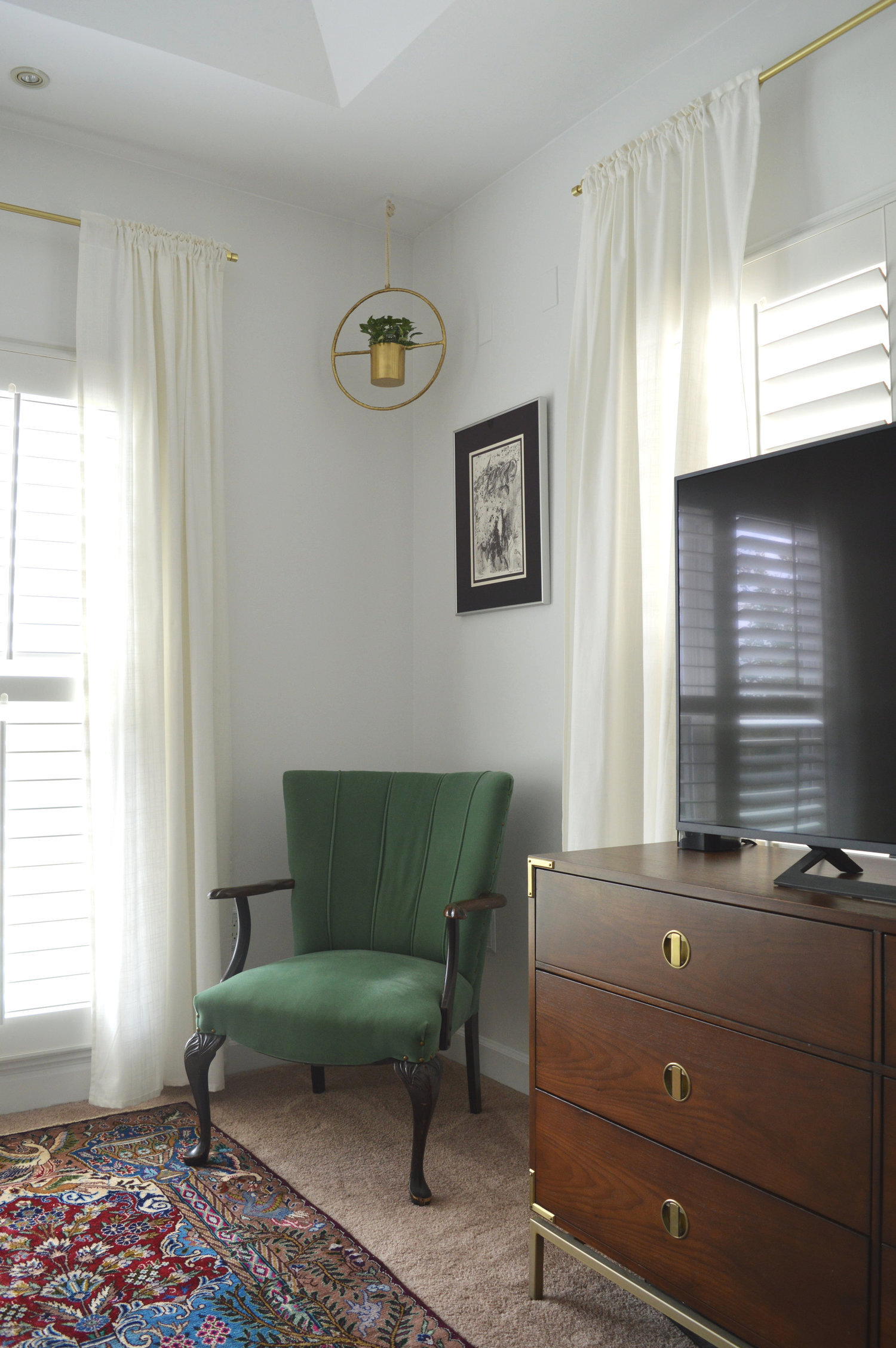
It was important to remember while working on this space that the same person I was designing this room for was the same person that, at one time, liked the lime green - you know that person has a bold aesthetic that doesn’t feel the need to fit in any one style box. While we wiped the green clean, we replaced it with a fun graphic paper that nods to the vibrant personality of the client.

A single statement pillow by my talented friend, Abbie at a. Naber Design pulls together the blues from the nightstands and the rug.


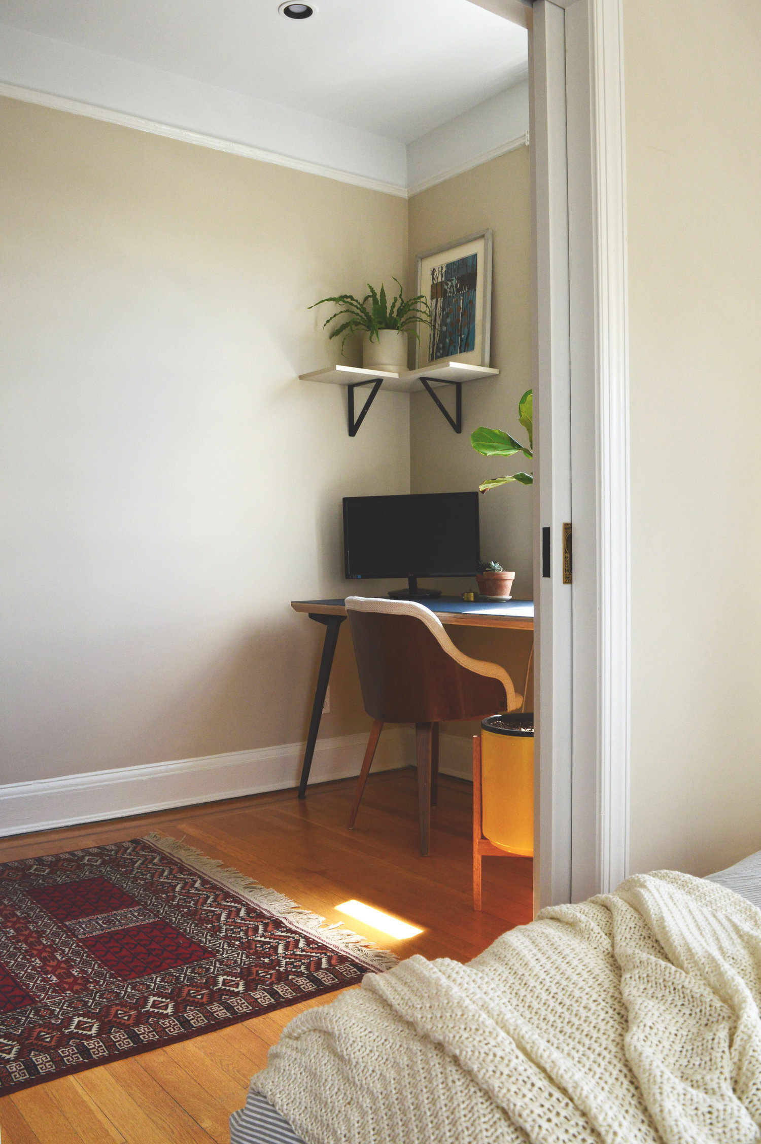
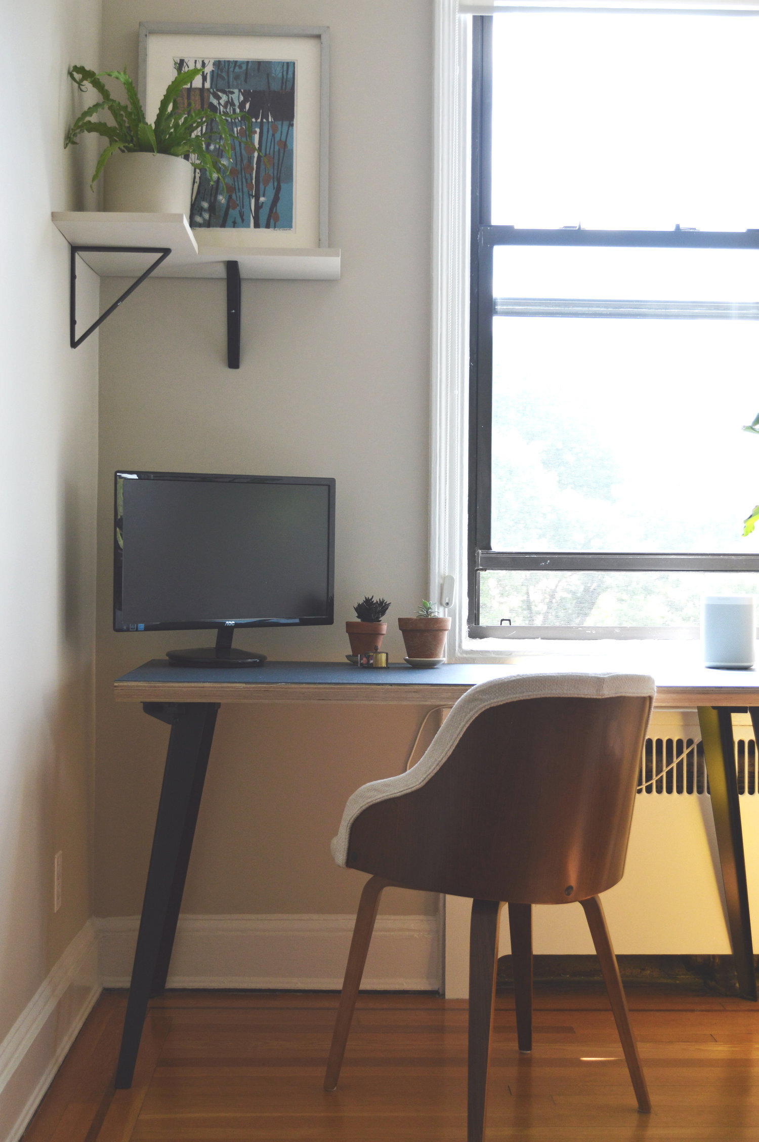
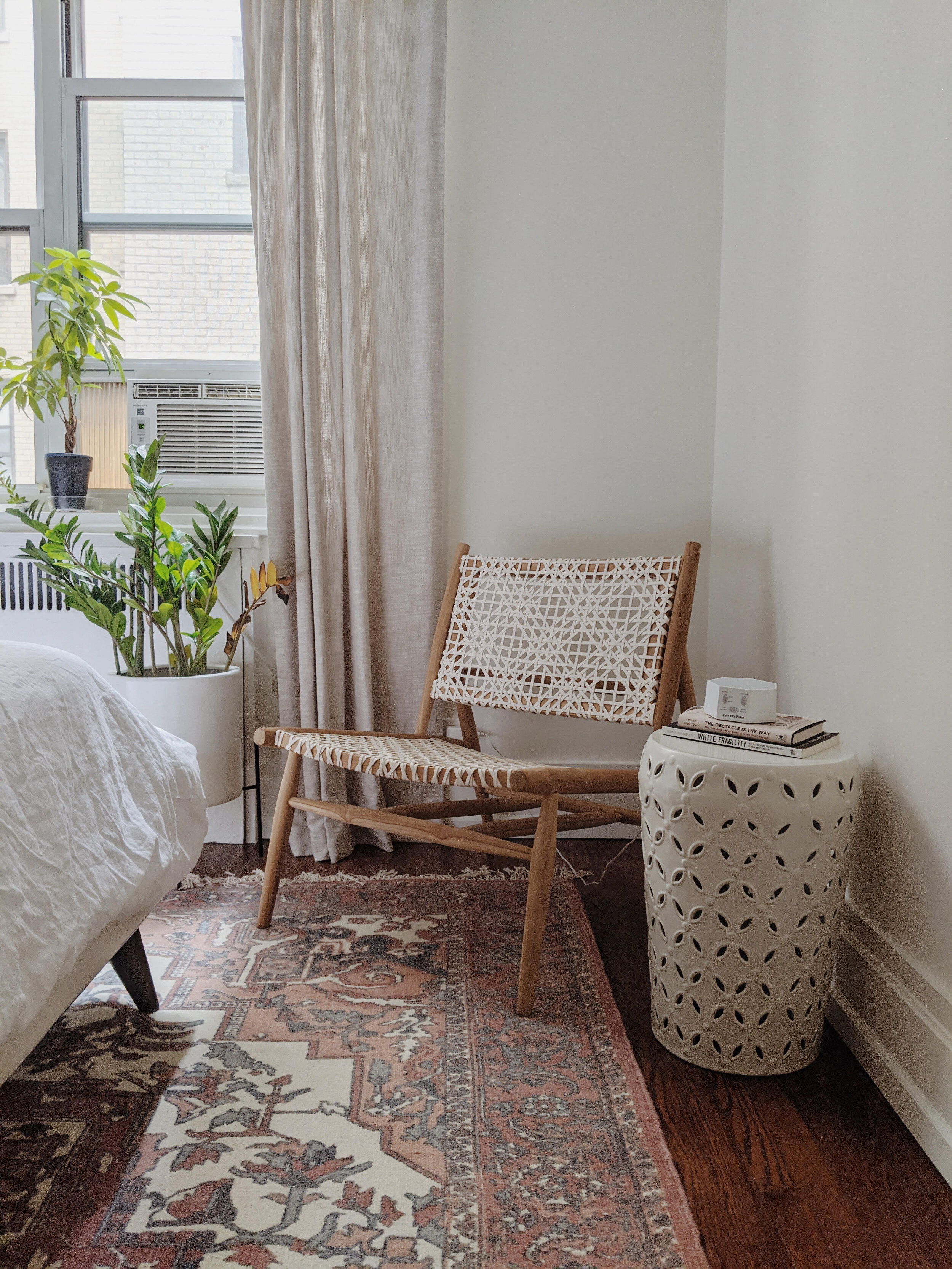
With bedrooms I like to make the bed and bed wall the focal point of the room. Since this client said she didn’t have any use for a dresser, we decided on a chic low lounge chair nestled near the natural light, and called it a day.
That’s a wrap, folks! This is one of my all time favorite bedrooms I’ve had the opportunity to design, and getting to share it with you is all because of the great effort of my client. Sarah, thank you. You are amazing and this was such a treat to work on with you.

Thank you all so much for stopping by today!