Reader Design: Madison's Bold Southwestern Style

When school brought Madison from Arizona to Boston, he took a bit of home with him. The result is a stunning space that is bold, bright, and imaginative and clearly derives its spirit from the Southwest. 

Let's take a look!

Wetter,Madison_StyleMutt_Hallway.JPG
 
Wetter,Madison_StyleMutt_Entryway.JPG
 

Though he tried to resist, the influences of his childhood both followed Madison all the way across the country and followed him through life stages and into adulthood as he put down New England roots and purchased a home with his husband. 

From Madison:

I grew up near Cave Creek, Arizona and a lot of those Southwestern touches have crept into our home. It’s funny because growing up I used to detest homes that were totally blown out in Bonanza. Now I can hardly resist when I go home. I have to stop into some of the local shops and pick up a Zapotec table runner or a piece of Talavera pottery.
Wetter,Madison_StyleMutt_Dining.JPG
We also travel a lot and love to bring home decor items back with us. Because of that we get a little eclectic and global chic thrown into the mix as well. If I had to sum [our home] up in one line I would say it’s Global Southwestern Mid-Century Modern Chic (that’s a mouthful!). Ultimately, we buy the things that speak to us and that give us that visceral response and we find a way to make them work. There’s no other way!
Wetter,Madison_StyleMutt_Living.JPG

Going with your gut is always the best thing to do, right? Everyone in this new world of authenticity - particularly on social media - preaches staying true to yourself.

But what if you're wrestling with what exactly that means? After all, Madison ended up emulating the very styles he thought he hated while living in Arizona. He even in initially struggled with color - not color choices, but how much of it to use in the first place.  

One thing that I wrestled with is color. A lot of people tell you not to go crazy with color because it will impact the resale of your home or that you will get too tired of it. We sort of just went with it and everyone seems to really love it, including ourselves. It’s not like we redid our entire kitchen with red cabinets - paint is so cheap and easy to fix or change or correct.

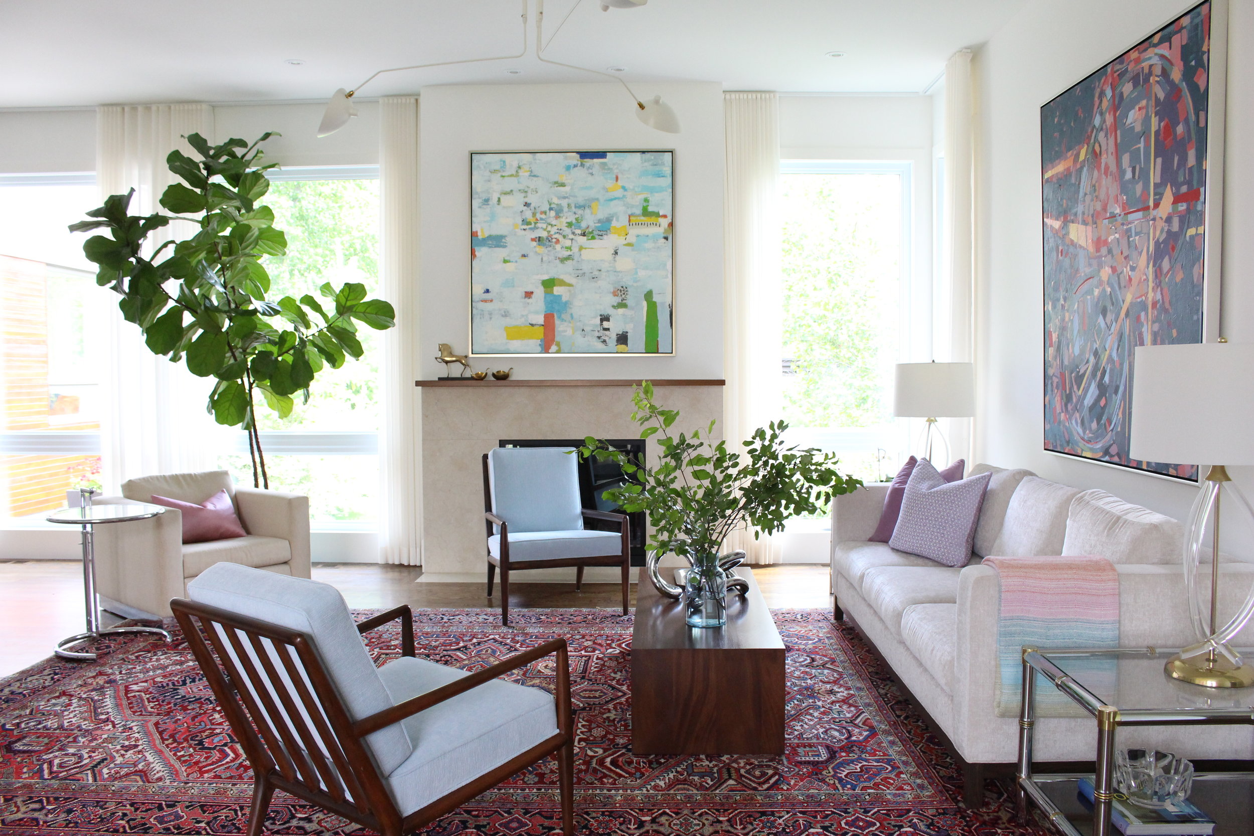
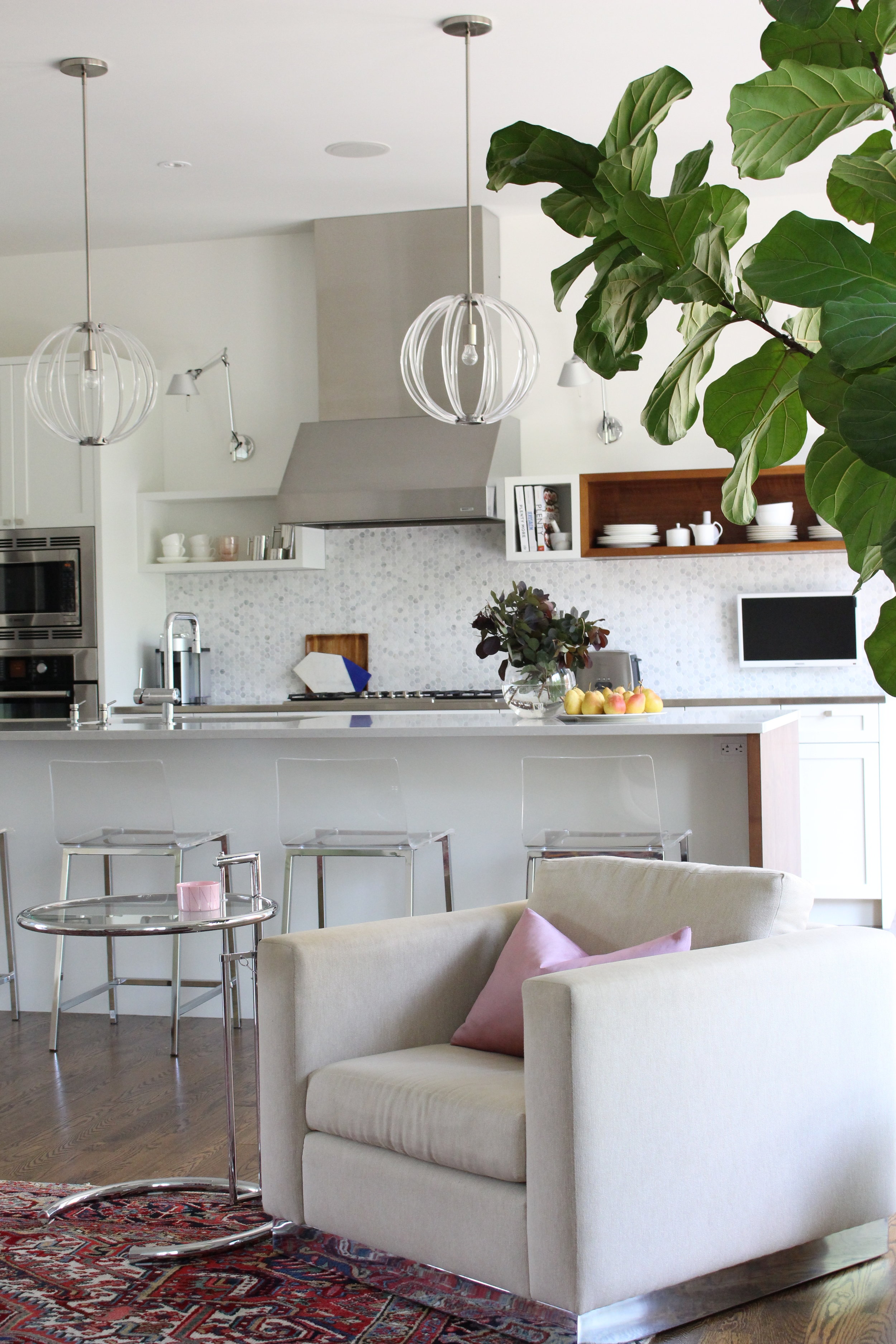
Obviously, color won out in this home. And thank goodness it did! At the end of the day, Madison and Sky wanted their home to be "energetic, interesting and fun" and "be a place that is comfortable and inviting." For them,  color did the trick. 

Wetter,Madison_Office.JPG

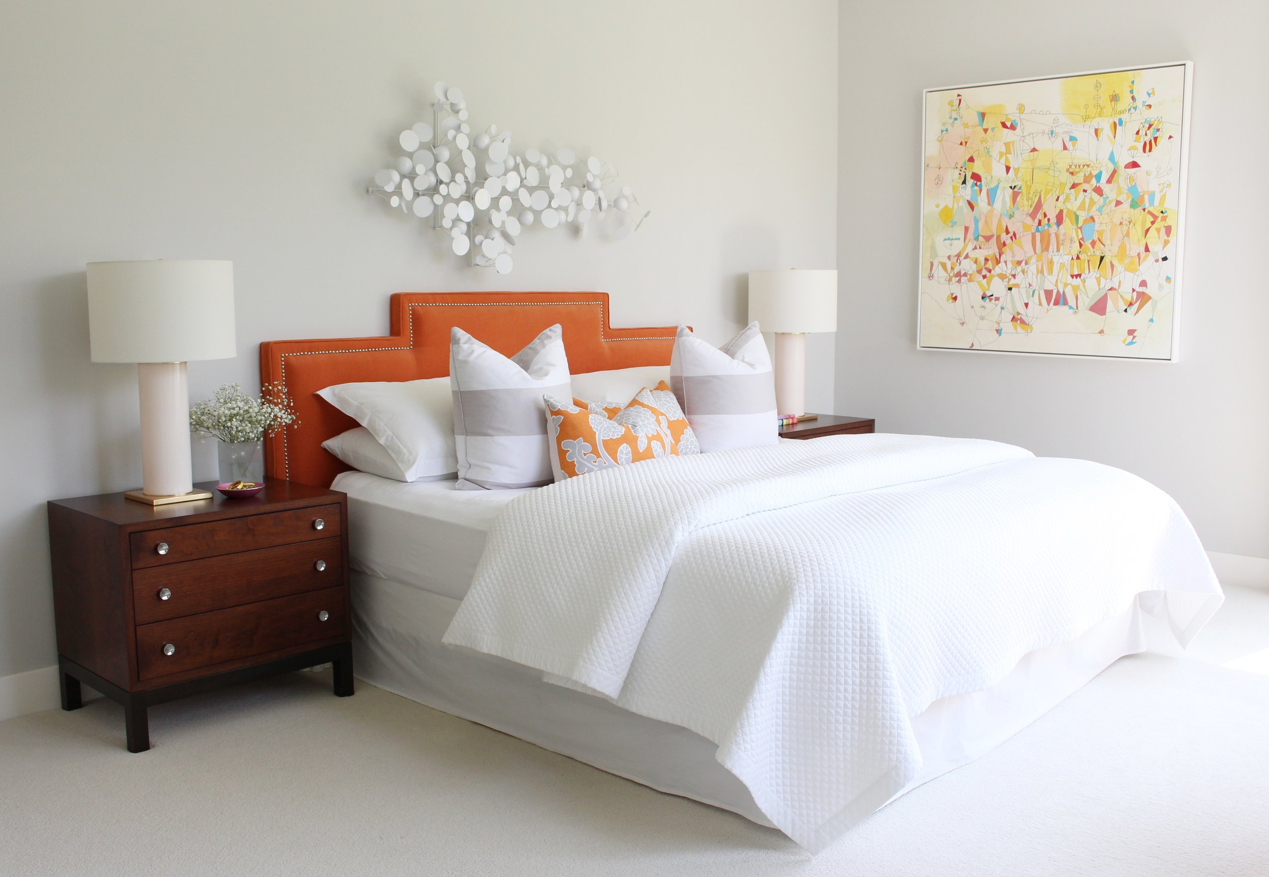
Moving to the bedrooms, the home starts to take on a quieter vibe. 

In our bedroom, we wanted to be a place of tranquility. The room was inspired by a painting my grandmother did in the 70’s with a Native American man in the sky surrounded by Kachina dolls above the Grand Canyon. That picture has always brought me a lot of peace, and I think that’s a good vibe for your bedroom.
Wetter,Madison_StyleMutt_MasterBed.JPG
 
Wetter,Madison_StyleMutt_MasterBed2.JPG
 

The guest bedroom, like its master peer, also has a fun theme. Instead of a family heirloom painting, that theme is..... drumroll please.... 

LLAMAS!

This is our llama/alpaca room - you will find touches of llamas in almost every corner. I love all of them, but my favorite thing is probably the picture of the alpaca on the yellow nightstand. Sky’s mom surprised me one year, and we want to one of the largest alpaca farms in New England. I snapped this picture of one of them and just can’t get over how much personality shows through the image.
Wetter,Madison_StyleMutt_GuestBed.JPG
2017-10-25_16-08-07.jpg

If there's one thing for certain about this home, it's that it has a whole lot of personality. Madison, your home is so, so, so fun, bold, and beautiful. Thank you for inviting us in! 

Follow Madison along on Instagram @mvwetter for more! 

McKenna Sig.jpg

Reader Design: Tatiana's Bright Space

Can you all believe that it is already August!? Back to school commercials started this week, and I just cannot believe that the summer is coming to an end. I haven't even seen the beach yet!

But alas, that's the reality. So while we can, we are bringing some color into your lives. Today, we're visiting Tatiana in Ottawa, Ontario.

Tatiana keeps this home for her family of four interesting by never being "done" with decorating; after all, that wouldn't be any fun, would it? She describes her style as modern classic with vintage and colorful twists. 

While I do incorporate pieces from big box stores, I am an avid vintage treasure and flea-market hunter. There is nothing more satisfying than finding an interesting vintage piece, putting it in the right context, and making it shine.
The overarching goal is to make my home feel bright and happy.

All that color is definitely representative of bright, sunshiney summer and helps make those Canadian winters just a little easier. 

In Tatiana's home, two things are the stars: her abstract art collection and her textiles. Her favorite pieces are prominently featured in the living room and are complicated perfectly by the neutral simplicity of the kitchen. 

My favorite pieces in my living room are the large mid-century abstract painting by Sinai Waxman that currently sits above the sofa and the Persian rug. With two children at home, the rug works beautifully! Both pieces have a rich palette and provide an invitation to play with different color schemes in the space.


The winner in the bedroom is the orange headboard. There's something about orange tones that is just so comforting and welcoming. It's not for everyone, but it works for Tatiana. And that's a good thing, because Tatiana and her husband custom-made this for their space! 

For a long time I was looking for a vibrant headboard, but all I could find was upholstered in neutral fabrics. Left to my own devices, my husband and I constructed this nice looking headboard out of a piece of plywood and covered it in juicy orange velvet.

What a fun home this would be to shop in - to change the art around, move things to new places, and shift pieces until your heart's content. Tatiana, thank you for letting us in today. 

Follow Tatiana along on Instagram @tatiana.wojtan.studio. 

My Bold Hues ||Week 2||

Man alive!  It has been a real treat to peruse the #MyBoldHues feed on Instagram and drink in all the color-filled DIY and décor goodness.  My co-hosts  Blue I StyleCopper Dot Interiors, Domicile37Mila Jest CafePMQ for Two, Semigloss Design, and I started this hashtag to celebrate our common love of ALL. THE. COLORS.  Each month, it is our privilege to share some of our favorite on our blogs and this month's roundup is a doozy.

Pati @patirobins has made me fall in love with black walls.  Seriously.  I've never realized just how much colors can POP against the dark void of color.  All of the photos on her feed are moody and fun and totally worth a follow.

Fun fact.  I love CHARTREUSE.  And Nikki's @collectedhome green walls are singin' my SONG ya'll!  It's split-pea nature is the perfect nod to her retro "mod pod" as she calls it and the perfect background to the graphic artwork.

Maggie's @maggieoverbystudios eye for style has always blown me away.  And this mantle is no exception.  I can't decide what I like most about this mantle: the art, the paint job, or THOSE CANDLESTICKS.  Ok.  It might be the candlesticks...

And I can't help but end on Mary's @thisthriftedabode styled peg rack.  A soft color pallet can still be bold people!  And these muted colors against the white wall read so calming with a generous helping of cheery.

Thank you all for sharing your colorful slice of home with us.  Please keep tagging your pics to be included in next month's feature and don't forget to check out my co-hosts for their features:
Blue  I Style
Copper Dot Interiors
Domicile37
Mila Jest Cafe
PMQ for Two
Semigloss Design