Meet StyleMutt Home's NEW Design Assistant!

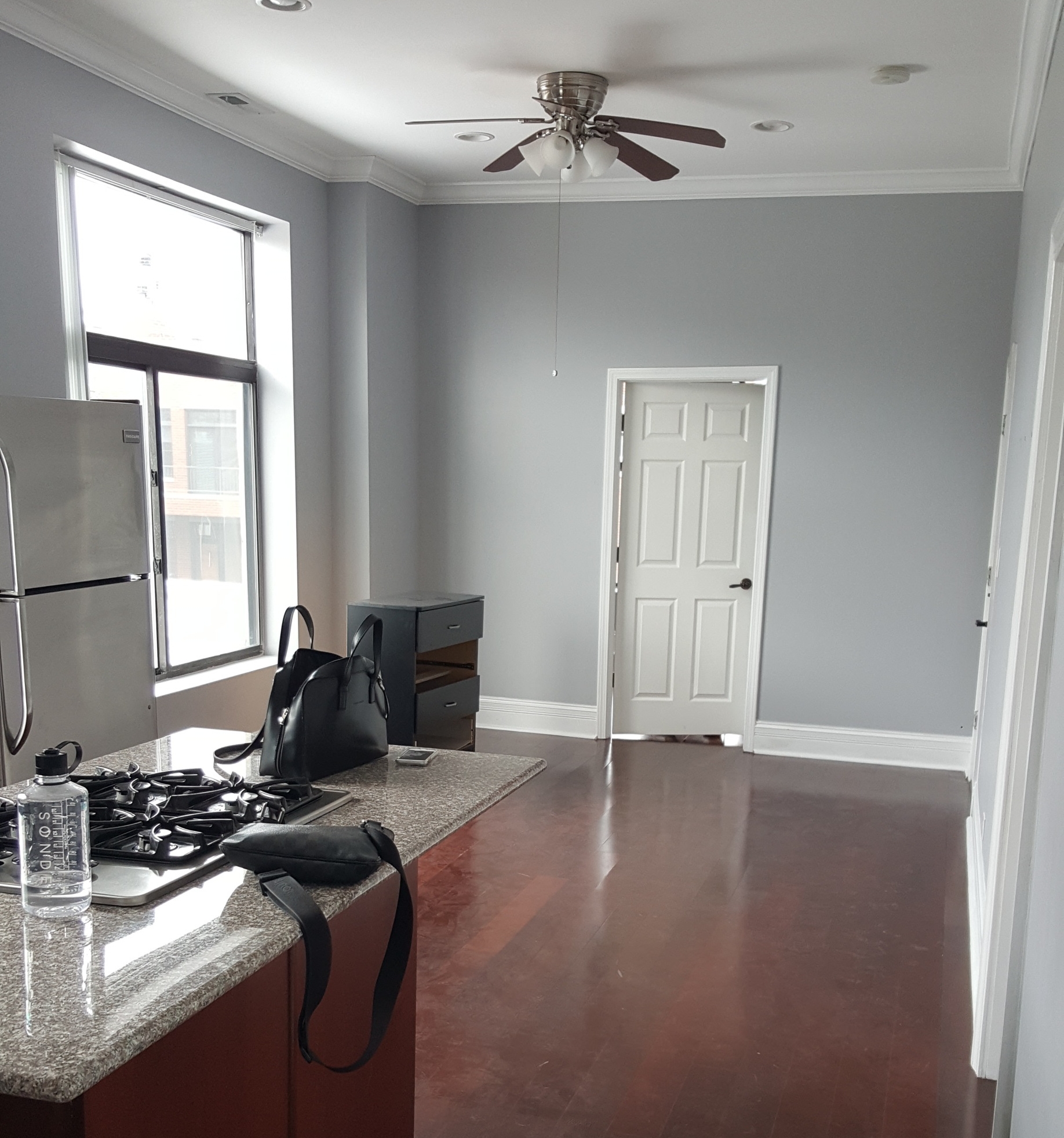
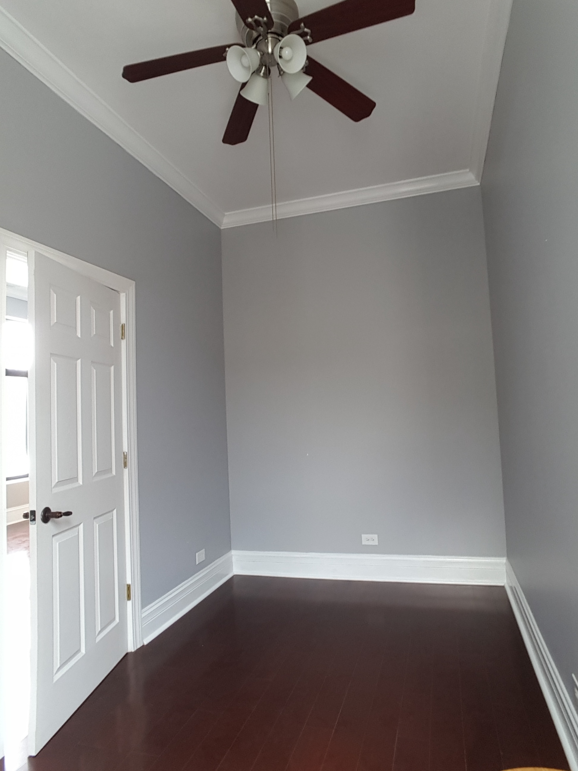
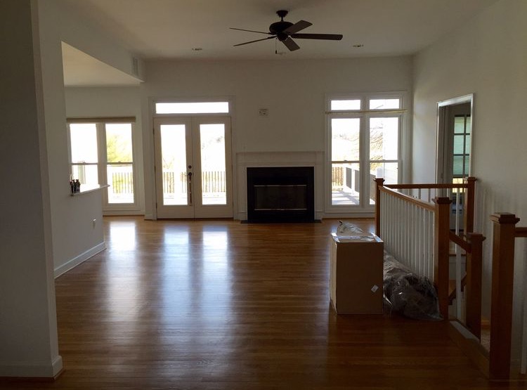
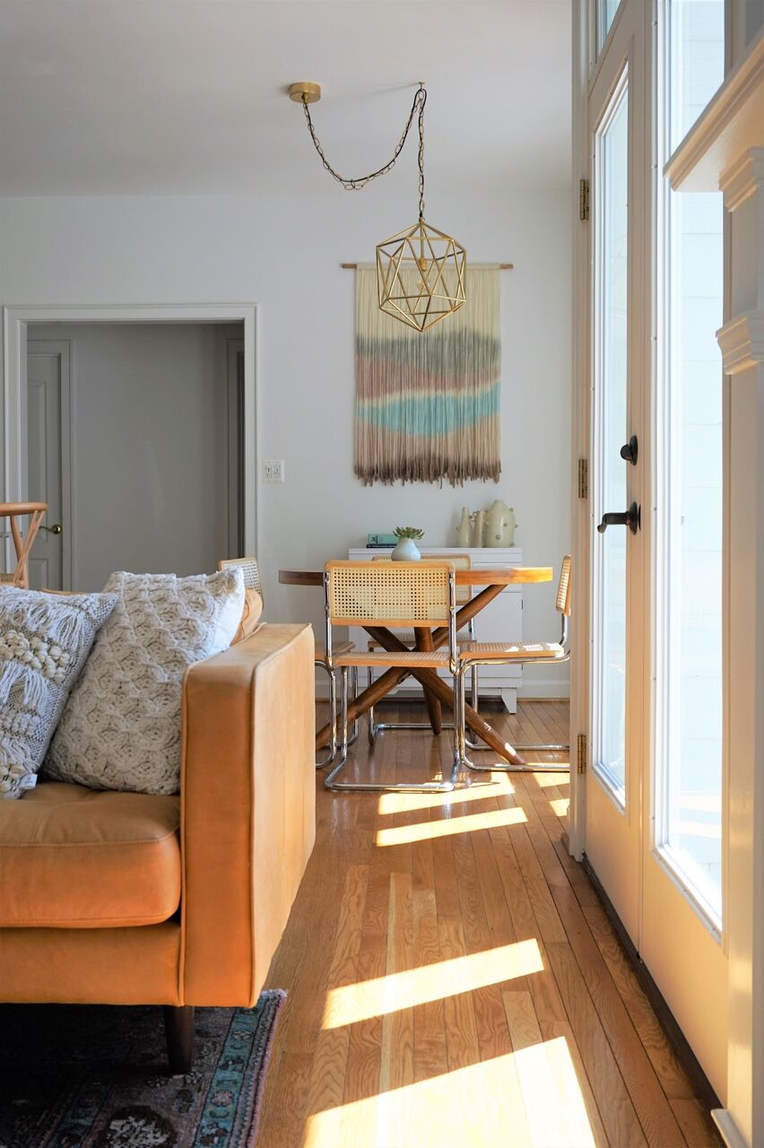
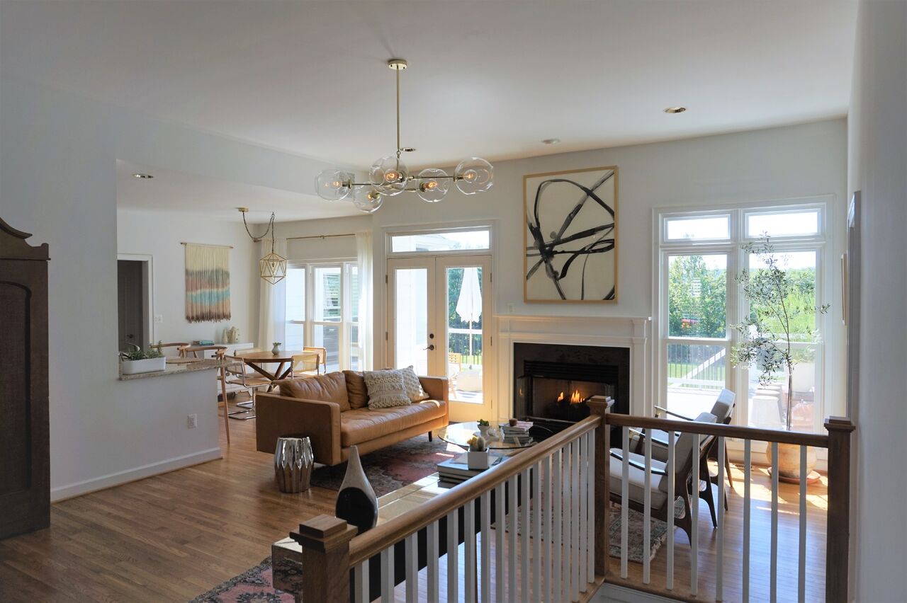
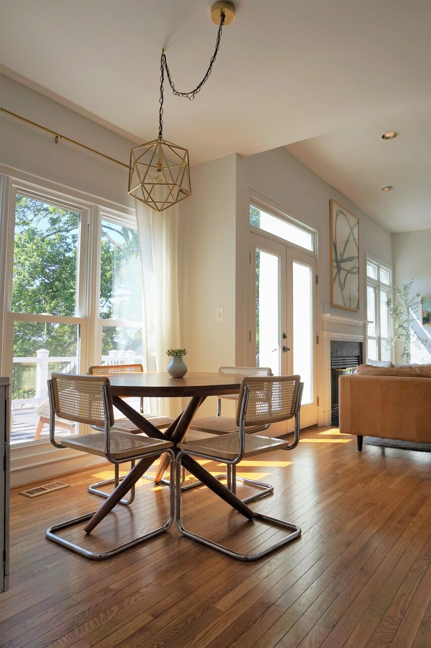
Hi Friends! We are THRILLED to introduce you to StyleMutt Home's newest team member, Joy Lewis! When we started the process of bringing on a design assistant to our team, we were completely humbled by the response. The turn out of passion and talent far exceeded our expectations, but we just kept coming back to Joy through each phase of the process. After meeting her it was the feeling I needed to have; total peace. She is someone that makes this growing process feel like the most natural thing in the world and she has already slid right in and taken on her first job, (with our first Australian client, nonetheless)!

It's such a delight to celebrate bringing Joy on our team with you today!

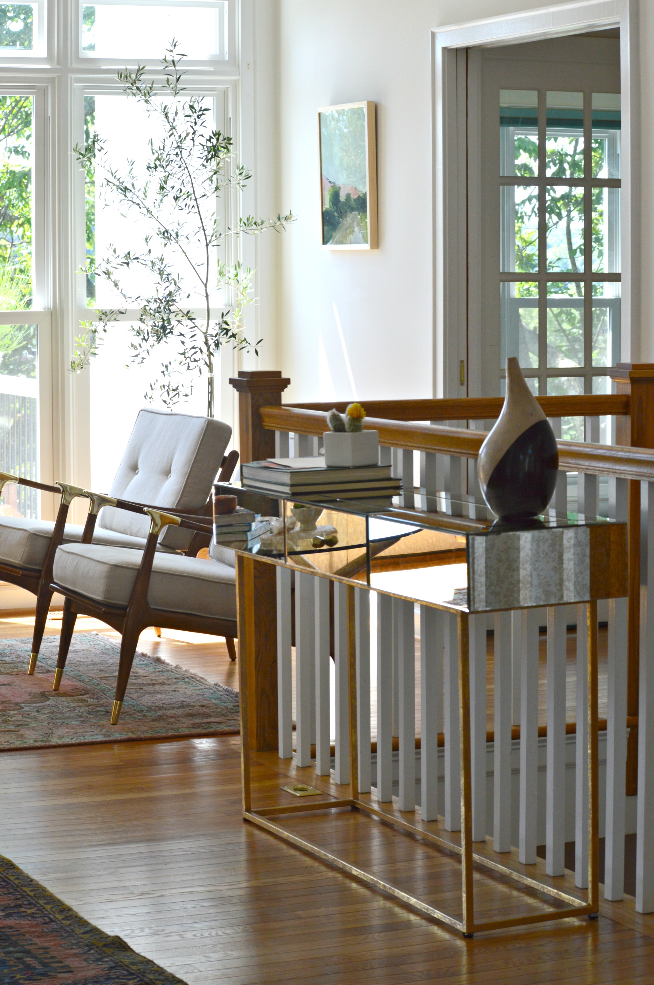
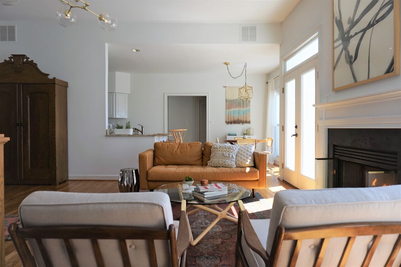
Joy has an impressive portfolio of projects under her belt that includes both her own home as well as corporate and private clients. We thought it might be a fun way of getting to know her better if we shared a few snippets of her past work!

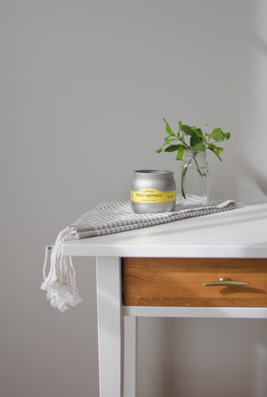
Joy has the impressive skill of refinishing furniture to suit the style of the project at hand - this sweet storage cabinet was refinished by her hand and we are just smitten with her attention to detail, from color choice to the styling!

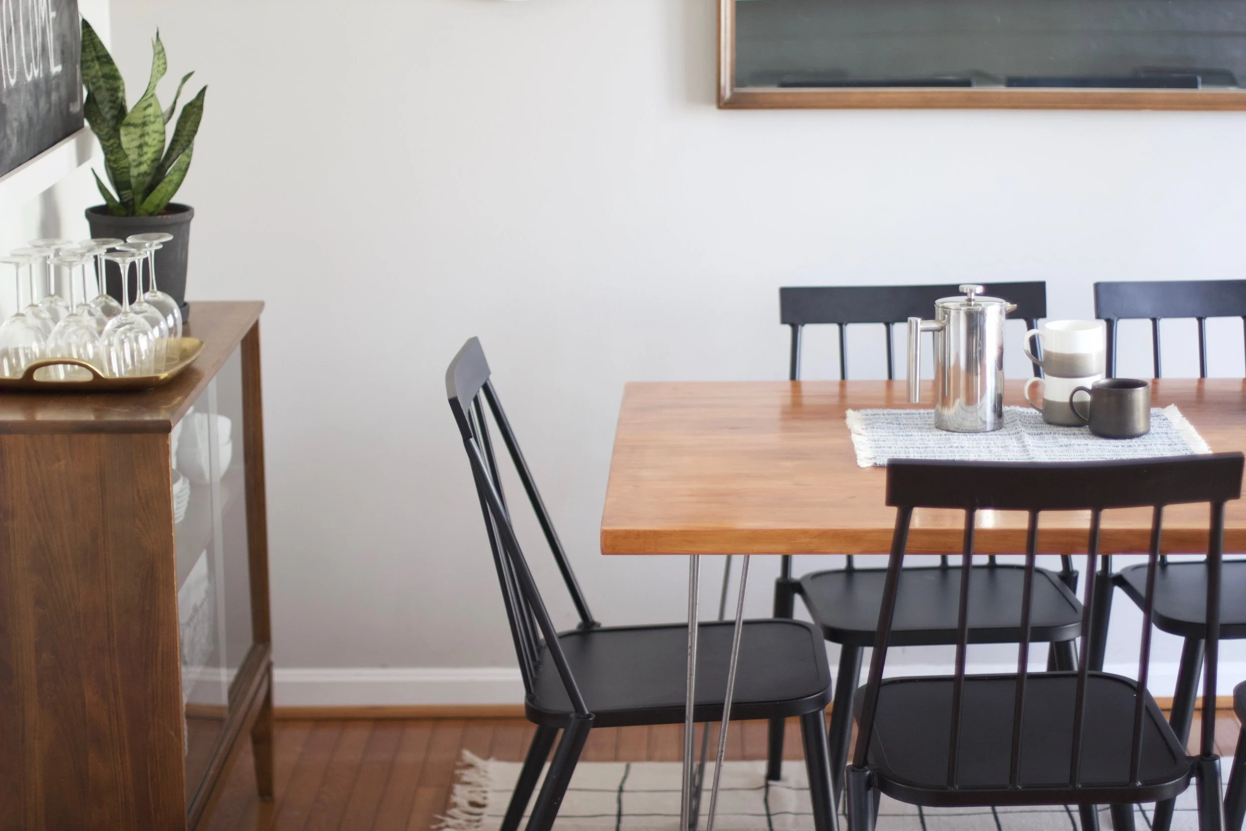
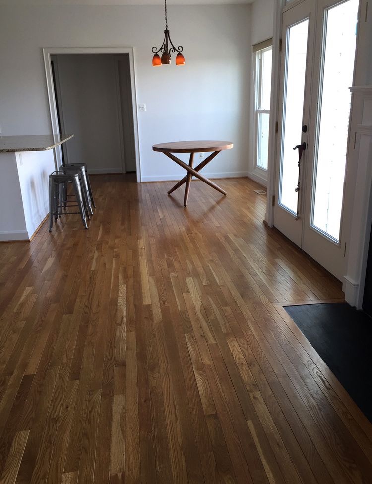
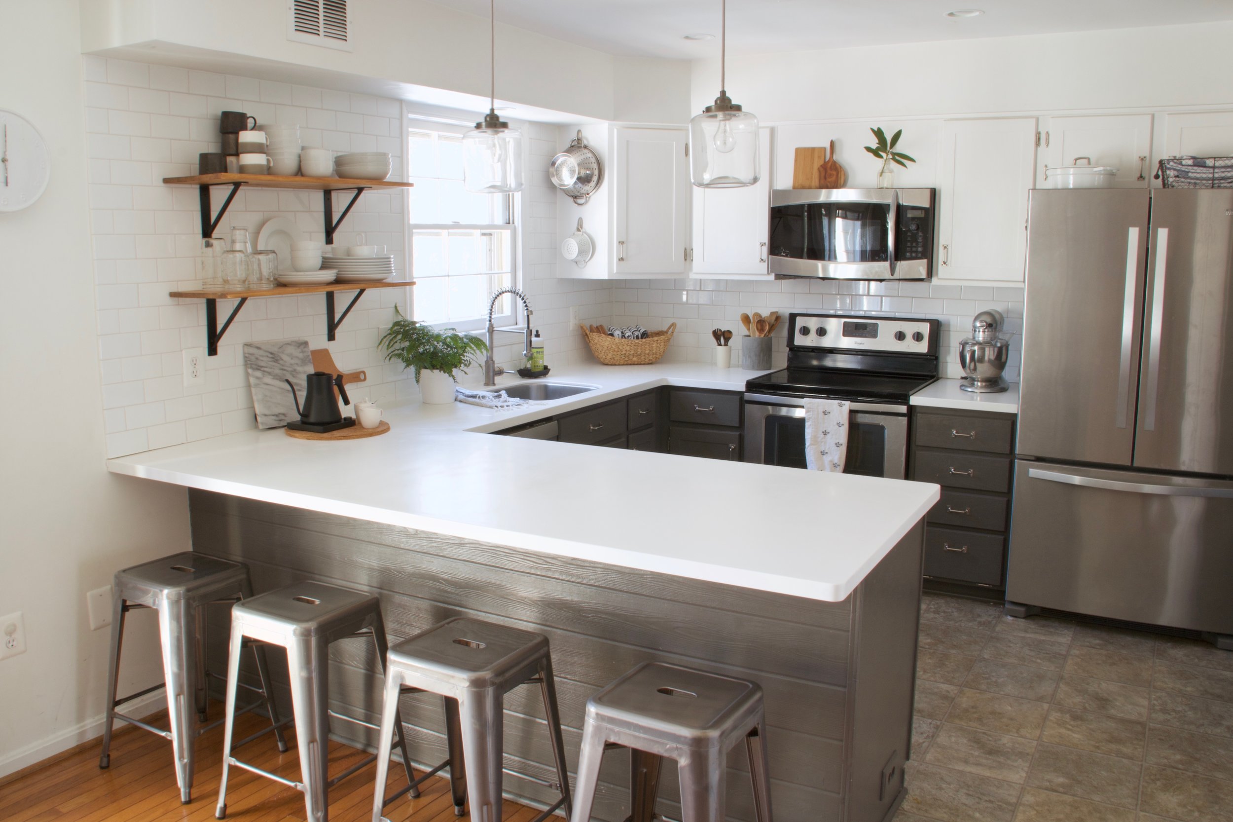
Joy and her husband tackled their own kitchen renovation recently and turned it into a functional, family friendly space that still maintains the character of their home.

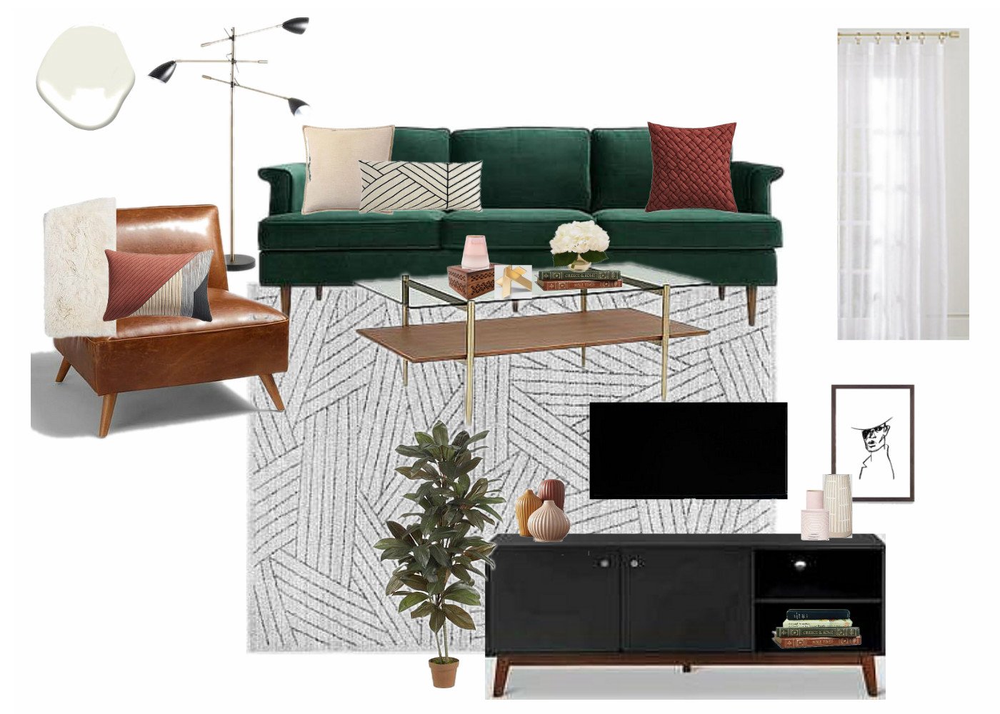
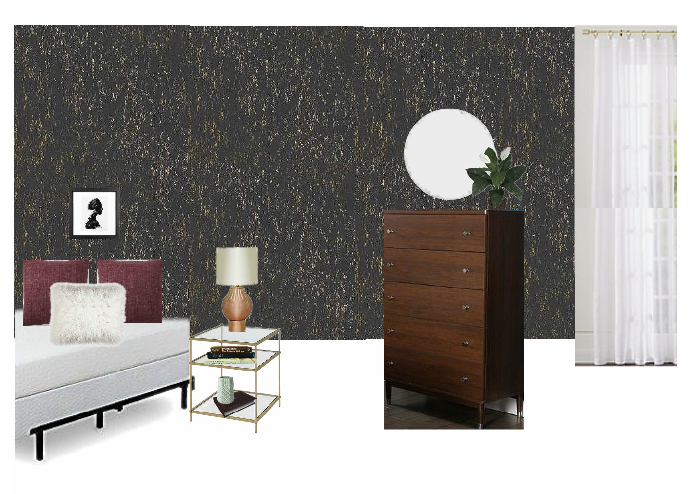
The following are just a couple furniture makeover projects Joy has done. Isn't that ottoman the sweetest?!

Intro 2.jpg
Intro 1.jpg

Please join us in welcoming Joy to the StyleMutt Home team! We couldn't be more excited to have this sweet and talented lady on board with us. She truly is an answered prayer and the way she's jumped right in and gotten down to work in the brief time since she's started has already blessed our business in various ways.

We look forward to sharing the work that Joy is doing for StyleMutt Home as her projects progress! If you would like to see more of her previous work we invite you to head over to her site, Joy Lewis Design!

Thank you all so much for coming by!

joint.jpg

Reveal: Eclectic Equine Condo

Hello, hello! It's good to be back here with you for another eDesign reveal! If you're newer around these parts of the great World Wide Web, first off, welcome! So glad you're here! I'm Chelsea and peeled off from doing furniture refinishing about 2 years ago to focus on the design branch of StyleMutt Home. It's been a really exciting challenge to learn how to do design work, (primarily eDesign), and navigate where the specific skills can be used. Although we have been blessed with a full load of individual clients this year,  I accepted and began a freelance design job over the summer with a corporate company who is similar to Airbnb. They're purchasing condos in major cities around the US and Canada and making them available to travelers as home-away-from-home stay places. But between their purchase and that first lease, there is a lot of work to do on these condos! My job is the design, (i.e. the fun part)! The work is very fast paced and often unpredictable. I design these spaces from the comfort of my own home, never stepping foot inside the physical space.  I never know what information they'll be able to supply me with on a unit before I get started on the design. Many times they give me a floorplan with measurements and that's it. If I'm lucky I get pictures, and maybe even a video tour! Regardless of what info I'm given for a space, they require all the details that make up a complete eDesign in a day or two. It's a lot of fast research, drawing, note taking and, <gulp> math, but the exciting part is having the creative freedom to design the spaces how I wish. The company always gives me a style direction, (industrial, old world, California cool, etc), but from there I can run with it.

The space I'm sharing today is in Chicago and came with all the lovely before photos a girl could ask for. It is a 2 bedroom condo with a comfortable living space complete with a full kitchen. When I saw the before photos the space just looked tired. The blue-gray walls just made the it all look kind of 'blah'; especially the kitchen. There is absolutely nothing modern or industrial about the architecture here like in many of the other spaces I have designed for this company, so my desire was simply to freshen it up and make it cozy. In my short experience with design thus far I have learned that the most successful designs are a natural extension of the space. Since this space is already very traditional, I stuck to fairly classic pieces that read traditional with a modern twist. When I first showed Cate her remark was how very equestrian it felt with the dark moody colors, rich velvets and warm leather. So I'm calling this the Equine Condo! Lol!

Let's take a look!

LIVING ROOM

Below is a before picture of the living room paired with my design plan:

BEDROOM 1

I'm telling you, it's so hard to design rooms without the current season on your brain. I worked on this space right as the days were turning crisp and pumpkins were being displayed on doorsteps. Can you tell?! I went all out cozy. It's a rather large bedroom and I just wanted to make it feel inviting, quiet, and relaxing. It's like a big green cave and I just love it.

finished 26.png

BEDROOM 2

They said a bed couldn't be done. They said a dresser could never fit. Literally - I actually (accidentally) stumbled onto other designers' notes on this room. The client deeply desired this space to be a second bedroom, and with an en-suite bathroom it surely made sense.  I studied that floorplan and researched beds. I knew if the measurements were right that a full bed mattress would absolutely be doable. A bedframe, maybe not. So I found an adjustable bedframe that could be pulled inward a few inches if need be but still support the full size mattress. And with the bed nestled cozy in the corner there was more than enough space for a modest tallboy dresser with a small footprint. I'm not usually one to sit and work on puzzles, but I thoroughly enjoyed figuring out how to fit the pieces together comfortably in this room!

And how about that wallpaper?! Target has a gorgeous line of peel-and-stick that is ~$30 for 27.5 sq ft! That's a lot of impact for a tiny bit of $! I'm still fairly weary of using wallpaper, but I'm so pleased with how it turned out in this space. It's the perfect tiny room for it.

KITCHEN

I admit I wasn't thrilled with these cherry cabinets and cherry floor - it was a lot of red wood, hurt my eyes. Hah! But once again I am floored by the magic of a fresh coat of paint. My design for this space included painting the entire main living space in Swiss Coffee by Benjamin Moore and it absolutely wakes this space up. With all the red wood, the stools may seem an odd choice. I totally get it; why add even more red toned wood? Well, for one thing I didn't want any statements in the kitchen. I was adding a lot of contrast to the living room right next to it and wanted the kitchen to just be easy on the eyes, nothing sticking out. Secondly, although the red toned wood itself is not my favorite, keeping it all the same gives this space a slight modern feel. It's monochromatic which I love.

That's a wrap! I hope you enjoyed looking around - I sure am grateful to you for coming by!

Chelesa.jpg

eDesign Reveal: Dani Barbe's Great Room

Hi friends! We hope you are all enjoying your Summer, wherever that may be! We've been so ridiculously excited to share one of our favorite eDesign projects so far that we picked up in the early Spring and recently finished. Today we are sharing part 1 of our amazing client, Dani Barbe's, home. This sweet lady contacted us with excitement, motivation and a completely open mind - all the makings for a wonderful eDesign adventure for us all! She is a self-made jewelry designer, (she has a collection in Anthropologie!), and to work with someone who inspires us so much has been such a gift. First up is her Great Room and Breakfast Nook, with more to come from her country side home in Frederick, MD shared with her fiance and their 'Lonny' - the most adorable french bulldog to walk this earth.

If you'd like to look back at our design boards and 3D renderings of this space before you see the entire finished product below, you can check out this post! Otherwise, come on in!

BEFORE

Fairly early on we settled into a less stuff-better stuff mentality all around. It's not overly filled but every piece was selected through thoughtful consideration of the grandeur of the room. Although the space is grand, indeed, Dani and her fiance are quite laid back and desired a space that was comfortable and easy to entertain young and old alike.

The light in this space was really inspirational in the design process and when we were faced with tough decisions, we ultimately focused on the natural glow of the space and what pieces would enhance that! Pastel colors came into play from the beginning, with mixed dark and light wood tones peppered throughout.

Both the area rug and runner for this space were ebay scores that we were definitely throwing virtual fist bumps over. Lol!

The entry way is balanced by an antiqued mirrored and brass console as well as an epic antique Craigslist find, (keep scrolling). Mixing in these unique old, (or old looking), pieces into the space, along with the vintage rugs, gives the modern bright white space some necessary grounding and storied character.

25.jpg

Ah-ha! Here is our extraordinary Craigslist find. I've truly never seen anything like this and admit I found and saved this piece in my phone before any aspect of the design even begun! I remember quickly creating a hypothetical design around this piece so I could share it with them and they could snatch it up before it was too late!!

As it goes with every design job, there are always a couple hurdles to overcome. The area rug turned out to be a bit smaller than what the seller had listed, so in order to fill a bit of awkward empty space on the side of the sofa where the sofa should have reached, we added an inexpensive mirrored accent table from Urban Outfitters. It balances the mirrored console beautifully and adds a touch of reflection to the darker side of the sofa!

On to the dining nook! Serious confession; I've been waiting for just the right opportunity to use a custom made fiber piece from Designs by Filia, who's work I've been following for a while. I don't know how she does what she does, but she's amazing at doing it! When we selected just the right furniture pieces for this spac and the light fixture, it just needed one final statement. Since we decided to forgo a rug in here, I really wanted to bring a touch of color and texture up the wall - and our opportunity was born! We worked closely with Filia to pick just the right colors for this space and she just knocked it out of the park! As I mentioned earlier, our focus was to maintain the natural glow of this entire space, and this piece does that so well.

When we mentioned that a tree of some sort would be ideal in this far corner, Dani mentioned that she had her eye on an olive tree. Little did we know what a green thumb she had - when we arrived to shoot this space we got to see all the olives on this thriving tree of hers!

Minted art for the win, folks. The black and white watercolor over the mantle is Minted as well!

Two of our most clutch finds were a StyleMutt Home team effort - McKenna nailed the art for over the mantle and Cate hit it out of the park with this light fixture found in Etsy shop, Intermountain Lights.

That's it for now! As you head out you'll notice this gorgeousbrass vortex fixture that gives the entry way all the attention it needs!

Speaking of attention, Lonny would love to say hello before you go.

Thank you all for walking through our latest project with us! This one was pure joy for us to work on and we thoroughly enjoy getting to share it with you friends. Stay tuned for more from this home! Hint: Green velvet, apothecary storage, raw minerals and gemstones, cement coffee table - we've got another doozie of a reveal ahead for you!