Dramatic Studio in the Theatre District

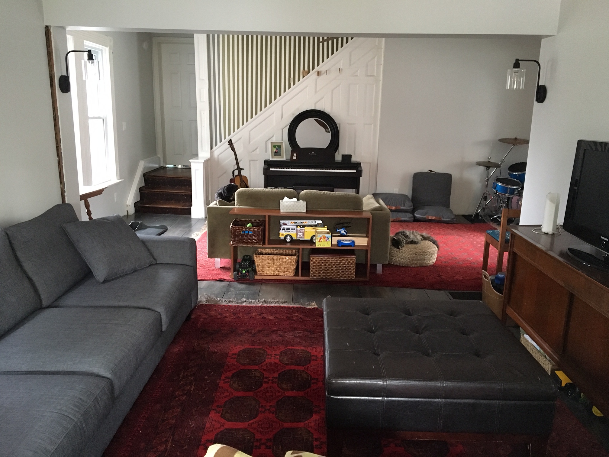
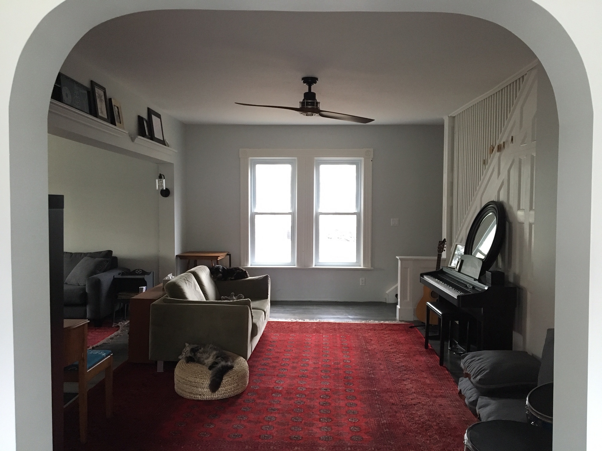
Hello dear friends! It's my first post since one of the dearest people to my heart passed away, my grandpa, ("Bampy"). He gave us so much to celebrate and a helluva lot to miss. It seems so fitting today to get to share a recent project I had the opportunity to do in the beautiful city of Boston, home of his Red Sox. We shared a love for New England and although I don't get to call it home anymore, the next best thing is having the chance to design beautiful homes nestled in some of Boston's most beloved neighborhoods.

Today's reveal is a studio right on the outskirts of the Theatre District. I've always wanted to design a studio - Something about the challenge of cramming your living, dining and sleep into one room just piques my interest! Hah! While this one is definitely of generous proportions, I still had a tricky time with layout. But it was an exciting challenge to take on and I'm so happy with out it turned out!

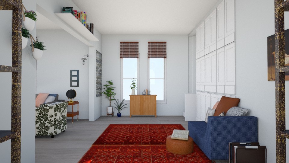
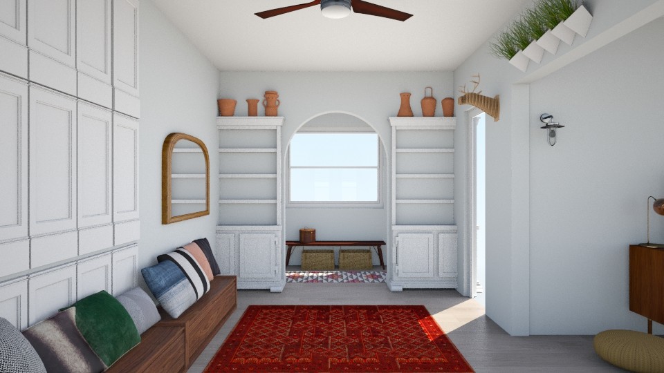
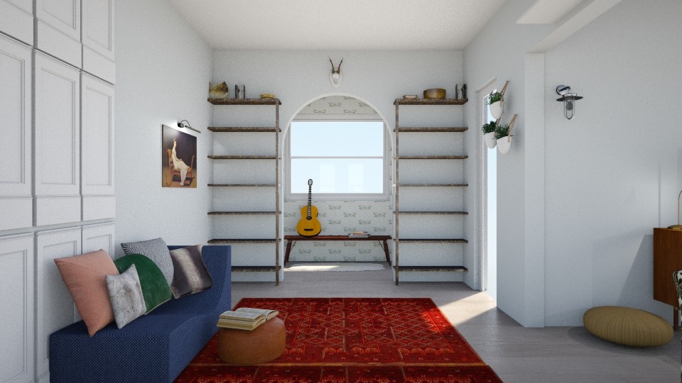
Let's take a look around:

finished 3.jpg

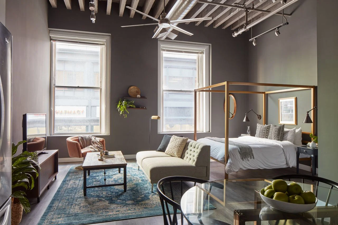
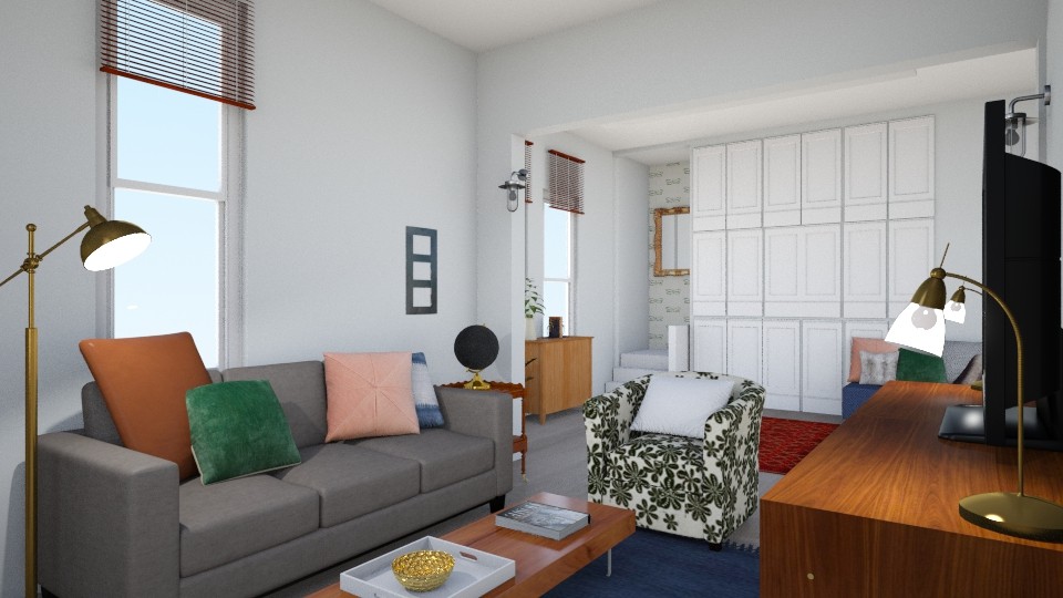
First, you can't beat these windows. All that natural light is making the design look goooood! I wanted to wrap the space in something dramatic so I chose a charcoal gray, (Kendall Charcoal by Benjamin Moore), that could move well from the lighter side near the windows, to the walls furthest out.

finished 2.jpg

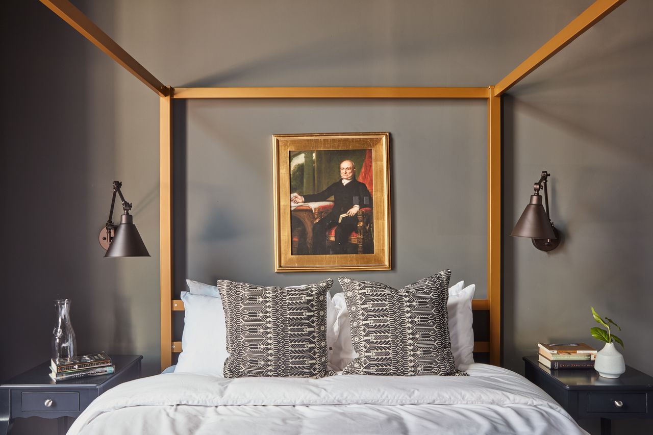
That Red Sox literature is for you, Bampy. :)

finished 7.jpg
finished 4.jpg

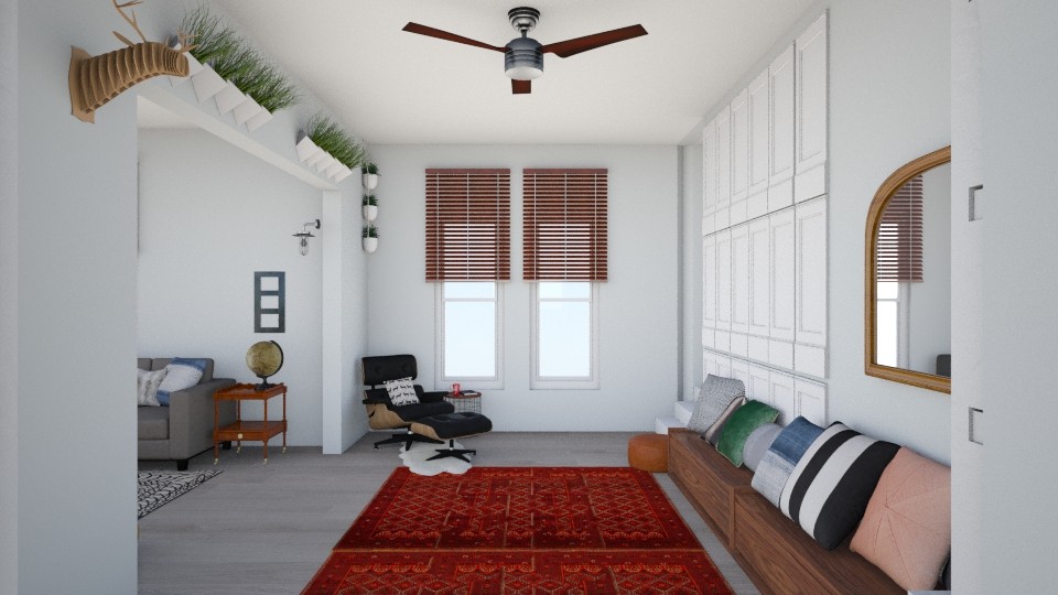
Another first for me was using a canopy bed! I figured creating a cozy sleep space in a studio could be a challenge. I wanted it to feel set apart and intimate, and I'm so pleased with how this piece, (found for a great price at Wayfair), fits into the space!

finished 12.jpg
finished 13.jpg
finished 14.jpg
finished 10.jpg

And if you're in to the behind the scenes process, here is one of the floorplans and design boards from this project! There are always edits but I try to hit the big picture concept early on so it's just tweaks from there. For this job I wasn't given pictures of the space beforehand nor measurements of the windows or between the windows, so when we saw how close together the windows actually were it made sense to rotate the living area.

Floorplan.jpg
Moodboard Bed.jpg

That's it - Pretty short tour when it's all one room! If you have any questions about where I found what please don't hesitate to ask in a comment below! I'll be back next week with another design reveal from the Windy City!

Thank you so much for stopping by!

Chelesa.jpg

First Design of 2017: Function + Character in a Century Old Home

Hi Friends! We can't believe we're already rounding the end of February here; it feels like we just celebrated the new year, just sat down and outlined our goals, just put together our new design packages and just said, 'I will put lipstick on every day'. Hah! Hard to believe that after all the work done to prepare for the year ahead, we're ready for the work of the year ahead.

Our first design project of the year wrapped up last week - at least from our end. Now it's up to the sweet Abrosimoff family to take their design concepts and run with them! This sweet couple contacted us from Canada to help them finish off the beautiful 100+ year old home they've been renovating. Let us just say, ANYONE brave enough to take on a century old house always has a spot on our schedule! Here are some snaps they sent over:

Right off the bat we were excited to get to work with such cool stuff in such an amazing space! They're avid thrifters/yard-salers/Kijiji-ers, (fun fact - Kijijji trumps Craigslist up there!) The two red rugs are actual vintage persians they found on Kijiji, but they both agreed that the two pieces together were too much red for the conjoined space.

The gray sofa and mid-century media cabinet were sure keeprs, while the funky mid-century bookshelf was a maybe, and the greenish loveseat was getting the boot.

These parents of three young kids requested a clean, open space that includes storage for kids' toys, a bohemian sitting area tossed with pillows, and layers of color and pattern. The Abrosimoffs chose our brand new Style Try-On package, which is where we design TWO concepts for a client space after getting to know their style and functional needs. One week after our consultation, during which we collaborated together on Pinterest sharing inspirational ideas, we sent them their two design concepts!

DESIGN ONE

Entering from under the archway we added a long storage bench up against the wall that serves double duty as a toy keeper and pillow clad seating. A sophisticated leather Eames lounge with small side table is the perfect place to kick back and observe the beautiful chaos of kids.

We gave the archway white built ins with room at the top for pottery or other sculptural pieces you wouldn't necessarily want at kid height, and an oversize arched mirror to bounce a bit more light in that darker corner of the room.

The kick-back part of this space was kept clean and open, with the addition of a neutral but bold black and white geometric rug and round glass coffee table. Light fixtures in brass and black are distributed to balance the space, while the funky mid-century bookshelf is placed under the window as a plant sanctuary to anchor the room with a strong focal point.

DESIGN TWO

We shook things up a bit with the second design, really tapping into the old character of the home with vintage inspired pieces, including a denim blue chaise lounge! This piece is topped with various leather, fur and patterned pillows and a leather ottoman serves as a scale-appropriate table or child size perch. A storage cabinet under the far windows is home to some happy plants and hides children's toys and games when they aren't being used.

Since the Abrosimoffs clearly aren't afraid of vintage pieces and happen to have a fabulous sense of humor, we included an ironic portrait of a woman on a chaise lounge to represent this spot as a perfect place for an oversized vintage piece of similar colors and proportion. You may also notice we included wallpaper in this design! We wouldn't include wallpaper in just any job, but in a century old home it couldn't be more fitting. We chose a simple, modern paper that is white with an oversize dark green pattern, (it happens to be dragonflies, but this was just to give our clients a visual idea), and we used it throughout the space, so keep your eyes peeled. ;)

See it in the mudroom on the other side of the archway? For this design we swapped the modern white built-in shelves for rustic industrial shelves, again leaving room at the top for various architectural artifacts.

The family kick-back space is anchored by our chosen wallpaper on the facing wall, and grounded with a saturated blue rug, (a fabulous addition our talented intern, McKenna, pulled for this space). The pattern on the chair isn't literal, but we love the idea of giving this room an extra dose of cozy with a floral patterned chair that compliments the surrounding colors and reminds the family of the history of their home.

Two designs for one home - both very different but as Cate would say, they speak the same language. The point of creating two different designs is not for our clients to pick their favorite and follow it verbatum, but rather to show them options - how two different looks and layouts under the same style umbrella would look in their own home. It's literally trying different looks on a home!

So, while we do not pit the two designs against each other, do you happen to have a favorite here? We'd love to hear what you think! And stay tuned, because the Abrosimoffs have hit the ground running and we can't wait to share these shots when all is said and done!

Thank you so much for stopping by today! If you'd like to give our Style Try-On package a try for $165, please don't hesitate to contactus here! We'd love to hear from you.