Design Reveal: Cali Meets Traditional Part 2

Welcome back, friends! In case you missed it or want a recap, part 1 of this 9-room reveal is here. But I’m especially excited for what’s in store with this second half of our design reveal! We’ve got wallpapered walls, bold built-ins, a refinished stone fireplace, and some serious Pearl Jam appreciation. In my opinion, today’s rooms are even more dramatic than what I shared on Monday in part 1!

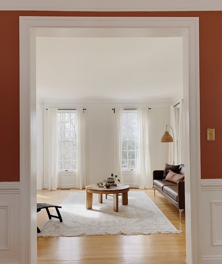
But I’m going to start with the most laid back of the bunch - the family room! As I mentioned on Monday, the clients hired me to really make this home feel 100% them - vibrant, fun and echoing their California roots. This was a tall order for a heavily traditional colonial style home - complete with rounded windows and lots of dentil trim throughout. This job was all about making intentional decisions big and small - doing what we could and making the rest work.

The one major update in the family room, aside from white paint which I had them do throughout, was the fireplace. The clients were on the fence with the stone - they didn’t hate it but something wasn’t right. We decided to do a limewash treatment which made a drastic difference. After swapping the mantle for a rustic wood piece, the fireplace looked brand spankin new!

Family+ROom1.jpg

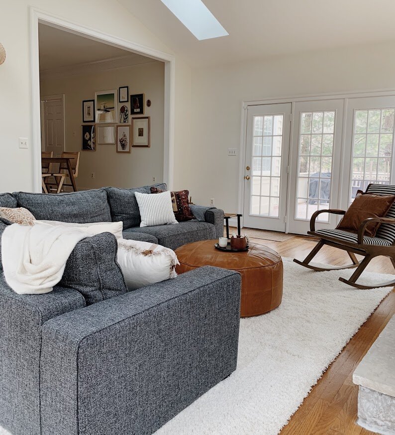
Here was my strategy with this room: Since I couldn’t do anything about the obvious traditional style of the home itself, I could at least bring in an overall organic feel with woven pieces, camel leathers, and natural dyes. I wouldn’t say organic is a style, but rather a feel, or a tone you can incorporate just about anywhere.

1.jpg

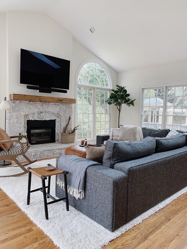
Due to the very long and narrow shape of this room, we had a custom sofa made by Interior Define, covered in an extremely family friendly fabric, (we used ‘Pepper’). Surrounding pieces had to be comfortable, durable, and interesting (without being loud). A striped rocking chair, for example, is visually interesting and balances the left side of the room, but it’s not distracting from everything else.

2.jpg
3.jpg

TVs are just not something you see in a lot of design reveals, but I’m here asking, Why not?! They are a part of most homes and I don’t like pretending they aren’t. Why designers refuse to show the TVs in their projects is perplexing to me. When styling this room with finishing details I pondered what to do on the fireplace mantle. I like a well dressed mantle just like anyone else. But nothing felt right. Books, plants, candles - any items I added just felt like clutter. I think when the only place for your TV is over the mantle, a nice clean mantle is the way to go. Instead, I focused on the hearth which balances the visual weight of the TV above.

4.jpg

I need to point out this brass and rattan sconce. The previous light fixture was a half dome that had moons and stars punched out - like a child’s nightlight. Actually, I just need to show you:

 
Matrix.jpg
 

It’s not the best picture but you get the idea. It had to go! This light below is one of my favorite pieces in the house (interpret as you will - I have lots of favorite elements in this home)

5.jpg

Is this what people did before open floorplans became a thing? A little unusual, but we worked it out and I don’t mind it at all with a bit of soft styling.

6.jpg
7.jpg
8.jpg
14.jpg
10.jpg
11.jpg

One more fireplace appreciation shot. I can’t get over how gorgeous this stone turned out. I mean, I imagined it and loved it in my head, but seeing it in real life is just so much fun.

12.jpg
13.jpg
Jaime+Office1.jpg

I mentioned this on Monday, but one of the best parts about designing in a colonial is getting to do whatever you want in each room! I mean, I aimed to give this home a consistent feel throughout - fun, vibrant, laid back - but how we achieved that feel from room to room is so different! The couples’ two offices are a prime example of how I created two TOTALLY different rooms to reflect them as individuals. And because they are on completely opposite sides of the home, it really doesn’t matter! Here is her office:

1.jpg

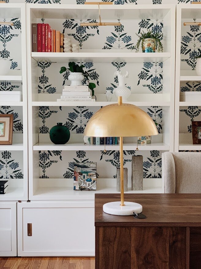
The star on all her zoom meetings? Why yes, yes she is. (No really, she told me so) We had the idea to paper this wall right off the bat, and float her desk in front. The paper itself is secretly edgy - there are snakes woven into the pattern which lend to her edgy personality. The family moved with the white base under the shelves, so I added on with additional units from this CB2 line.

3.jpg

Battery operated picture lights finish off these shelves for a subtle evening glow highlighting the various pretties on the shelves themselves.

2.jpg

If you must work from home, you may as well add a sofa to that office! A perfect lounge place to answer emails, review files, etc. A little movement throughout the work day feels like a luxury these days, and since she had the room for it I wanted to give her a second option during the work week.

4.jpg

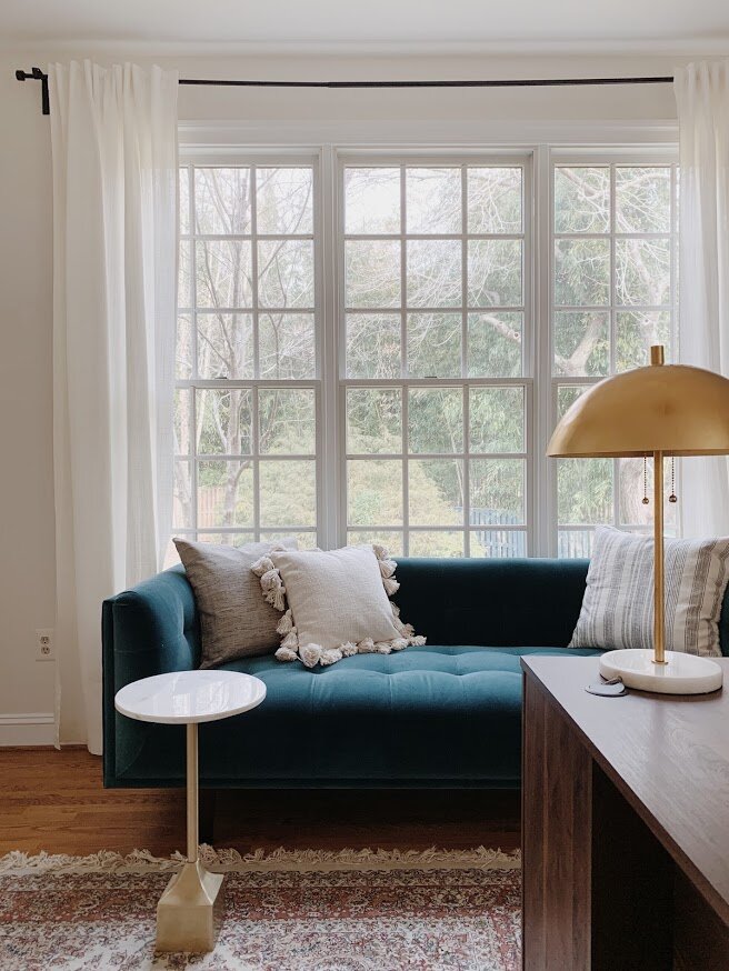
Not once did I compare the blue velvet of the sofa to the blues in the wallpaper. I didn’t need nor want them to be a perfect match, and I love that the sofa has a very subtle green tone.

5.jpg
6.jpg
7.jpg
8.jpg
alex+office1.jpg

Like I said, the two home offices are polar opposites! Where I went soft and feminine in one, I went hard and bold in the other.

6.jpg

If I had to guess, I would bet his coworkers appreciate his zoom meeting background, too. Even if they aren’t outright saying it. ;)

2.jpg

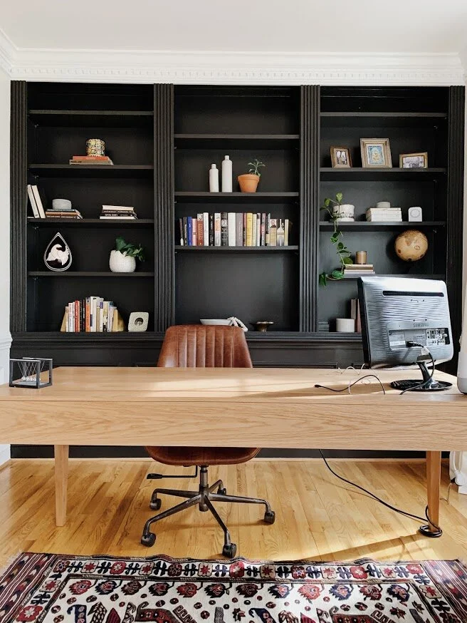
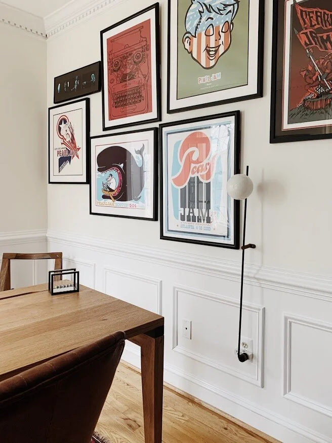
True story, this space was designed and complete before one evening when I got a text from the clients asking if there would be anywhere to add their collection of Pearl Jam concert posters. It was like meeting them again for the first time. A shared obsession with one band?! I was THRILLED to use these pieces and promptly had them frame their collection at Framebridge and played with an arrangement that would suit this office. I had actually picked that pole wall lamp before knowing about these pieces, so it was really fun to work the gallery wall around that piece. I am still beyond words excited with how this turned out!

3.jpg

Sophisticated meets rock n’ roll? Oh yes. Please and thank you.

4.jpg
7.jpg
1.jpg
Kingsley+Room1.jpg

Hard pivot now from Pearl Jam’s shrine to adorable childs room. Hope you’re hanging on tight, lots of twists and turns in today’s reveal! From black and bold to…butterflies!

3.jpg

I need to stop us here really quick to say, I think we can all agree the wallpaper MAKES this room. Well guess what? I was utterly stuck on wallpaper. I was chasing after big bold florals, enchanted forests and everything in between. But nothing felt right. I wanted a wallpaper that would suit this 5 year old little one as she is now, and when she’s a teenager. Everything I was finding seemed either too nursery, or too sophisticated. Fast forward to one of several afternoons I got to spend with a teen from our church over the summer, when her and her brother would come over and literally just play with my kids (and the other 234 kids in our neighborhood) for a few hours. I asked if she’d help me with this room if I paid her for her time, and within an hour she sourced THIS PAPER. It knocked me right over. So, huge shout out to my friend, Meredith Jolly! Thank you!!

1.jpg
10.jpg

The velvet teal bed felt like an unexpected pairing with this wallpaper, which made it feel just right. I really got into this groove of making brave choices with this home, and their daughters bedroom was no exception. Don’t overthink design, friends! You never know what you’ll uncover.

9.jpg

The rug felt like another unusual choice - the bed doesn’t really match the wallpaper which doesn’t really match the rug - and it all totally works and is glorious.

6.jpg

I wanted to finish the room off with more neutral pieces - you don’t really see the winks of black and brown in the wallpaper until you layer those colors in and it hits you.

11.jpg
5.jpg
7.jpg

I think if happiness were embodied in a physical room, this is what it would look like. It’s just pure delight in here!

8.jpg
2.jpg

I can’t believe that’s it for this reveal! Or is it? Good news, the family has just hired me to work on the master bedroom with a quirky adjoining side room, and their finished basement. Who knows what we’ll get into but I’m all in. After these rooms I am sure it’ll be very exciting, indeed!

Thank you so very much for coming by! Every hit to our website helps our little business so much, so we sincerely appreciate you taking the time to visit on our very special reveal days. It truly means a lot! Have a wonderful rest of your week!

Chelesa.jpg

Design Reveal: Cali Meets Traditional Part 1

When life throws you a pandemic you roll with the punches - that’s just what these clients did last Summer! They uprooted their life in the hub of Washington D.C. for the quieter and more relaxed suburban life. Nestled inside the beltway off the picturesque Clara Barton Parkway, this traditional colonial met it’s match with a vibrant and eclectic family with laid-back California roots.

I was brought onto this project ahead of the move which gave me plenty of time to game plan the 9 room job! I was tasked with designing their Entryway, Kitchen, Eat-In Nook, Dining Room, Living Room, Family Room, Her Office, His Office, and their daughters Bedroom and adjoining Playroom. The main objective for this family was to feel settled as quickly as possible. The couple both work full time (from home), and their young daughter would be entering Kindergarten in the Fall (also from home), so while not every aspect of the house itself was their style, their MO was to make it work in this season so they could feel at home for a little while. There may be possible renovations down the road but who wants to live in a renovation while working and schooling from home? I appreciate their discernment and desire to feel settled for the time being.

So we’ve got a big reveal to share this week! Since it’s so many rooms I have broken it up into two parts. Today I’m excited to walk you through the Kitchen, Eat-In Nook, Dining Room, and Living Room!

Kitchen1.jpg
2.jpg

With renovations off the table at this time, I planned out a number of inexpensive updates to soften their kitchen. The previous gray walls, gray stone backsplash and cherry island made the space feel very disjointed. I had them first paint their backsplash the same color as the walls, (which we updated all throughout the home to match the dentil trim - a great way to give a traditional element a modern twist). I also wanted to ditch the cherry island counter for something more natural and casual - an IKEA butcher block counter in a larger size than the original piece makes the island feel a more suitable size for this kitchen space - plus that gave them enough room for a third stool!

3.jpg
4.jpg

Additional updates include swapping the cabinet hardware, (matte black bar pulls are a fantastic option if you have white cabinets you want to give new life), and these stunning ceramic blue sconces are from Modefinity on Etsy!

5.jpg
6.jpg
7.jpg
8.jpg
9.jpg
10.jpg
11.jpg

As always, sourcing rugs was an absolute pleasure. A peachy vintage runner with blue accents just glows in this room with the leather stools and warm wood accents. And it compliments its far more saturated neighbor, a 6x9 vintage piece under the Eat-In Nook!

12.jpg
1.jpg
Eat In1.png

I just really wanted this space to glow - like a California sunset. Pairing light natural cane chairs with a walnut table and a backdrop of meaningful pieces sprawled across the wall, it speaks of this family’s love and joy.

1.jpg
2.jpg

This light was one of my favorite finds - I can’t recall which came first, the island pendants or this piece, but I wanted them to be really in sync and equally as different. This ceramic light fixture is another handcrafted item from one of my favorite Etsy shops, ClayCafe. They have quickly become one of my go-tos, but just a heads up they are currently only open the first two weeks of every month. Two on, two off.

3.jpg

I designed this gallery wall using some of the family’s own sentimental pieces, and building around those with a supporting cast of pieces that represent both their happiest memories and this new adventure, (‘This Must Be The Place”)

4.jpg
Dining Room1.png

You know what’s fun about colonials? All the segmented rooms! I love a sweeping open layout, don’t get me wrong - that’s what I am most used to! But I have never done so many separated rooms as this home, and there’s something about having the freedom to do big and bold things in just one space that you don’t necessarily want to commit to all over. You know?

Case in point: Cavern Clay, by Sherwin Williams

2.jpg

The client decided to keep their dining room furniture in the move, including that beautiful rectangular linen shade light fixture . In addition to adding an arch mirror, the wispy pampas grass and some punchy art from Upton, I wanted to wrap this room in something bold but still organic. Terracotta came to mind one night right before I fell asleep and I couldn’t wait to find just the right shade for this room!

4.jpg
3.jpg
10.jpg
1.jpg

We all instantly liked black paired with this magnificent color, and strategically peppered it throughout the space on all sides.

5.jpg
6.jpg
7.jpg
9.jpg
Formal Living Room1.png
11.jpg
10.jpg

We wanted to keep this space really simple and minimal to make the dining room high impact. But the trick was not going too far the other direction. Using natural materials that echo the organic feel of the dining room really works to marry the two rooms, and a few winks of rust/orange/terracotta in the pillows are all we needed to complete the connection.

9.jpg
7.jpg
2.jpg
3.jpg
4.jpg

That’s a wrap on this leg of our reveal! Wednesday I’ll be back with the Family Room, both Offices, and their daughters’ Bedroom - the sum of which include two wallpapered walls, bold built-ins, and some serious Pearl Jam appreciation. This home has been the most fun and thanks to the fabulous client, a lot of laughs along the way! So excited to welcome you all into this space so full of joy. More Wednesday!

Thank you so much for coming by!

Chelesa.jpg

Design Reveal: Prospect Park in Brooklyn, NY!

We’re in Brooklyn!! This project represents a long time dream - designing in New York City! What can I say, I’ve always been charmed. This was actually my sixth or seventh design job in the Big Apple but the first one I’ve had the opportunity to take photos of. Coincidentally, I am working on two more apartments just around the block from here, (one being a generous word of mouth recommendation from these home-owners!).

When these adventurous globe-trotting clients approached me with little more than a random piece here and there in each room, I was so smitten with them, the stunning archways in their home, and their goldendoodle, Nala, that I couldn’t wait to jump in. Over the course of six months we worked together room by room, item by item, detail by detail. Oh how I have looked forward to this day!

It all came together SO well and I can’t wait to walk you through! The MO with this home was to achieve a simple but eclectic look with a balanced global vibe. With space being limited, we enlisted the help of local contractor Ethan Abramson to design and install storage in every room. I’ll point out his work as we go along but I can’t tell you how fun it was to work on custom pieces with such a skilled craftsmen. Would highly recommend Ethan to anyone in the area! Let’s head in, everyone!

Entryway

DSC_0054.jpg

You walk into this apartment and immediately enter a long hallway. Creating depth of view is one of my favorite design elements - giving you something to see down the length of a space from either end. A personalized curated gallery wall pulls you into the home, while a graphic wallpaper, and architectural accent chair bid you farewell. (If you’re interested in the sources used throughout this home, please see our list at the end)

2.jpg
DSC_0049.jpg

When less is more, I like to use interesting pieces. A single accent chair by itself had better be something special, otherwise, why?

DSC_0053.jpg

The wallpaper was possibly one of the first decisions in the whole home! This is the only place it’s used which I think just makes it that much more dramatic.

DSC_0051.JPG

Speaking of dramatic…

Dining Room

DSC_0105.jpg

We were so intentional with every detail in this space I can’t help but look at the collective whole and remember the conversations and design renderings created for particular elements. It is a process of pure creativity that I have fallen so in love with over the years.

DSC_0093.jpg

The clients had this idea for a gallery wall here and my gosh did they hit a home run. Notice the continuity among the frames - all thin, and either black, white, or natural wood. That’s it! There is nothing visually connecting the actual images, but the carefully collected frames create cohesion and freedom to display whatever suits them.

4.jpg

The light fixture was actually left by the previous owners and totally works for our purposes. Its thin and the right scale and the only brass used throughout, setting it apart as the primary decorative accent in the dining room. With the cutout looking into the gallery wall hall, I opted not to add anything else to the wall space surrounding the table, so this visually impactful fixture works beautifully.

DSC_0059.jpg

Living Room

DSC_0107.jpg

I can’t move on without pointing out the trim. First of all, so thick, old and regal. I’ve never ever painted trim a contrasting color, but the clients had this idea to do something different and accentuate it. In the early renderings I used black and that felt too stark. Gotta start somewhere, right?! After doing some research on similar architecture I found three images with white walls and beige trim and fell. in. love. I sent over three color options, the clients tested, and we came to a unanimous decision to use Clay Beige, by Benjamin Moore. Walls in Swiss Coffee, BM.

DSC_0115.jpg
DSC_0064.jpg

The first of Ethan’s pieces - this wall unit! He built the cabinets and shelves above, using Rejuvenation brackets we selected.

DSC_0063.JPG
DSC_0068.jpg

The triptych is just the bees knees! The clients found the street artist, Dede, in Israel and looked him up upon returning to the states. They commissioned this special piece for their last apartment and were not sure it would have a place in this one. My top choice was over the sofa if the dimensions fit. It’s just the right kind of drama needed for this room! Still so thankful this installment fit!

DSC_0070.jpg
DSC_0071.jpg

I honestly don’t believe we ever considered any other light! We had started down this road of edgy pieces with a subtle flair of drama. I’ve used similar sconces before and this France and Son number was just right for our far corner here. Can we also take a moment to acknowledge the clients incredibly green thumb - I’ve been loading up on her generous tips!

DSC_0081.jpg
DSC_0075.jpg
DSC_0077.jpg
DSC_0113.jpg
6.jpg
DSC_0098.jpg

Bedroom

DSC_1040.jpg

Hold on, scroll back up and take in that pocket door pull. The details of this home are just incredible! What a privilege to work on such a fun space!

DSC_1043.jpg

You’ll notice in this room as well as the office coming up next that we opted for reverse walls - beige walls with white trim. They’re itty bitty spaces so it just felt like a fun opportunity to try something different in this home.

DSC_1046.jpg

The bedroom is a story of small business owners. You may recognize Ethan’s work in the bedside tables, (inspired by similar I found on Etsy). You may also recognize some items StyleMutt Home has used before! The Marylou sconce from our friends at Rough Luck Studio, and the fibre art by a favorite, Designs by Filia.

DSC_0001.jpg

More small businesses are represented on the bed. Pillows from fair trade global artisans, The Citizenry and Mae Woven, as well as Brooklyn local business, Brooklinen. The bed itself, as well as the office desk, (coming up), and the olive tree stand, (living room), are from Floyd - a company establishing the standard of modern-day furniture. They make furniture that is easily portable to those often relocating, but without sacrificing quality. West Elm recently partnered with them so I’m sure you’ll see more of them soon!

DSC_0002.jpg

Curious how New Yorkers manage such tiny spaces? Epic closets. These were installed by the previous owners who gambled some solid square footage in the room. And worth every inch, if I do say so! Who could deny those leather pulls…

DSC_0018.jpg

Office

DSC_0022.jpg

We have two fine installments from Ethan in this space - a cute corner shelf that I wanted to use to soften the deep narrow space,

DSC_0043.jpg
DSC_0027.jpg

and the coolest bookshelves I ever did see!

DSC_0039.jpg
DSC_0032.jpg

This is artists work right here, people. The detailing is just everything!

DSC_0033.jpg
DSC_0038.jpg
DSC_0036.jpg

And that’s it! I had so much fun working on this home I feel guilty calling it work - not every job feels that way but this one was a joy every step. The clients were beyond amazing and, as always, I am so touched to be trusted so fully with their home. Designing someones home is an honor I don’t take lightly, so when it’s all said and done there is definitely a bittersweet feeling left that it’s all over.

We have worked so hard to get here with StyleMutt Home Design but it still feels surreal to be sought after from around the country. It takes so much time and strategy to establish yourself not only as capable of doing the work, but as the top of your field. I don’t know what is next for us, but I have had this desire for some time to dig into how we got to this point in our business and use what we have learned to help other aspiring designers. With the completion of this project and wrapping up a couple others this week, my plan is to take the rest of the summer off from design projects and eat up the time with my babes. With design work on hold until September, I’d like to dabble in some writing to publish an eBook loaded with all the info of how we got to this point from scratch. It’s so much more than just dreaming big and I am really excited about creating a guide to help others reach their goals! If you’re interested in doing interior design and/or eDesign, shoot me an email at chelsea@stylemutthome.com and I’ll be sure to send you a note when the guide is complete!

Thank you all for coming by today! It’s always so fun to get to share these projects with this community and I truly am so grateful for you.

Chelesa.jpg

Some more photos of the trip - Matt and I went up together and had the BEST weekend celebrating our 13 year anniversary! I still can’t believe our marriage is a teenager now. There is absolutely no aspect of our life now that I would have guessed for us on the day we got married, and I think that’s just what makes it feel so grand. Making a life together with this man has been the adventure of a lifetime, that’s for sure!

SOURCE LIST
Entryway:
Sideboard - Article
Lamp - CB2
Rug - Loom and Kiln
Runnger - Etsy
Chair - Stowed Home
Wallpaper - Etsy
Tassel wall hanging - Holistic Habitat

Dining Room:
Table - Room and Board
Chairs - Serena and Lily
Linens - Parachute Home
Rug - AllModern

Living Room:
Rug - Serena and Lily
Sofa - Article
Coffee Table - Anthropologie
Table Lamp - AllModern
Sconce - France and Son
Pillows - Serena and Lily, Mae Woven, Anthropologie
Planters - Holistic Habitat

Bedroom:
Bed - Floyd
Duvet - Brooklinen
Pillows - The Citizenry, Mae Woven
Fibre Art - Designs by Filia

Office:
Desk - Floyd
Desk chair - Urban Outfitters
Yellow planter - West Elm
Pillow - Mae Woven