Design Reveal: Cali Meets Traditional Part 1

When life throws you a pandemic you roll with the punches - that’s just what these clients did last Summer! They uprooted their life in the hub of Washington D.C. for the quieter and more relaxed suburban life. Nestled inside the beltway off the picturesque Clara Barton Parkway, this traditional colonial met it’s match with a vibrant and eclectic family with laid-back California roots.

I was brought onto this project ahead of the move which gave me plenty of time to game plan the 9 room job! I was tasked with designing their Entryway, Kitchen, Eat-In Nook, Dining Room, Living Room, Family Room, Her Office, His Office, and their daughters Bedroom and adjoining Playroom. The main objective for this family was to feel settled as quickly as possible. The couple both work full time (from home), and their young daughter would be entering Kindergarten in the Fall (also from home), so while not every aspect of the house itself was their style, their MO was to make it work in this season so they could feel at home for a little while. There may be possible renovations down the road but who wants to live in a renovation while working and schooling from home? I appreciate their discernment and desire to feel settled for the time being.

So we’ve got a big reveal to share this week! Since it’s so many rooms I have broken it up into two parts. Today I’m excited to walk you through the Kitchen, Eat-In Nook, Dining Room, and Living Room!

Kitchen1.jpg
2.jpg

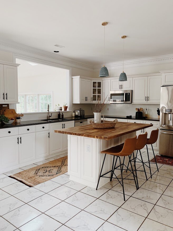
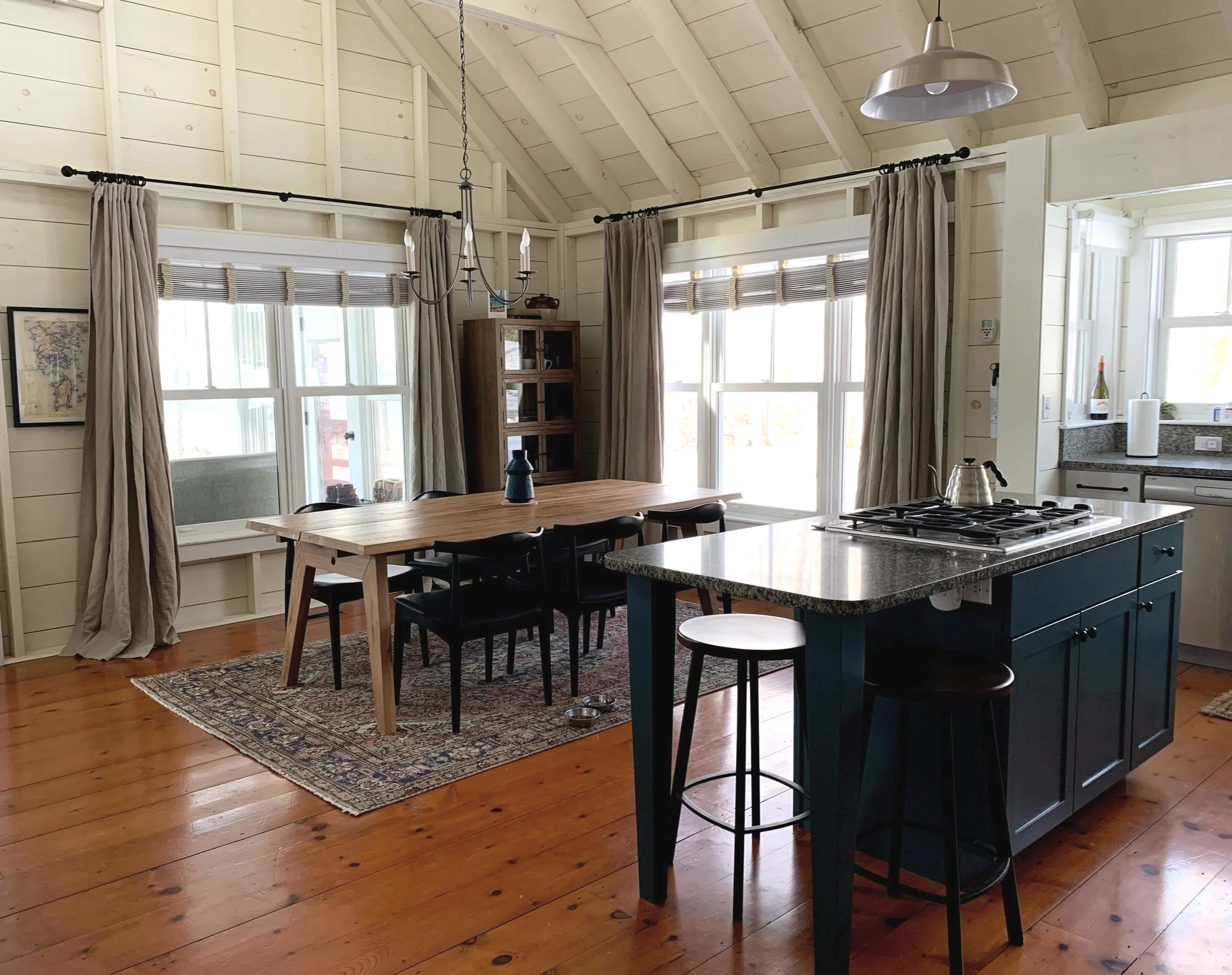
With renovations off the table at this time, I planned out a number of inexpensive updates to soften their kitchen. The previous gray walls, gray stone backsplash and cherry island made the space feel very disjointed. I had them first paint their backsplash the same color as the walls, (which we updated all throughout the home to match the dentil trim - a great way to give a traditional element a modern twist). I also wanted to ditch the cherry island counter for something more natural and casual - an IKEA butcher block counter in a larger size than the original piece makes the island feel a more suitable size for this kitchen space - plus that gave them enough room for a third stool!

3.jpg
4.jpg

Additional updates include swapping the cabinet hardware, (matte black bar pulls are a fantastic option if you have white cabinets you want to give new life), and these stunning ceramic blue sconces are from Modefinity on Etsy!

5.jpg
6.jpg
7.jpg
8.jpg
9.jpg
10.jpg
11.jpg

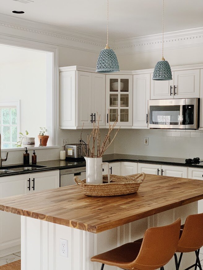
As always, sourcing rugs was an absolute pleasure. A peachy vintage runner with blue accents just glows in this room with the leather stools and warm wood accents. And it compliments its far more saturated neighbor, a 6x9 vintage piece under the Eat-In Nook!

12.jpg
1.jpg
Eat In1.png

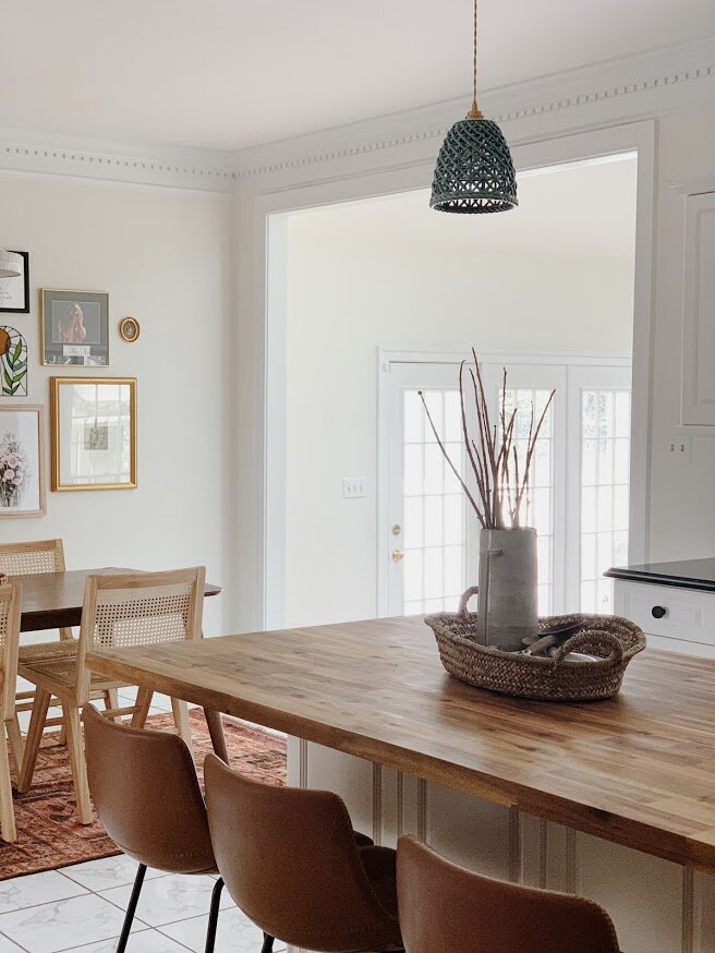
I just really wanted this space to glow - like a California sunset. Pairing light natural cane chairs with a walnut table and a backdrop of meaningful pieces sprawled across the wall, it speaks of this family’s love and joy.

1.jpg
2.jpg

This light was one of my favorite finds - I can’t recall which came first, the island pendants or this piece, but I wanted them to be really in sync and equally as different. This ceramic light fixture is another handcrafted item from one of my favorite Etsy shops, ClayCafe. They have quickly become one of my go-tos, but just a heads up they are currently only open the first two weeks of every month. Two on, two off.

3.jpg

I designed this gallery wall using some of the family’s own sentimental pieces, and building around those with a supporting cast of pieces that represent both their happiest memories and this new adventure, (‘This Must Be The Place”)

4.jpg
Dining Room1.png

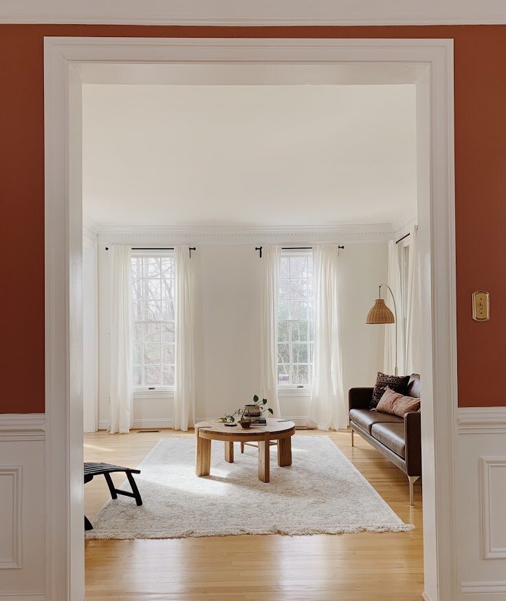
You know what’s fun about colonials? All the segmented rooms! I love a sweeping open layout, don’t get me wrong - that’s what I am most used to! But I have never done so many separated rooms as this home, and there’s something about having the freedom to do big and bold things in just one space that you don’t necessarily want to commit to all over. You know?

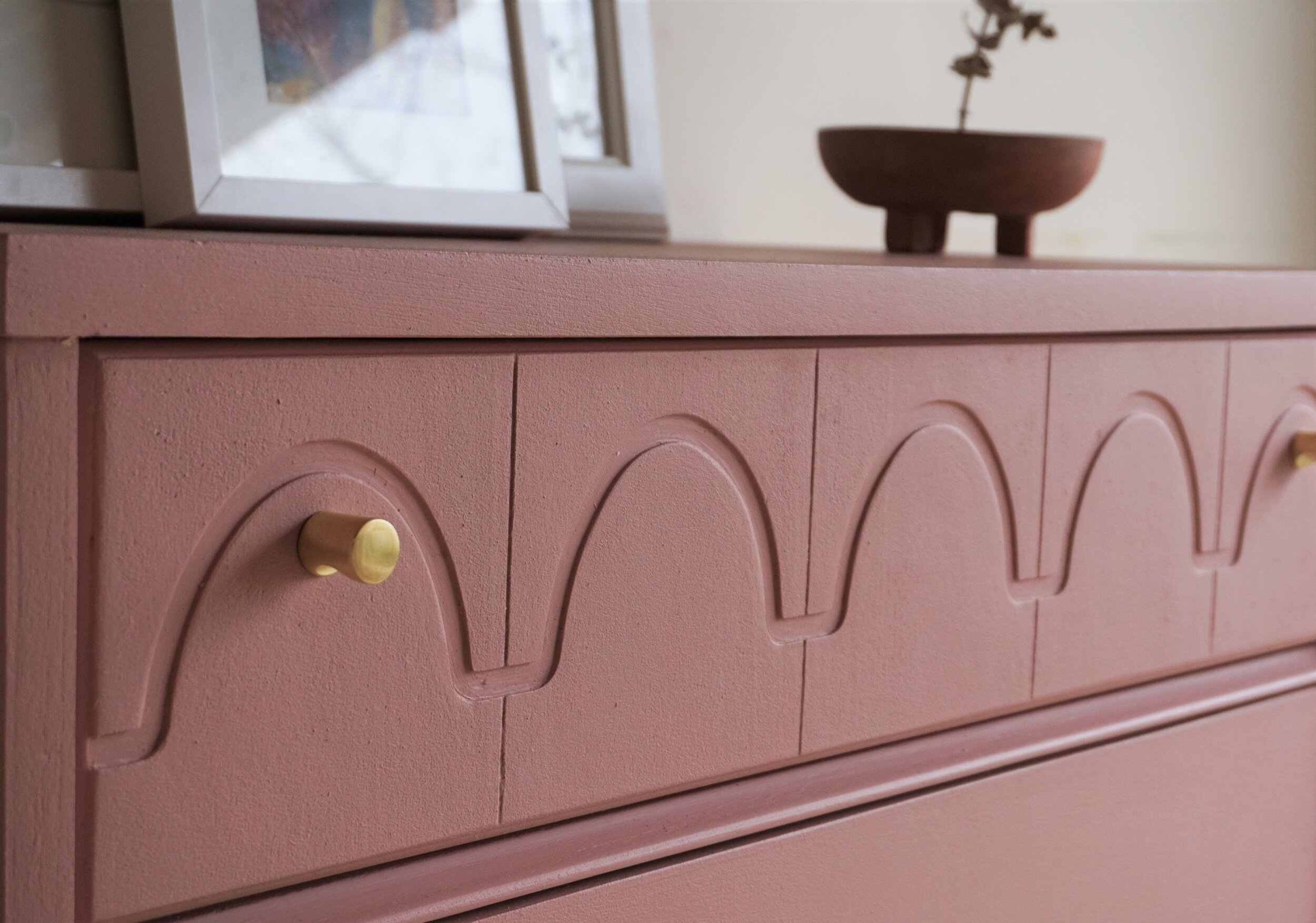
Case in point: Cavern Clay, by Sherwin Williams

2.jpg

The client decided to keep their dining room furniture in the move, including that beautiful rectangular linen shade light fixture . In addition to adding an arch mirror, the wispy pampas grass and some punchy art from Upton, I wanted to wrap this room in something bold but still organic. Terracotta came to mind one night right before I fell asleep and I couldn’t wait to find just the right shade for this room!

4.jpg
3.jpg
10.jpg
1.jpg

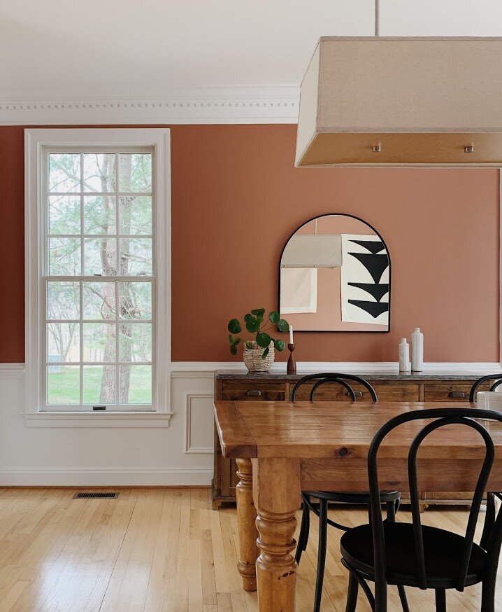
We all instantly liked black paired with this magnificent color, and strategically peppered it throughout the space on all sides.

5.jpg
6.jpg
7.jpg
9.jpg
Formal Living Room1.png
11.jpg
10.jpg

We wanted to keep this space really simple and minimal to make the dining room high impact. But the trick was not going too far the other direction. Using natural materials that echo the organic feel of the dining room really works to marry the two rooms, and a few winks of rust/orange/terracotta in the pillows are all we needed to complete the connection.

9.jpg
7.jpg
2.jpg
3.jpg
4.jpg

That’s a wrap on this leg of our reveal! Wednesday I’ll be back with the Family Room, both Offices, and their daughters’ Bedroom - the sum of which include two wallpapered walls, bold built-ins, and some serious Pearl Jam appreciation. This home has been the most fun and thanks to the fabulous client, a lot of laughs along the way! So excited to welcome you all into this space so full of joy. More Wednesday!

Thank you so much for coming by!

Chelesa.jpg

Design Update: Castine, Maine Lake House

“Hi! Would you have time to chat sometime this week? We recently bought a vacation home in Maine and would love to explore some updates and redesign. Thanks!”

15 months after completing their Brooklyn, NY apartment, two of my very favorite clients reached back out with a very special project in mind - a lake house they just purchased in Castine, Maine! This isn’t the first time I’ve worked on a second home with a client and I am incredibly humbled for the opportunity to continue good work with people I thoroughly enjoy!

When I first saw this place I was all in.
(every photo in this post was taken by the clients - they are truly amazing!)

IMG_3879.JPG
IMG_3888.JPG

I love two things about this:
1) The gorgeous structure and architecture of this home, and
2) How terrible it looked when we began

This job is a classic example of the perfect cosmetic update. It wasn’t hard at all to imagine what this home could be!

IMG_4415.jpg
IMG_4003.jpg
IMG_4409.jpg

Pretty amazing, right? Since this home will be used as a vacation place, the clients do plan to rent it out when they’re not there. This dictated much of the design and selections for the home - durable, family friendly elements were a must, and using some of the homes existing pieces where possible helped stretch the budget.

IMG_3990.jpg

We still have a little ways to go, but I thought it would be fun to share how far this home has come since September! Items left to do include painting the window frames black and updating the dining room and kitchen lighting. There is also a guest room/office that we’ve been chipping away on and that will be included in the final reveal in a few months!

Come on in, friends!

IMG_5429.jpg

Repositioning the existing sectional and adding a pair of forest green armchairs gives the living room an intimate, cozy feel in this cavernous space. The clients really wanted the sofa to face the windows, so I believe we turned it a whole 180 from where it had been. We’ll be adding an old, rustic bench along the back side, which conveniently leads right outside to the screened porch.

IMG_5437.jpg

When I was told this home would be rented out, I really wanted to add some special touches unique to Castine. A pair of framed maps helps visitors identify where they are in this very special, undisturbed part of Maine.

IMG_5436.jpg
IMG_5491.jpg

Reusing the existing coffee table and media console were easy options - they work well in here as functional pieces that don’t stick out. The style direction we were after was a modern rustic/farmhouse vibe - primitive, functional pieces, nothing too modern or fancy.

IMG_5489.jpg
IMG_5462.jpg
IMG_5445.jpg

Browsing for textiles in this home has been the MOST fun. All pillows and rugs came together just beautifully. I haven’t updated the throw blankets yet but I think a couple fresh selections will pull this all in just right! Isn’t the light in here so lovely?

IMG_5441.jpg
IMG_5457.jpg
IMG_5466.jpg
IMG_5474.jpg

I absolutely can’t wait to see the new lights installed over the dining table and island. I think you’ll really like what I found! Little different, but everything about this design has been a fun opportunity to step outside the box.

IMG_5433.jpg
IMG_5484.jpg
IMG_5486.jpg

The kitchen required the most effort from the clients - I picked out a few paints for them to sample, they sent some pics, we finalized, and then they got to work! They painted all the cabinets Light French Gray by SW, and the island Newburg Green by BM. But one of my favorite updates in here was removing the previous yellow-y shelving unit and replacing it with natural wood shelves on simple iron powder coated brackets. Done and done! I can’t wait to see what the kitchen will look like when the window frames are all painted black. Cannot. Wait.

IMG_5452.jpg

This past year has been deeply hard in so many ways and I can honestly say this project came at just the right time. I needed this level of creativity, I needed a project that would rejuvenate my soul and allow me opportunity to see some fruit from my efforts. Every time I sat down to work on this place I felt my mind enjoying the escape. While I’ve not stepped foot in this house, I’ve loved every second of working on it and studying its every corner, nook and cranny. More to come soon when it’s ready for it’s big final reveal!

Thank you so much for coming by, friends. Stay warm and stay safe out there!

Chelesa.jpg

Maybe Mauve Dresser

Creatively speaking, I don’t have much to show for myself lately. When the world shut down, many of you found sanctuary in projects while stuck at home. I found myself going to my day job in full PPE. Suddenly I was signing waivers at the door each morning, bruising my nose and breaking out under an N95, getting COVID tested twice a week, limiting my water intake to avoid taking off my mask, wary that a single mistake that could compromise my health or that of those around me.

My 9 to 5 is working with residents at an Assisted Living Facility - a very vulnerable population that I have seen wither under sequestration. My creative bandwidth was eaten up by how to keep spirits up among the residents and how to keep us all safe.

For these reasons, my garage workshop stayed quiet for most of last year (well that and because Caleb turned it into a home gym for a while). My 2020 flip list fell by the wayside with only one project completed and others never tackled or never shared.

I have a lot of hope that this year will be different. I do want to see more pieces unfold on this platform as my time and energy will allow. These projects still bring me great joy and your support and positive response to them are such a source of encouragement for me to keep creating.

before.png

I found this gem listed in Facebook as a curb alert. It was free and in the neighborhood so I snapped it up while I was already out running errands.

IMG_1771.jpeg

I was kinda digging its dusty color but the original paint job was a HOT MESS. The body was shellacked with thick drips of high-gloss beige while the top was and unfortunate clash of flat cream from what I can only assume was a bad repair job.

IMG_1793.jpeg

The stripping process revealed several layers of paint that started peeling off like wallpaper - indicative that it wasn’t applied properly in the first place.

Adjustments.jpeg

This piece had lived at least three other lifetimes as a shabby chic dresser with obvious brush strokes in a white paint finish. Then it did a stint as a vivid aqua/teal dresser. Then it turned into the mauve-meets-beige mess that landed it in my workshop. But that mauve gave me an idea to try something new so I picked up a new color to try.

dsc07099.jpeg

Now mauve is technically in the purple color family but that scalloped detail was calling for something soft and pretty and reminiscent of Shire’s pink room circa 2018. I browsed my favorite paint line (Behr Marquee) and chose Retro Pink that lands in right the dusty hue range.

dsc07077.jpeg
dsc07107.jpeg

The scalloped detail lends itself to a sweet overall look while the dusty pink color still reads mature for all you millennial-pink lovers out there.

dsc07110.jpeg
dsc07095.jpeg

Keeping with the original dresser’s look, I painted the tapered legs in the same color as the body.

dsc07089.jpeg
dsc07102.jpeg

I did not however, keep the ridiculous pulls from the original dresser. Instead, I filled those holes and drilled new ones for a single gold whistle knob on each side.

dsc07087.jpeg

Just enough gold to give it a touch of glam.

dsc07103.jpeg

I had wanted the color to be reminiscent of a dried clay so naturally I had to style with a ceramic touch.

dsc07094.jpeg

I pulled this trio of ladies from various corners of my house and invited them to come smirk from atop the dresser.

dsc07073.jpeg

They agreed to make eyes at the dresser’s potential buyers until the right one comes along.

dsc07097.jpeg
dsc07099.jpeg
Cate Sig 2.jpeg
 

Maybe Mauve Dresser
Now Available for Sale
$545

If you are interested in this piece or a custom order like it, email me at cate@stylemutthome.com