Pop of Red Dresser

When it comes to repairing old dressers, I’ve seen quite the spectrum of original conditions.  Water damage, bent hardware, chunks missing, splitting veneer, broken legs, and even dog pee.

But this piece...

IMG_1872.JPG

…this piece might take the cake. 

The previous owners had been keeping it practically unsheltered in their carport for who knows how long.  Exposed to the elements, every inch of the cherry veneer was clinging on for dear life.  As soon as I touched it, the veneer started flaking off like bad dandruff.  Poor thing. The state of this thing meant I couldn’t restore all of it back to its former glory. The drawer fronts, although in need of excessive touch-ups, were mostly salvageable.  But the sides were an irrestorable tragedy that would have to succumb to a good coat of paint. But this meant I had a fun opportunity on my hands… a chance to play with color:

DSC04816.jpg

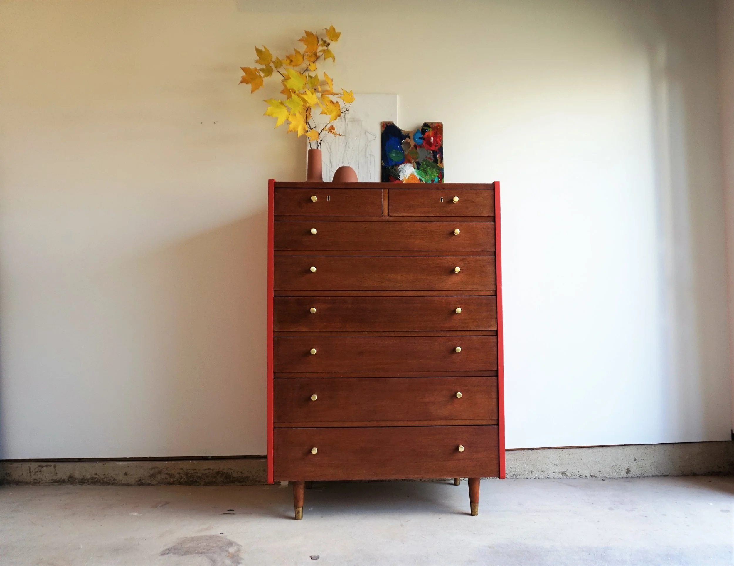
So if paint had to be on the agenda, I chose a sassy red-orange to play off the red cherry tones in the drawers.

DSC04792.jpg
DSC04799.jpg

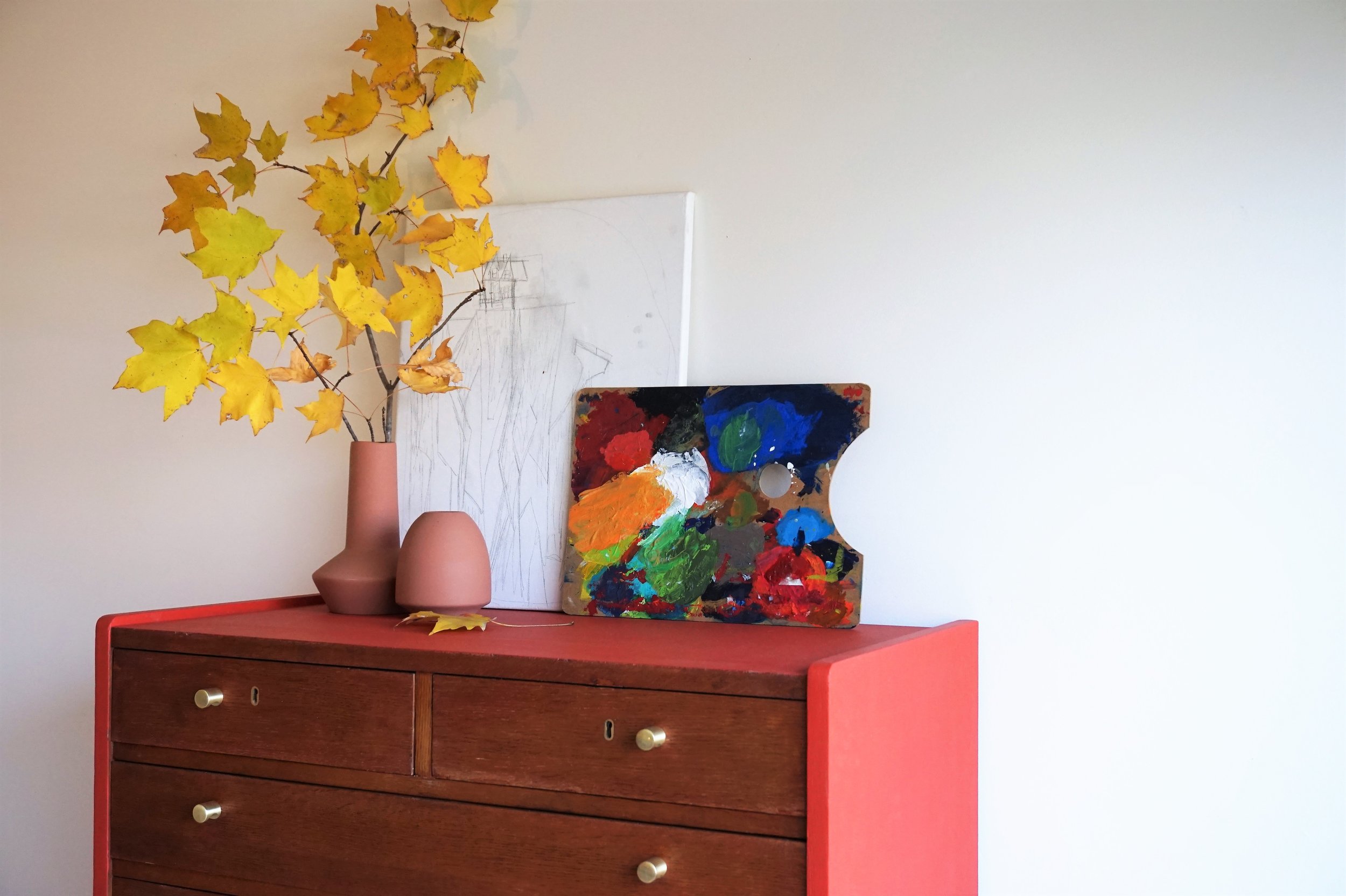
The drawers had a lot of chipped veneer around the edges which I painstaking patched and painted to match by hand.  Then I reoiled the wood to bring it back to health like a good moisturizer for cracked hands in winter.

DSC04826.jpg

The original wooden pulls were also too damaged to keep so I replaced them with brass whistle knobs that match the brass keyholes in the top drawers.

DSC04836.jpg

I was able to keep the original gold capped tapered legs however!

DSC04815.jpg
DSC04790.jpg

To style it, I used my painter’s pallet and the most exquisite golden foliage I could find.

DSC04823.jpg
DSC04834.jpg

GAH! This is why it’s my favorite time of year to style with tree branches!!! (I can’t help myself - just see here and here and here).

DSC04805.jpg
DSC04819.jpg
 

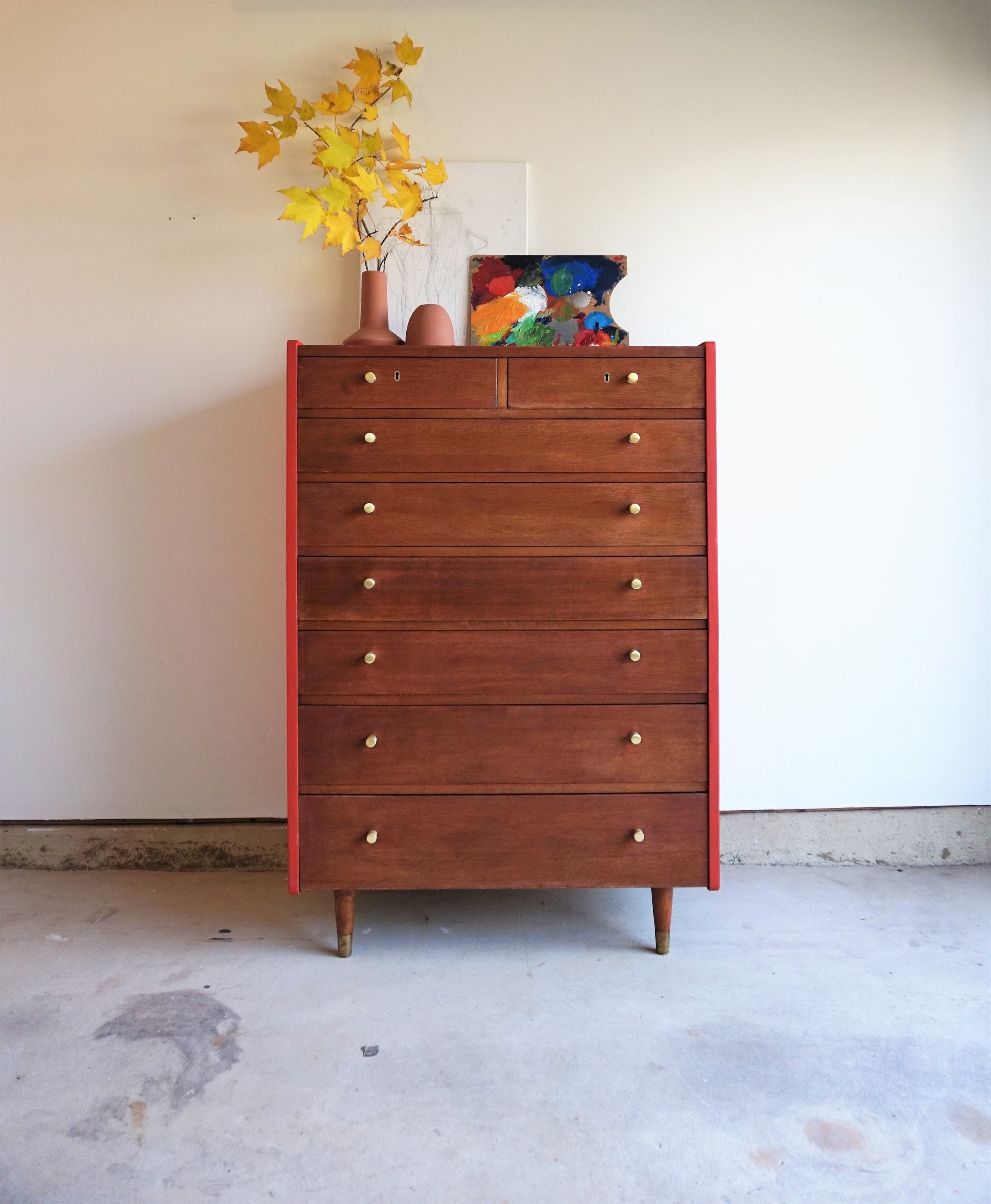
Pop of Red 8 Drawer Dresser
Now Available for Sale
33.5”W x 18”D x 48”H
$495


If you are interested in this piece or a custom order like it, email me at cate@stylemutthome.com

Cate.jpg

eDesign Reveal: Jess and Keith's Soulful Row House

Well this is a very special reveal, indeed! Remember last March when we welcomed a much needed addition to the StyleMutt Home design team? Well since then our girl Joy has been representing the SMH brand well, tackling jobs across the world in Australia and right here on our home turf. As we have learned since branching out to include design services, getting to actually see a finished job is a BIG deal! StyleMutt Home has been beyond blessed to work with many clients who are as passionate about seeing their homes transformed as we are, and we’ve had just the opportunity with a particularly fun client over this past year.

Jessica and Keith are a SUPER sweet couple living in a quaint DC row house on a street oozing with charm. When they came to us they had only been living there for a few months but had come a long way putting their style on their home. While their living room was more or less finished, (just needed some of those final details), their dining room was only just beginning. Let’s take a look at the ‘before’ shots they sent us!

Joy and I decided to divide and conquer on this project; I took the entryway and living room, and she tackled the dining room. Having two designers working on one home can be tricky because you really want to make sure that there is a consistent point of view from one room to the next. Communication from all parties involved needs to be tight, and I can honestly say this crew made it happen without a hitch. Jessica and Keith were amazing to work with, and Joy’s design for the dining room left me in awe. It was just so much fun! So let’s look around the finished home!

In the entryway we wanted to get things off the floor and hugging the wall. We swapped the coat tree for a hanging rack, and got all the shoes in a narrow storage cabinet on the adjoining wall.

DSC_0330.JPG
DSC_0315.JPG

The living room was so close when Jess and Keith came to us - they just needed a bit of advice for styling accessories, lighting, art and a rug! It never ceases to amaze me how a space suddenly looks awake! with just a few additions and styling!

DSC_0319.JPG
DSC_0318.JPG
DSC_0323.JPG
DSC_0321.JPG

The dining room, on the other hand, was closer to the beginning of its makeover than the end! (This would be a good time to jump back up to the top and take a look at the ‘before’ picture!) The only element Jess and Keith wanted to keep was the freshly painted accent wall, SW ‘Citrine Dream’. And after Joy took the reigns in here, I don’t think I’ve ever loved an accent wall more!!!

To point out the obvious first, the use of warm woods in here mixed with stark white and black pieces makes this bright color take on a highly sophisticated personality. A punchy color works remarkably well when the remaining elements are strong and LOOK expensive, (even if they are not).

finish2.JPG
finish6.jpg
finish3.JPG

Less obvious touches of brass and marble speak volumes in this multi-functional area, and prove that small doses of these finer materials go a long way.

finish7.JPG

An intentionally selected statement art piece doesn’t cower against the statement wall - anything softer would have been absorbed by the citrine color, but this piece pops right out - exactly what it was intended for!

finish4.JPG

It has been such a treat to get to work with Joy on this amazing home with these incredible clients. Everyone put in the time and effort to see this home to the finish, and we wish Jess and Keith the very best life together here.

So ridiculously proud to get to share Joy’s hard work here! It is truly a pleasure to have her on our team and I’m still pinching myself that we are lucky enough to offer her talents to our design clients. You can see more of Joy’s work on her site, Joy Lewis Design.

Thank you all so much for stopping by!

Chelesa.jpg

SOURCE LIST

Entryway hooks, Urban Outfitters
Entryway mirror, Pottery Barn

Living room shelves, Room and Board
Living room sofa, Crate and Barrel
Living room coffee table, West Elm
Living room drink table, West Elm
Living room chair, West Elm
Living room rug, West Elm
Living room sconce, Lamps Plus
Living room art, Laura McGuigan
Living room accessories, primarily CB2 and what the client had on hand

Dining room table, Overstock
Dining room chairs, Poly and Bark
Dining room rug, Overstock
Dining room chandelier, West Elm
Dining room art, Minted
Dining room shelves, World Market
Dining room white storage, IKEA
Dining room vintage storage cabinet, Craigslist

Reader Design: Johanne's Black & White Beauty

Today, we're off to Canada! Johanne, who is a professional interior designer, is welcoming us in to her Montreal home that she shares with her husband and two adult children. 

Johanne and her family moved in to this 1950's cottage 15 years ago. It sits outside Montreal in a town known for its stunning mountains and parks. Johanne doesn't use a lot of color, but that doesn't mean that her home is devoid of depth or emotion. Her neutral palette just bring other features to life - like the wood fireplace, used year-round, that Johanne calls "the best investment in the house." 

From Johanne:

Many things come into play when designing a house. The first thing I look at is the architecture. This cottage has very large windows, so our first move was to open up the space and take advantage of the ever-changing light and nature surrounding the house.

The second thing Johanne considers? Location. 

We live in a Nordic city, so I am very influence by Scandinavian design not only for its style but also for its way of life: simple, modern, warm, and practical. I love wood and try to use it as much as possible along with natural materials such as stone, straw, wool, and cotton.
Midcentury and Scandinavian furniture design offer modern furniture that blend well with many different styles. They are good quality and timeless which is always a good investment. I like to mix them with older pieces such as our tulip dining chairs with our rustic dining table, which we found in an old barn and have had for many years.

The third consideration is nature. Johanne seriously considered the world around her and took advantage of those influences in every way she could. 

Soothing grays, greens, and earth tones are always a good choice for me. Those are the colors I see when walking on the mountain, but they are also the colors I see when I go on the gorgeous beaches of Maine, USA, where I have spent every single vacation of my childhood and where we have taken our children as well since they were born.

I think we can all agree that Johanne has some incredible style. Thank you, Johanne, for letting us in and sharing your design influences with us. 

Learn more about Johanne on her website or follow along on Instagram