Reader Design: Courtney's Airy Loft

I think Winter is playing a trick on us, and I don't know how to process it. DC was warm enough for an evening walk last night, and my friend in Boston went coatless on her way home from work. Do you hear me!? Coatless in Boston in January!!  

Ok, enough complaining. Today we're exploring Courtney's airy Rhode Island life, which is completely versatile for every season, photographed by the talented Joyelle West.

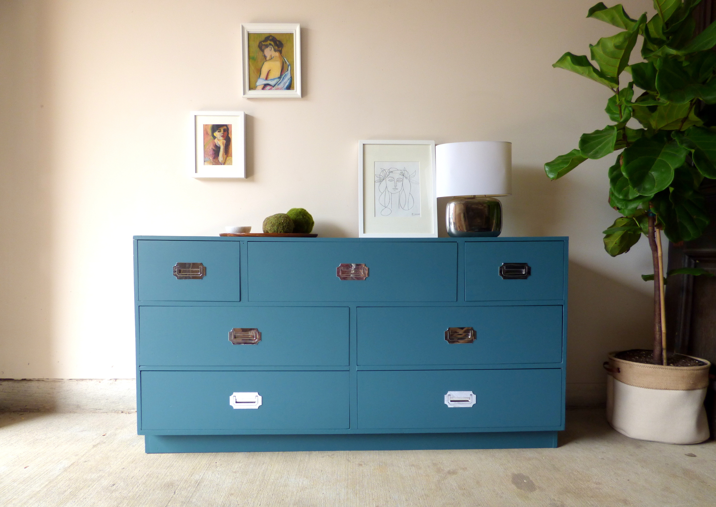
Courtney, her husband Brandon, and their cat Oliver share this space that expertly mixes bohemian, mid-century modern, and rustic styles. 

From Courtney:

Our apartment creates a true reflection of us. We wanted it to feel honest and homey with a mix of stylish and functional pieces. I don’t bring anything into the apartment that I don’t absolutely love. Our core pieces are all favorites and we hope to live with them for years to come!

One of those core pieces is the dining room table. Courtney's dad built this beauty using hairpin legs Courtney purchased on Etsy and a raw tabletop made from a large plank of wood.

But key message here: sticking with the tried & true things you love does not mean your style becomes stagnant. In Courtney's case, she still leaves plenty of room to be inspired by the places she goes, people she meets, or even trends that permeate everything we see online. 

I always struggle with my place being too trendy. I love marble, pineapples, macrame, mudcloth, rattan, and brass as much as the next person but I try to bring those elements in small doses. They’re a way to make a statement without the investment.

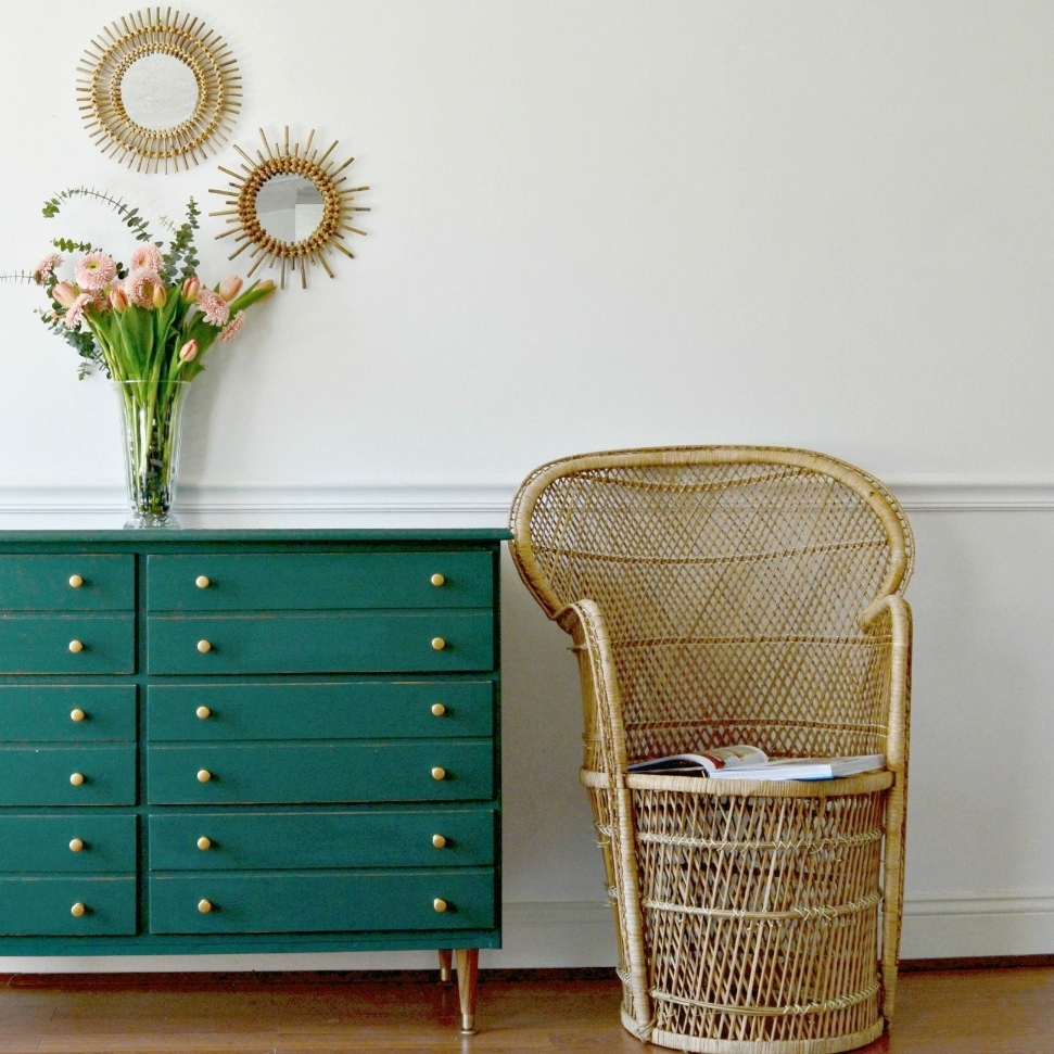
Speaking of rattan... take a moment to absorb Courtney's expert incorporation. That hutch piece is to. die. for. 

The expert pairing of calm design and showstopping pieces continues in the bedroom. Courtney commutes to Boston for her day job, and this room is the perfect place to collapse after a long day. In the bed... or that chair... THAT CHAIR!! 


It's my duty to tell you all that Courtney got that chair from a friend for free. I'm sorry for any feelings of jealousy this fact is now leaving you with... 

Courtney, way to rock every single corner, nook, and wall of your 900 square foot space. You are a master! 

Follow Courtney along on Instagram or on her blog! You can also see more of Joyelle West's amazing photography here and here

See you next week, 

Color of the Year: Did Pantone Get It RIght?

Hi friends! Over the better part of the last decade I have found a tremendous amount of enjoyment from home decorating and styling. I desire to further my knowledge and soak in as much as I can both from a creative standpoint as well as the business. A large part of this business is understanding the ebb and flow of trends. Trends have always fascinated me even well before I stepped into the interior decorating world. How does an idea take off and become trendy? Who gets the ball rolling? Is it every day people or the rich and famous?

Then you have trend predictions which further add to my curiosity. One of the first trend predictions I started following a number of years ago was the Pantone color of the year. Didn't know there was such a thing? Here, take a look at some of their recent selections:

How do they pick the color year after year? I understand it from a marketing standpoint. With every declaration of which color will be leading the way that year you see the ripple effect right down to the most accessible and popular shopping destinations, such as Target, HomeGoods, Pottery Barn, etc. And then the celebrity designers partnering with those stores, (think Emily Henderson and Target), start styling their projects with the newest goodies available, showing everyone just how to incorporate the declared color of the year in a tasteful, manageable way.

This year the color turned out to be a twofer! They picked not just one, but two colors for 2016: Rose Quartz and Serenity. Here, they created this image of a faceless woman wearing a flowing cape to make the announcement:

Since this is an honest place I'll admit, I wasn't terribly excited by this combo. It brought me back to the days of when we had new boy-girl twins under our roof and everything was baby pink and baby blue. And really, other than a blush crocheted throw pillow at target I've barely noticed these colors make any strong statement this year.

Then something strange happened. I started noticing a different color breaking through the color-of-the-year combo - dark green!

If you're a big Fixer Upper fan you may recognize the photo above and the one below. They're just two examples from Joanna Gaines' strong use of dark green in their latest season which finished earlier this year. I noticed this color in just about every episode and I absolutely adored it.

And with the Fixer Upper cult following, I wondered if anyone else noticed as well. So I picked up a can of dark green, (Behr's 'Secluded Woods'), to refinish a mid-century dresser last Spring and it got scooped up within days. I had so many inquiries on that piece that once it sold, I had an immediate request for a nearly identical custom piece, (below on left).

I took the Summer mostly off from refinishing to focus on my family and some design jobs, but as soon as the kids went back to school last week I painted this beauty below in Ralph Lauren's 'Scholar Green', and it was taken within two days.


Is there a new color trending? Will it carry over to 2017? I sure hope so as we've got a little surprise to show you in a design job we're working on right now! But until we're ready to reveal, here are some more stunning examples of this moody color casually staking its claim:

Thank you all for stopping by!

Teal Campaign Chest ||A Craigslist Experiment||

As active furniture flippers for the past 6 years, Chelsea and I really have our fingers on the pulse of our local craigslist.  In fact, between the two of us, we have found and flipped nearly 200 pieces in the DC Metro area - which has proven to be a crash-course in decor supply and demand.  We've often shifted our aesthetic to capitalize on budding trends: specializing in chalk paint + heavy distressing, hunting down mid-century modern scores, playing with bohemian touches, etc...  

When we decided to launch StyleMutt Home in September 2014 we started to really pushed the decor envelope to try out new styles, paint colors, staging techniques, patterns.  And we've had a BALL YA'LL.  Exercising these creative muscles started opening up design possibilities (see some of our latest here and here).  We chalk this up to the Lord's blessing.  And that being yourself is so much more rewarding than just trying to fit in.

Some Personal Fave Past Projects


So lately our Craigslist spidey-senses have started noticing some developing trends.  The price for Grandma's old dresser is going up in correlation with the sheer number of DIY pieces for sale.  Now, we LOVE seeing so much budding talent in our area.  But it makes us ask ourselves how can we stand out to potential buyers?

So when I found this campaign piece, I decided to conduct a little experiment.  (I actually do this often when staging my pieces for sale).  I LOVE bright, bold, loud colors.  On/ in/ around everything.  But based on what I've seen in our area, most people want a "tamer" more rustic look and something too eclectic could be a off-putting.  So I decided to refinish this piece in a color that would still play well with the neutrals that are so indicative of the farmhouse craze everyone is in these days.

If you're as obsessed with HGTV like I am, you may notice that the predominately grain sack and burlap color scheme of the farmhouse scene has started to relax it's restrictions the rest of the color spectrum.  Home decor shows like Fixer Upper (a personal fave) have started mixing in muted teals, deep greens, saturated navys, matte charcoals, and warm woods amongst all that greige.  And well I just happened to have a can of muted teal on hand from a custom order so I went for it.

I still styled it with some fun abstract art because well... it's me we're talking about here.  The hung art is intentionally undersized (it's so wrong it's almost right) in hopes that it shows how a "safe" piece can still be used in bold ways (you know - just in case it struck a cord with a another style mutt in the market for some new furniture ;)

I laid aside my overactive love of brass and styled with a silver lamp to match the chrome pulls.  In my mind, silver is a "safer" choice for hardware because brass can rub some people the wrong way (I used to only see the 80's when I saw yellowy brass, but just because I've changed my tune doesn't mean everyone else has).  Besides they original chrome pulls with in immaculate condition - all they needed was a little polish.

And for good measure (since FLFs are after all quickly becoming the standard for home decorators) I asked my newest plantchild Figadora the Fiddle Leaf Fig to pose with mommy's newest flip.

So now we wait for the experiment's results: will the piece appeal to a lot of potential buyers with a variety of styles?  Will it only attract another style mutt like myself?  Or will it sit in the garage shop until I try something new?  I'll have to keep you posted.  In the meantime, how would you characterize your style?  How does this gray-blue piece strike you - yay or nay?

Muted Teal Campaign Chest
58"L x 16"D x 30"H
Now Available for Sale
$545