Today I have the privileged of debuting not only a fresh piece but also a fellow creative! Posts like these are some of my favorites - when two creatives join forces to make something together. I connected with Cory of Modern South via Instagram and jumped at the chance to work with her on a juicy collaboration.

Modern South Studio
Original Artwork by Cory McBee
Charleston, SC

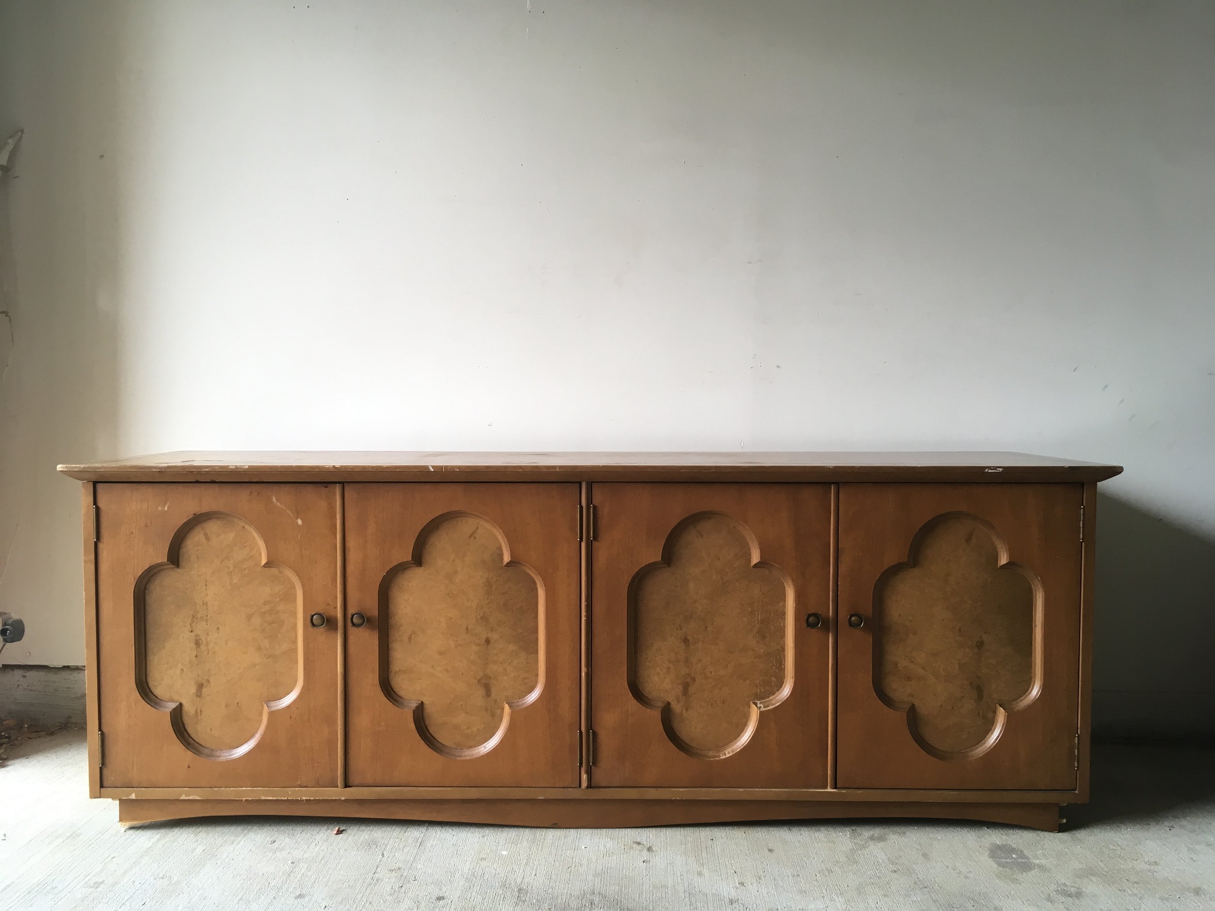
Cory and I share a mutual love of color and abstract art. When we were looking for an excuse to work together, I had the perfect piece in mind to show off her ethereal landscapes art. I found this four door credenza without a leg to stand on and the sweet quatrefoil detailing was so endearing that I couldn't pass it up.
Plus I was jonesing to do something in a buttery gray again.

The classic lines of this piece called for a feminine and glam look - something a little softer than I normally debut in the garage shop.
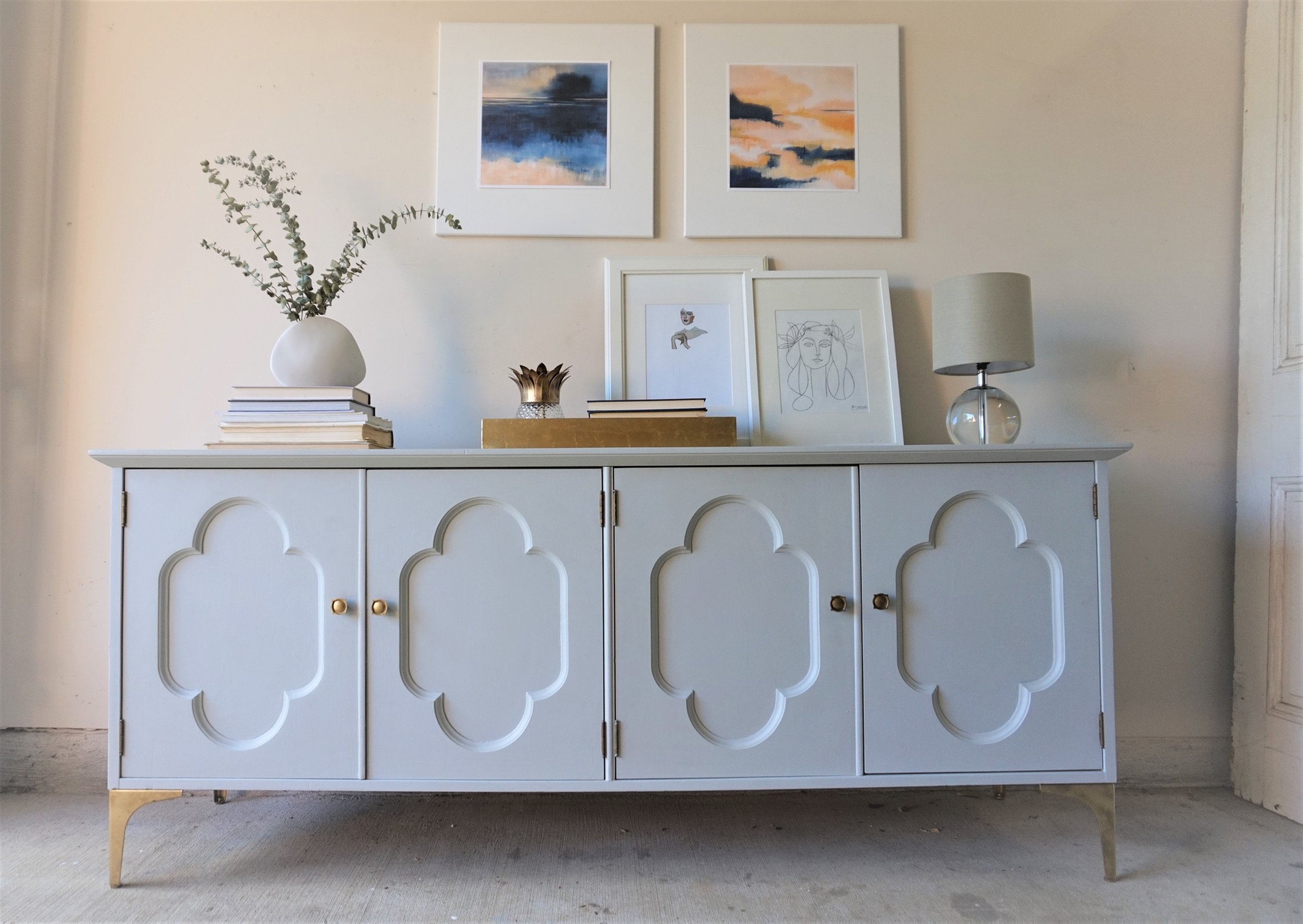
The paint color I went with was Hailstorm Gray by Behr Marquee. In person, it's almost blue, almost purple, almost green and therefore an all-around very mysterious neutral.


It actually did pain me a bit to paint the burled wood inserts on the doors but there were too many areas of damage that needed repair and I just couldn't picture a two-toned look. I think because the two-tone is more indicative of a modern streamlined piece that wouldn't fit a piece like this with more decorative details.

For her new gams, I found these metal 7" legs. Their sleek lines help modernize the credenza so it can appeal to a wider variety of home decor styles.

The piece's original floret-ed knobs complimented the quatrefoil design on the doors too perfectly to give up so I gave the legs our favorite faux-gold finish to match.


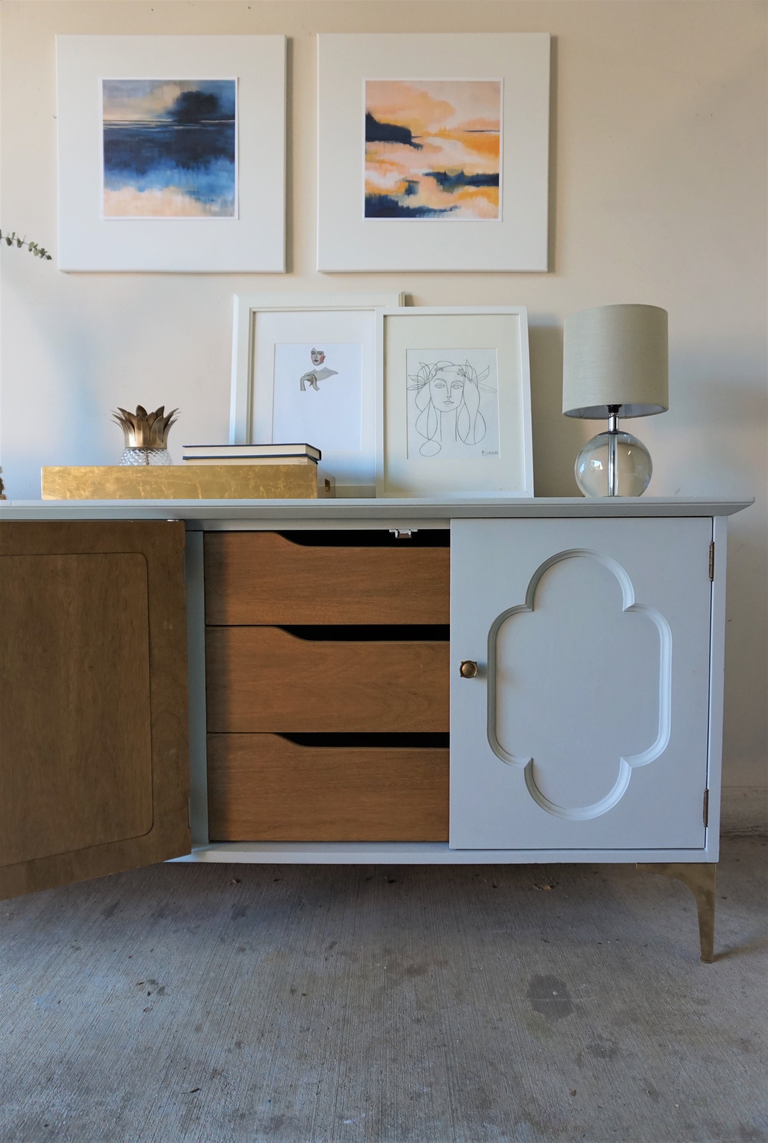
Inside is a cabinet on the left

and a set of drawers on the right.
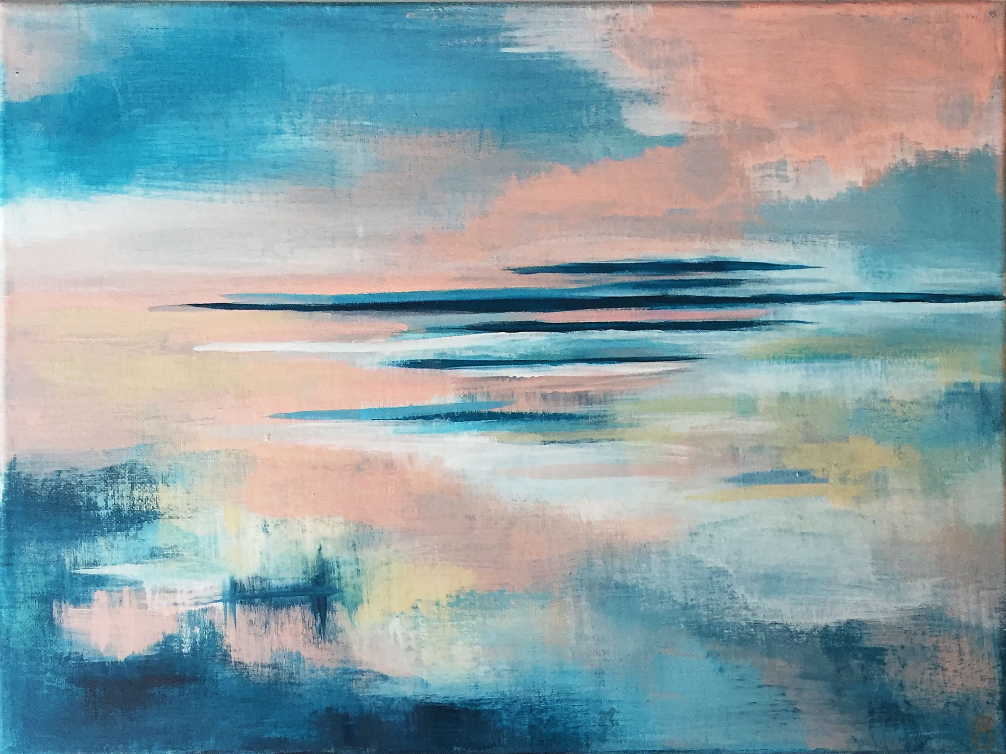
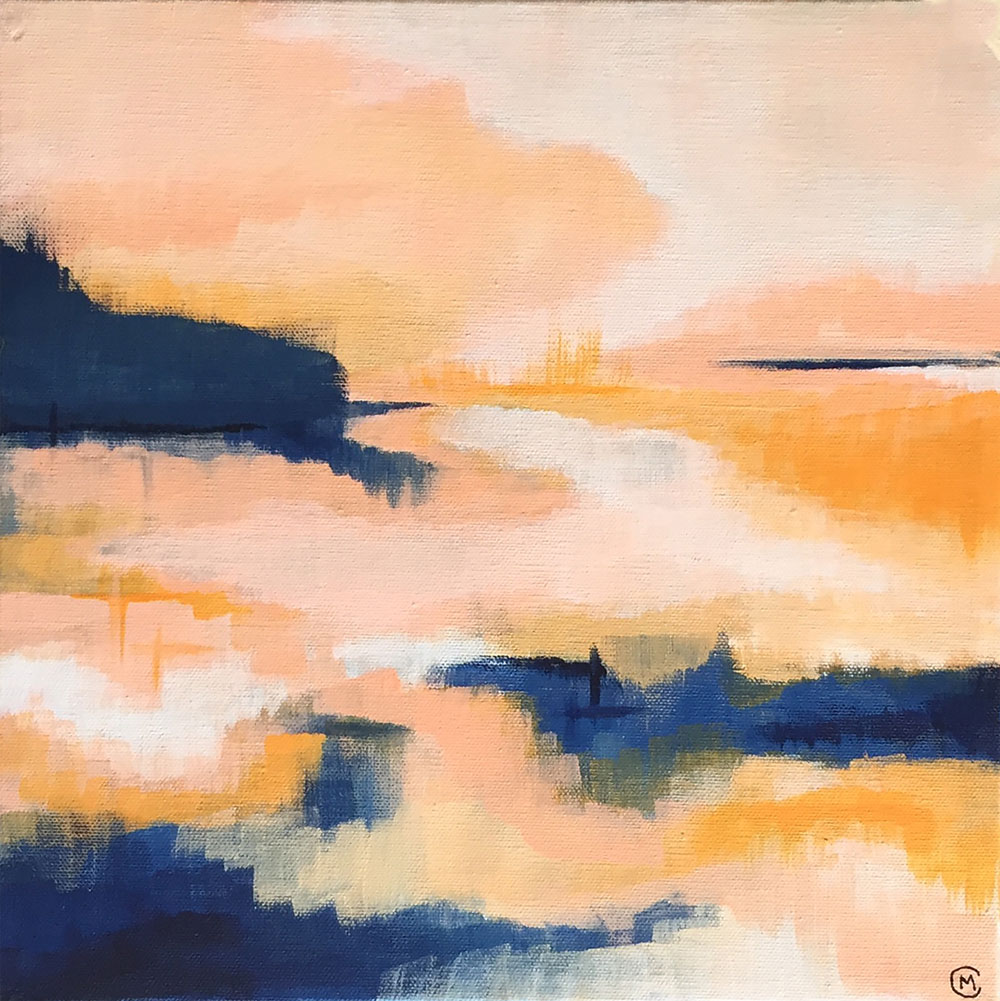
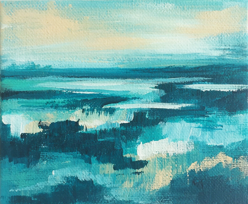
Any one of her prints would have been the perfect compliment, but Cory's "Blue Fever" and "Dreaming in Orange" make such a lovely couple.
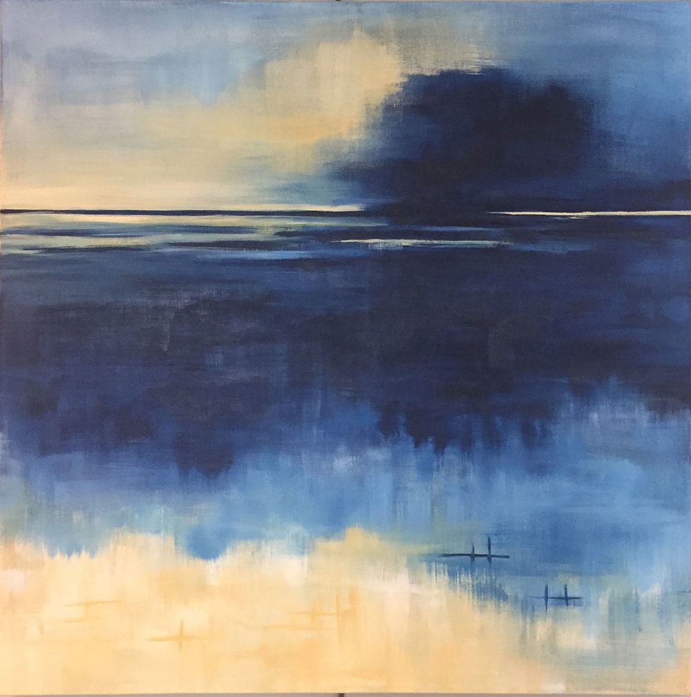
Blue Fever by Cory McBee, Modern South Studio

Dreaming in Orange by Cory McBee, Modern South Studio
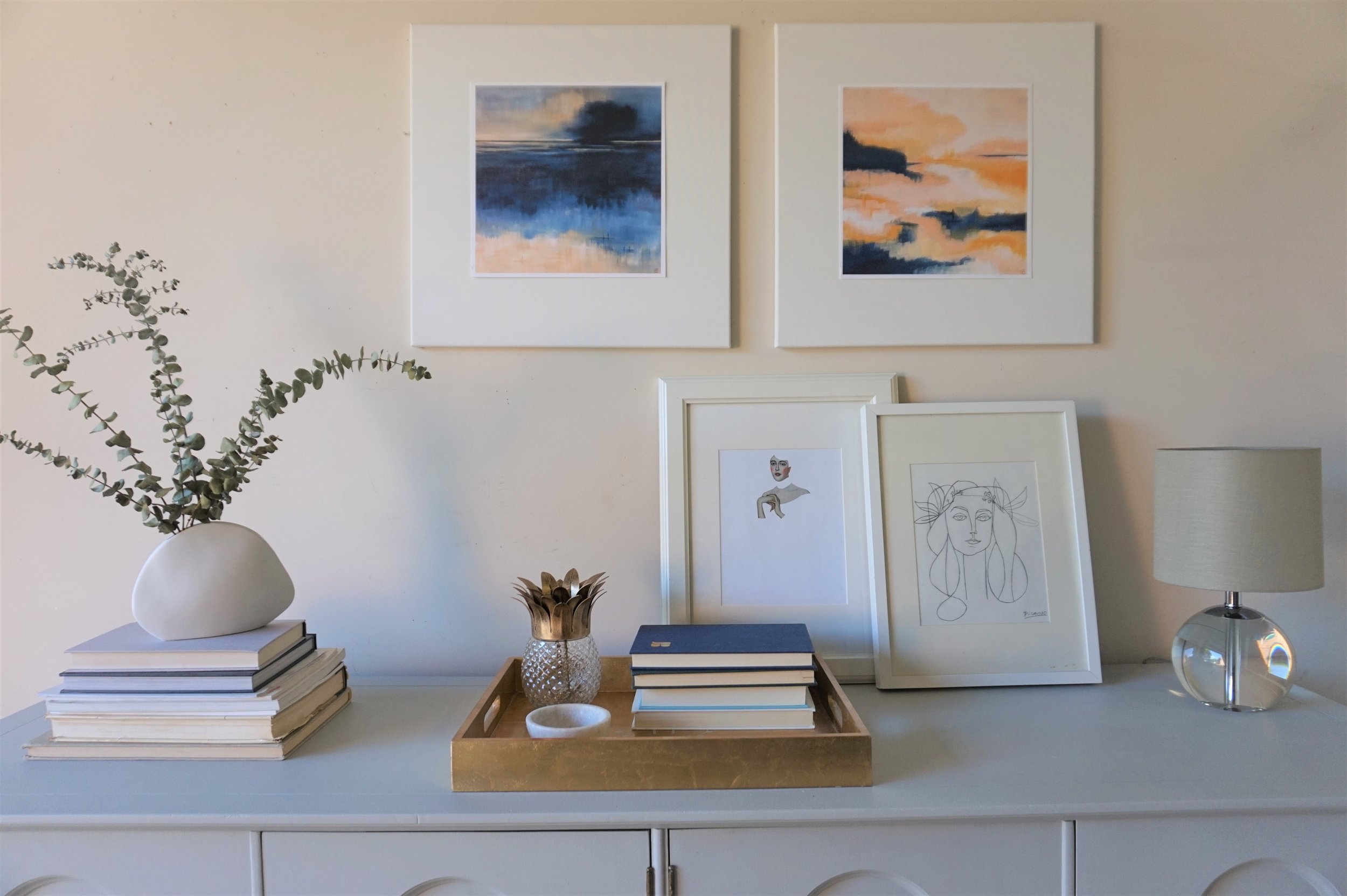
The navy and blush paired with the gray and gold of their piece reminds me of a quiet sunrise.

I kept a relatively neutral color scheme with the rest of my decorative items: dried eucalyptus in a white ceramic vase, a couple stacks of books, white picture frames and touches of glass and gold.

Cory's prints are the precise soft/ feminine accents I was picturing when I finished this piece. If you want a set of your own, you can shop Modern South Studio or email Cory for customize print sizes. And if you're local to the DC Metro area, this gray quatrefoil beauty could also be yours.

Gray Quatrefoil Dresser
Now Available for Sale
72"L x 20"D x 30.5"H
$685
If you are interested in this piece or a custom order like it, email me at cate@stylemutthome.com.