Oh Grow Up... Art ||Flip List Item No.4||

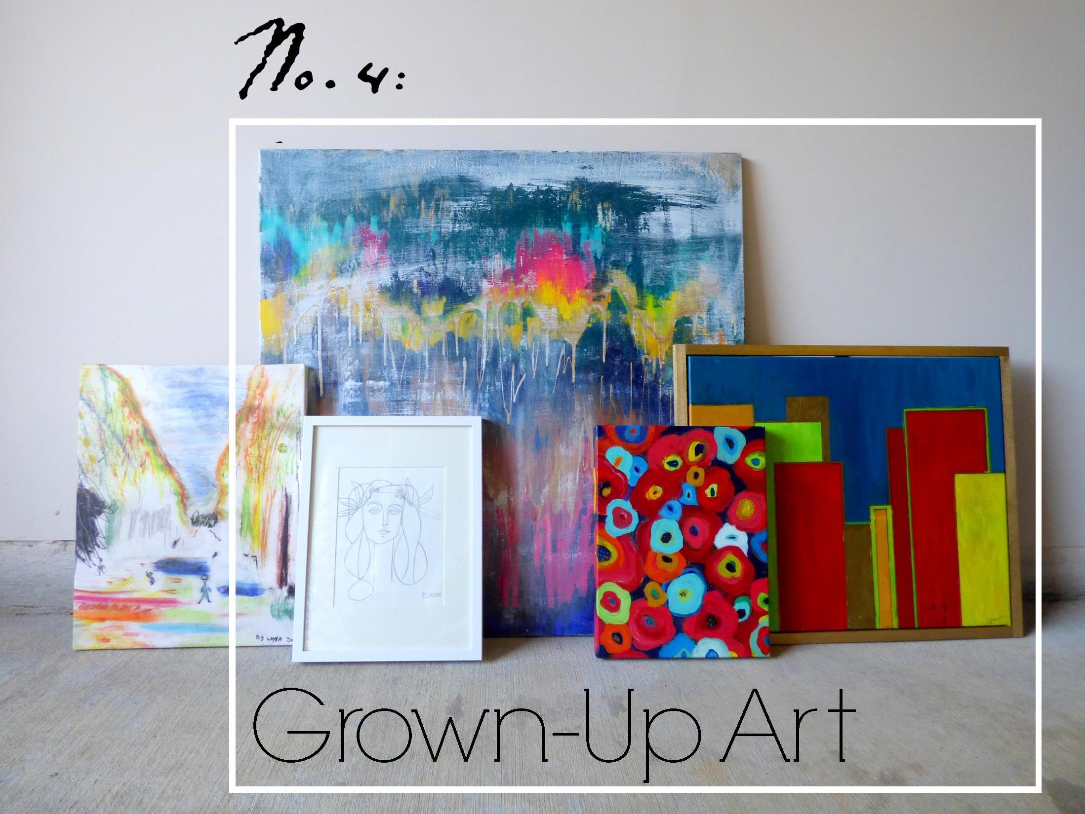
For a few months now, my collection of original abstract artwork has felt...off.  It's like you're trying to copy your mom's crowd-pleasing artichoke dip and yet it just doesn't taste the same when you do it - you feel me?

image.jpg

In an effort to solve this art conundrum, I declared "Grown-Up Abstract Art" as item No.4 on my furniture flip bucket list and began to do some research on what ingredients may be missing from my art collection.  After consulting pinterest, I kept stumbling on some delicious abstract art showcased in gorgeous, minimal floating frames.  

Source: Ellen Dodd

Source: Ellen Dodd

And so my first theory was formed.  I rummaged up some spare wood trim to fashion a make-shift gold frame for one of my smaller pieces, but when I finished it still felt juvenile somehow.  

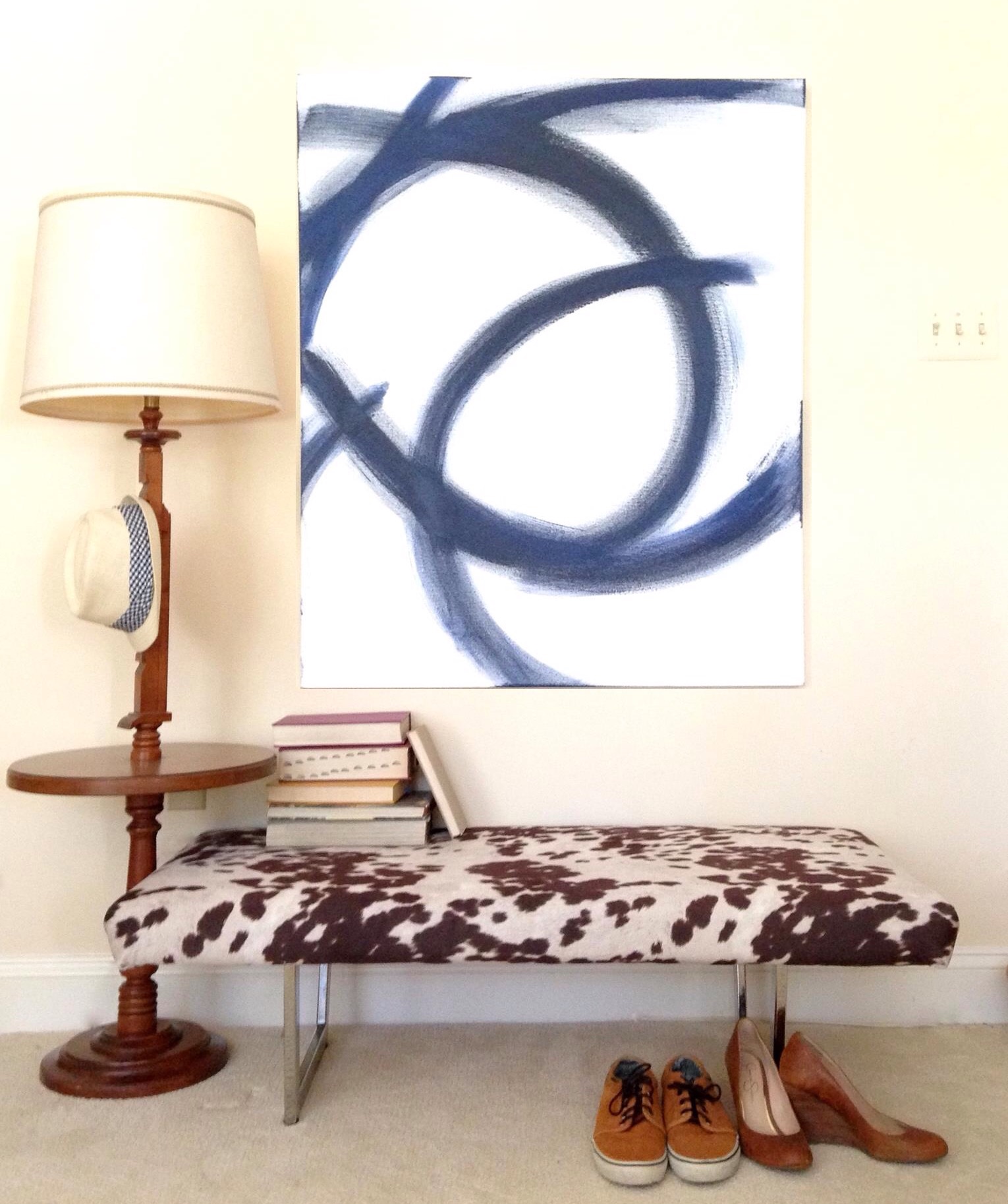
After mulling over it for a little while longer, I began to think that perhaps my portions were off.  I love to paint but I'm no professional artist - when I paint, I can't help myself: I love ALL THE COLORSSSSSS.  But perhaps I need to balance out the generous helpings of bold pops of color with some graphic patterns and white elements like this large piece I painted to help stage the cowprint bench.  [It actually sold at our Pop-Up Shop at Sweet Clover Barn so I never got the chance to mix it into my new abstract art recipe.]   And interestingly enough, despite my obsession with large-scale abstract art, I don't actually have any pieces hanging in our apartment. 

Ok so let's meet the "art ingredients" I do have in stock and let's see if we can mix them together for a winning combo.

Meet Art.jpg
Van Gogh's Les Alyscamps

Van Gogh's Les Alyscamps

  • "Les Ales Camps" - a 3rd Grader made this piece at a school I worked for.  The elementary art program was doing a series on Van Gogh and this young artist was studing Van Gogh's Les Alyscamps (which she mistakenly labeled as "Les Ales Camps" in the top right corner lol.  I loved the playful take so much that I had it printed on a canvas to hang in my office.
  • "Unnamed" - this is the largest piece of abstract art I've done and yet I haven't found a place for it.  I think I feel like it would overpower any of our small spaces so I've never hung it in our home.
  • "Hadley" - this is the piece I tried to give a floating frame.  I think the proportions are off and I would like it better if the frame were thinner and little daintier.
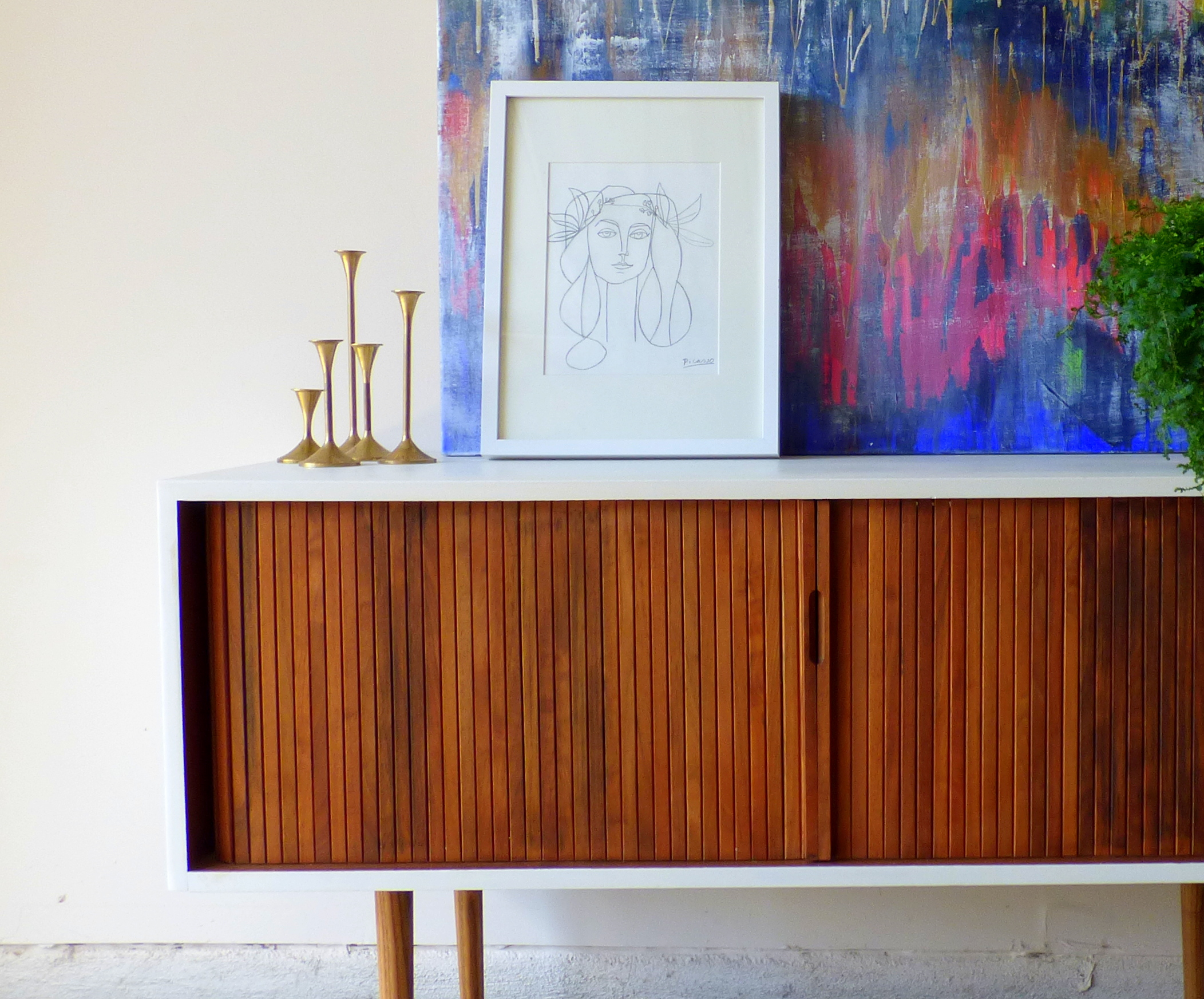
  • "Picasso" - this is another piece I can't take credit for.  I just love this line drawing so much that I traced it on some paper and popped it in a frame - forgive me Pablo P.
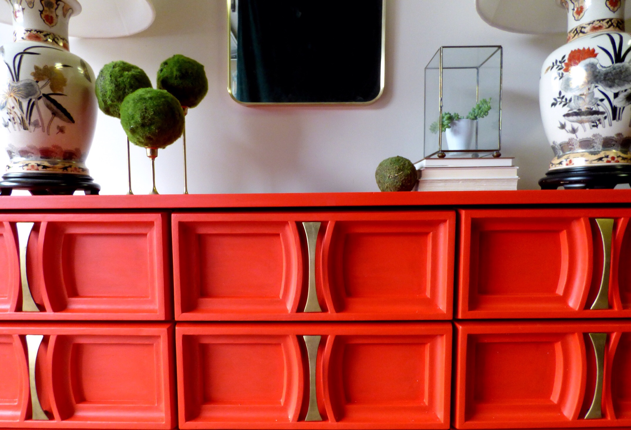
  • "A Riot of Color [in a dreary world]" - name that movie!  I painted this poppy-inspired piece while watching a Heath Ledger favorite (may he rest in piece).  You may recognize this pop of red from staging this piece here

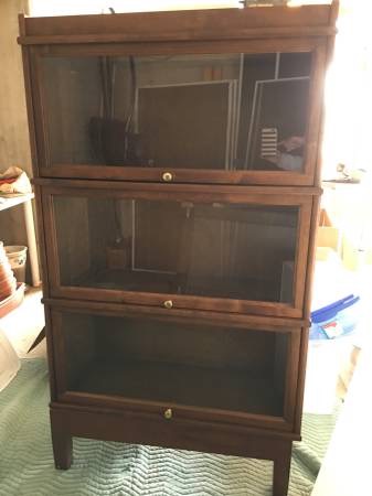
For plating purposes, I've enlisted the help of a fresh flip who'll be heading to his new home in DC soon [I removed the original toe-kick and added tapered legs with the nickle caps cut off and painted the top and sides a glossy white].
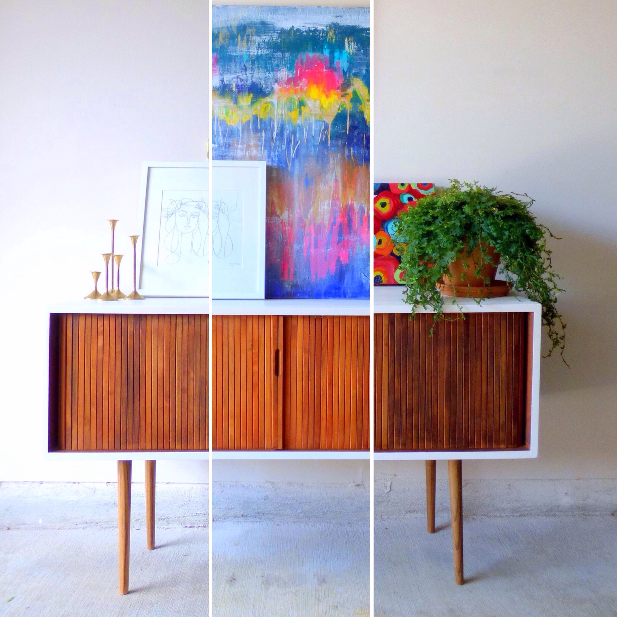
P1010468-001b.JPG
image.jpg
image.jpg

Art Recipe No.1:

image.jpg

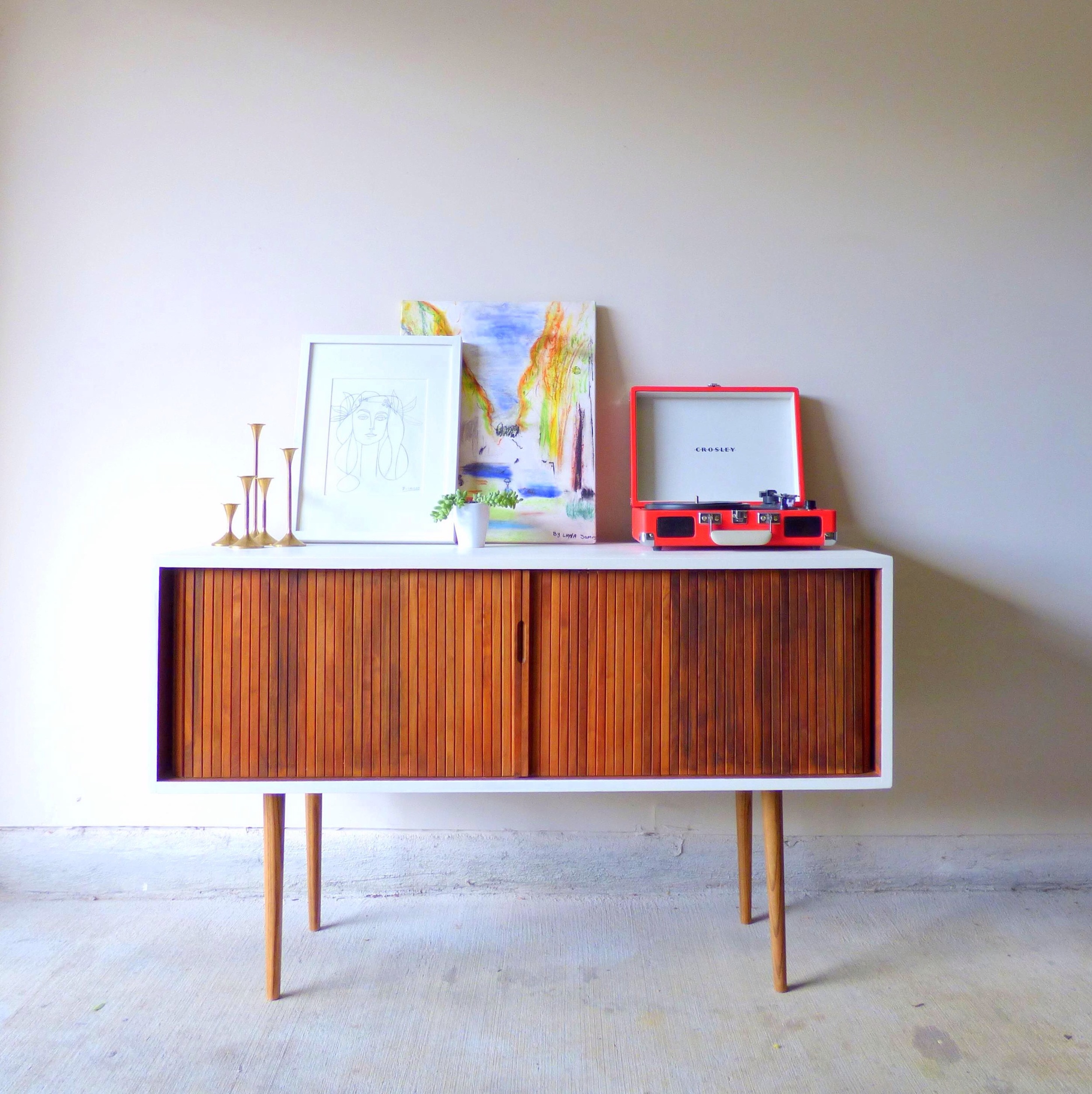
Playful "Les Ales Camps" with a side of "Picasso" garnished with plant, brass candlesticks and record player served on a Mid-Century Record Console Table with storage for your vintage record collection.

image.jpg

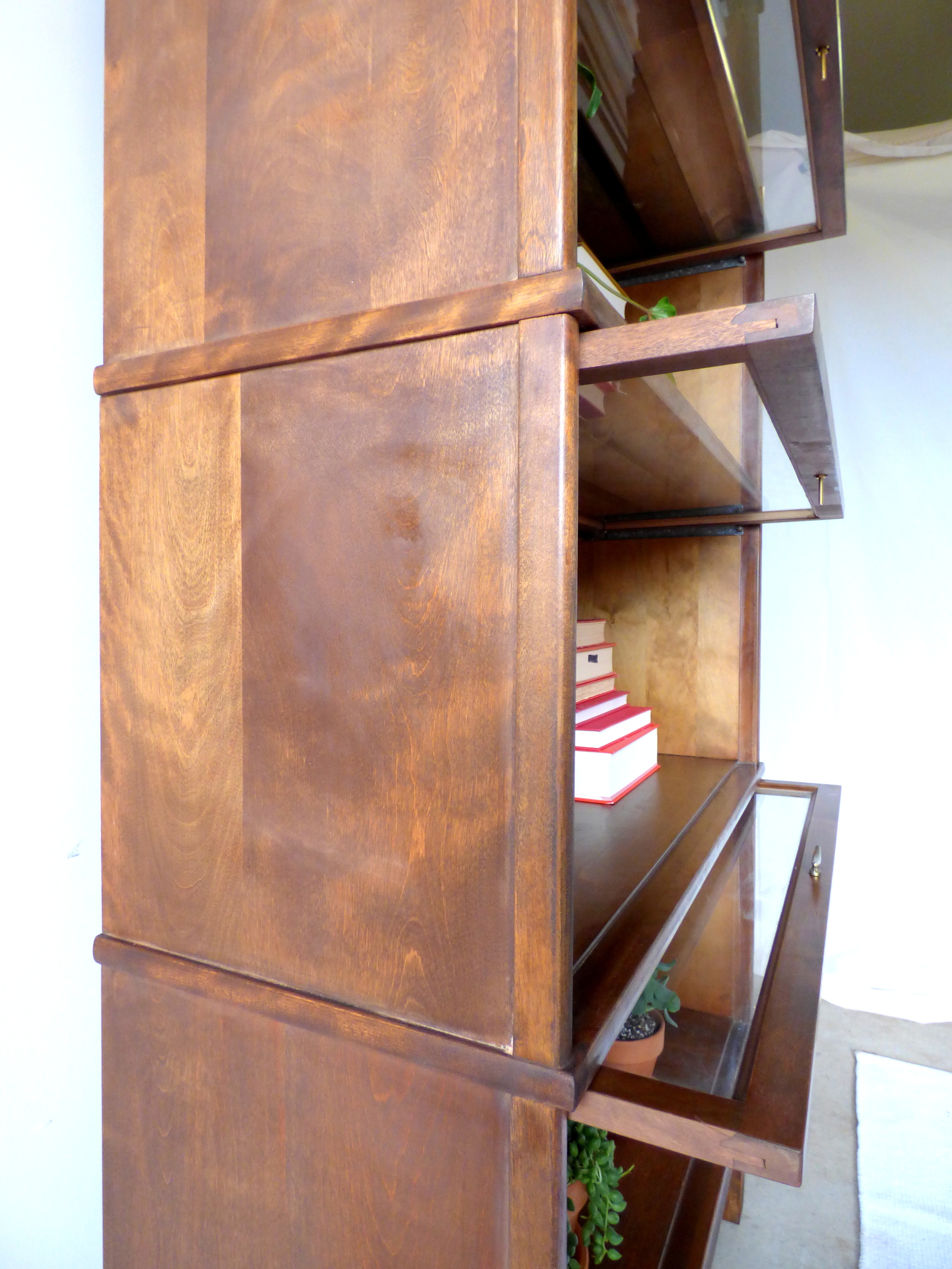
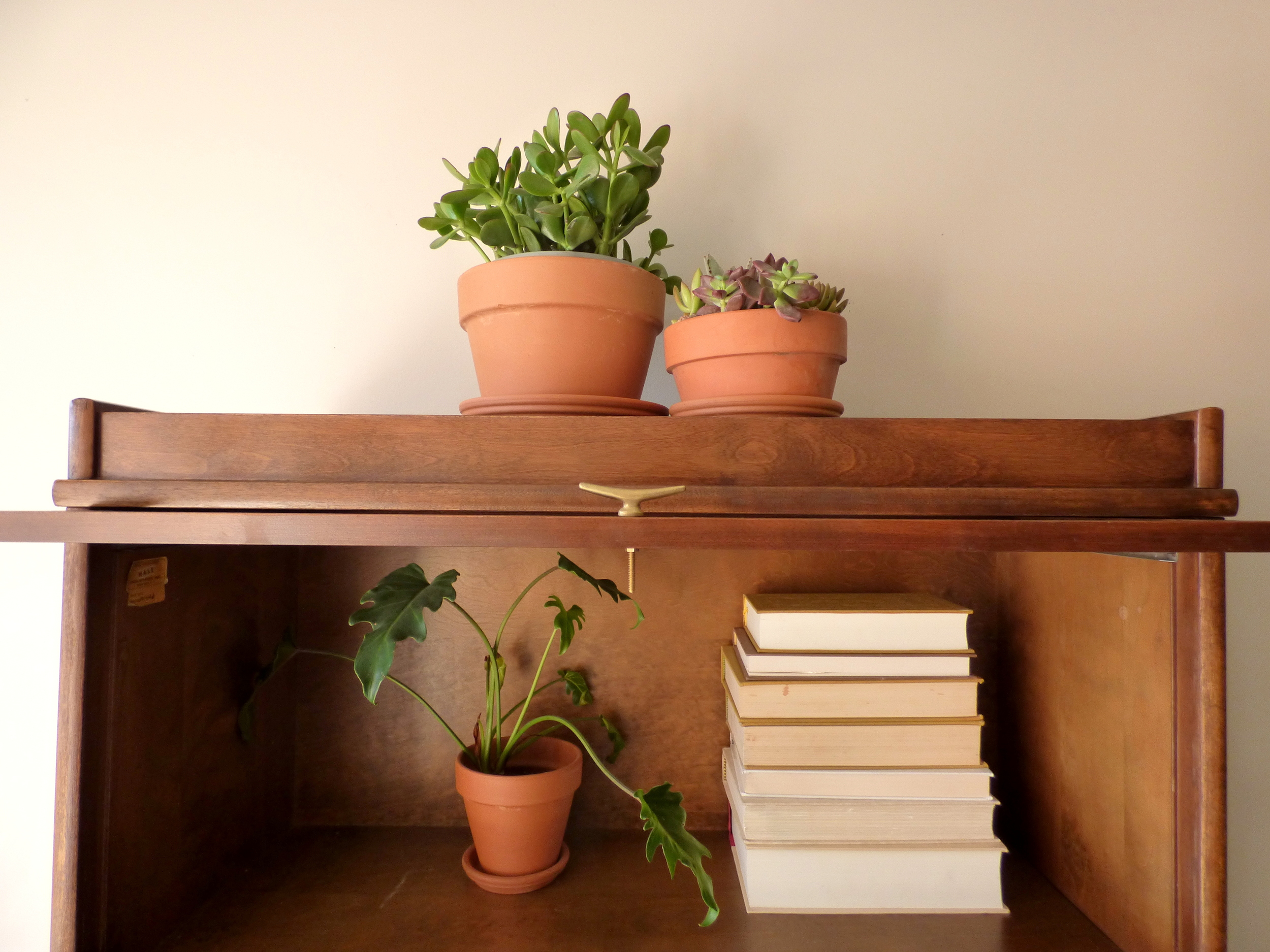
[How cool is that rolling door for space-saving storage?!  And there are four compartments inside with removable vertical dividers.] 

image.jpg

To combat my tendancy to over-saturate with color, my thought here was to pair the two "lighter colored" art pieces on a white-wall background.  The smaller graphic "Picasso" cuts the intensity of the color in "Les Ales Camps" and the record player.

Art Recipe No.2:

image.jpg

A large helping of "Unnamed" abstract with a side of "Picasso" drizzled with candle sticks and a fern for garnish.  Since "Unnamed" is such a powerful flavor, I also tried to soften it with the dainty print and anchor it with a large plant. 

Art Recipe No.3:

image.jpg

Spiced "Riot of Color" and "Hadley" with creamy "Picasso" served with natural elements encased in glass cloches and garnished with a potted fern.

image.jpg

[Look at that gorgeous wood grain in the slats of the console table's rolling front.]

image.jpg

Since I was using two bold paintings, I again employed the "Picasso"print and accented with the airiness of the glass cloches.

image.jpg

[Fun fact: the stand for the raw mineral is just one of my fluted candlesticks turned upside down].

image.jpg

Which recipe hit the spot for you?  Any suggestions on how to make my art collection more flavorful/ refined/ spicy?  Leave your tips in the comments below!

image.jpg

Mid-Century Record Console Table
48"W X 18"D X 29.5"H
SOLD
$525

If you are interested in a custom order like this piece, please contact me at  cate@stylemutthome.com

image.jpg

Check in on the progress of this year's furniture flip bucket list:

Styling with Heirlooms ||And 2016 Flip List Item No.5||

Show of hands: how many of you have inherited a piece of furniture or decor that you're not sure will translate across generations and fit seamless into your style?

Chelsea and I have both been blessed by (free) heirloom pieces from family members.  These pieces represent our family history - and are usually of a much higher quality than what's for sale in the big box stores (that I can afford anyway).  So do we compromise a fresh young style for dated decor that has better bones?  Luckily it's not always a one-or-the-other situation.

As style mutts, we've learned that there are ways to mix old and new styles that still feels fresh, hip, and most importantly like you.

Take Chelsea's heirloom headboard for example.  I bet if we looked at a slide of Chelsea's blood under a microscope we would see mid century modern sprinkled with bohemian, rustic, and maybe a touch industrial.  And yet, when she was offered a gorgeously ornate bedroom set, Chelsea didn't turn it down just because it was on the traditional side.  She said thankyouverymuch to Grandma and welcomed home a bedroom set with rich family history (her great great grandma was born in that bed - can't get any "richer" than that ;).

image.jpg

She found a way to take a piece with such formal presence and make it feel ...dare-I-say-it... casual.  The modern stencil (that's right, I said STENCIL) paired with  a floating nightstand, a modern brass sconce, and some fun pillows has this vignette speaking fluent boho-chic instead of in a thick formal accent.

Now recently I had the opportunity to play with some heirloom pieces myself: a pair of rather large and stately ginger jar lamps.  I don't often gravitate towards the Asian flare of chinoserie-style pieces, but these babies have some beautiful details and just the right shade of red for a piece I just finished... 

Remember this guy?

image.jpg

As you may know, I set out to refinish a dresser in another jewel tone (I just can't help myself) for this year's Furniture Flip Bucket List.  And back in January I asked you all to help me figure out what color I should choose for this mid-century fella.   I thought that by polling you, I would 1) be able to determine what bold color would most attract a buyer and 2) get some clarity on what I my color-loving self really wanted deep deep down...


 You know when you ask your mom to help you decide between two outfits?  And after she gives you her opinion, you go with the opposite of her suggestion?  I did this repeatedly in my teenage years and my mom would always throw her hands up and walk away saying "Why did you even ask me in the first place?!" Well my friends (and mom) - I ask because sometimes I need you to activate my emotional-decision barometer.  If I feel even the slightest twinge of disappointment when I hear your suggestion, then I can finally get some clarity on what I really really want.  When I asked you all which bold color should I refinish with, I was surprised that Emerald won with Teal and Navy in a close race for second.  But the more I thought about it, the more I realized doing another teal or navy piece or trying to follow up Chelsea's knock-out emerald tall boy  wouldn't satisfy my jewel-tone craving.

Soooooo I went with my gut and chose one of the underdog colors...

image.jpg

Poppy Red

Did you see that coming?  I'm so sorry if I let any of you down who were rooting for a different color.  But rest assured, my jewel-tone days aren't done so you can expect some future fun projects.

image.jpg

How does he compare to the original rendering?  Close no? 

image.jpg

Let's loop back to the lamps really quick.  This staging sesh was a total alignment of the stars.  I had a bold piece to style that really needed to be balanced by a strong pair of  lamps.  My father-in-law had recently decided to shed some office decor he had inherited from his folks and asked Chelsea to help him photograph some oriental lamps for resale.  While loading up for our latest design project, I happened to spot grandma's vintage but in-impeccable-condition lamps (with the PERFECT color scheme and scale no less) in Chelsea's garage. 

image.jpg

And in the spirit of killing two birds with one stone, I borrowed the lamps in hopes that Big Red and his lamp arm candy could help each other find new homes with a fun photoshoot.

image.jpg

I accidentally stumbled on this color scheme: poppy red + hunter green.  And I'm really digging it.  Red and green are opposite each other on the color wheel so they really make each other pop.  But a red with an orange tint countered by a saturated green keeps it from going too...Christmasy.

image.jpg
image.jpg

I decorating with brass to bring out those gorgeous bow tie handles.

image.jpg
image.jpg

The impromptu moss & candlestick topiaries are both classy and whimsical which keeps this vignette fresh instead of stuffy.

image.jpg

Now I'm kind of hoping someone will buy all three so they can stay together forever.

image.jpg

Poppy Red Dresser
64"W x 19"D x 31"H
Now available for sale
$545

If you are interested in this piece, a custom order like it, or if you're local and are looking for some immaculate antique ginger jar lamps, please contact cate@stylemutthome.com.  

image.jpg

If you want to catch up with my progress so far on the 2016 Flip List, here's where I'm at:

Barrister Bookcase ||a subtle makeover||

Why don't I talk about bookshelves more often?  They add height to a room and critical vertical storage.  I guess because I don't have a HUGE book collection, I don't think about just how awesome these pieces of furniture are.  Bookshelves are like the Jan of the Brady bunch and dressers the Marsha, Marsha, Marsha.  In fact, with the exception of the white triplets from my own home, this is the first time I've refinished shelves to sell!

Photo Mar 18, 10 13 33 AM.jpg

It's hard to tell, but this piece was originally as glossy as a 90's kitchen cabinet.  And the base painted (not stained!!) a fake brown.  Womp womp.  So first order of business was stripping off the polyurethane and the stain and sealing it with a Danish oil instead.

P1010042-001.JPG

Barrister bookcases (also known as lawyer's bookshelves) are handy because they have glass doors to protect from dust.  Which makes them perfect for protecting your books or other precious collections.  When staging this piece, my first thought wasn't actually to use books.  This is partly because I don't have a big juicy book collection, but mostly because of a photo my dear friend Amanda from Our Storied Home recently posted on Instagram:

Genius way to display the all-precious shoe collection no?  I mean, WOW-ZA!  (And who wants dibs on those red satin peep-toes?!?!)  But alas, I actually have less shoes than I have books - so I styled with books after all and filled in any spaces with my plant children.

P1000990-001.JPG

The Danish oil is a nice contrast from the original "plasticky" finish.  It gives it something a little softer and (as I like to call it) buttery.

I also completely stripped the paint finish off the base and custom-mixed a new stain to match.

P1010049-001.JPG

And switched out the original yellowy brass knobs to splurge for more modern pulls from anthropologie.

P1010052-001.JPG

What's $7 for a knob when you only need three lol?!?

This Barrister Boy is an original Hale bookcase - which means he was made in the USA and is built for versatility: the top, the three units, and the base are all stackable so you can add, subtract, and rearrange them however you please!

Each glass pane slides up and stiows away for easy access to your displayed goodies.

And in my case (pun so intended), I'm showing off Big Jade, Tuscon the Succulent Garden, Melvin the awkward leafy thing, Penelope the String of Pearls, Little Jade, and the Jades' cousin Jasper.

And for the record, all my plant kiddos are still alive and (mostly) well. 

Black Thumb out. 

3 Shelf Barrister Bookcase (Barrister Boy)
34"W X 14"D x 60"H
Price: $425 SOLD

If you are interested in this piece or a custom order like it, please contact cate@stylemutthome.com.