Reader Design: Miranda's Welcoming Nest

Oh style mutts, how I've missed you! I'm writing from the comfort of my couch, coffee in hand, because jet lag is real, my friends. And we're back after a brief hiatus with a reader design home that makes coming home oh so special.

Miranda and her family of four have lived in their Charlotte, North Carolina for 13 years, and over that time, Miranda has made it a loving reflection of how she views style and family. They love it so much that they plan to simply add on to the space as they need to grow and stay here as long as they can. 

The warm, welcoming, and eclectic design you see today isn't how this home always looked. As Miranda explains: 

My style came to life a handful of years ago when I was home all day, every day with two kids under two. With baby gear, and toys, and a large dog, I felt like there was just no room to breathe. During nap times, I found myself scrutinizing the living spaces, and trying to figure out how to make the areas feel larger. Over time, I realized our giant Rooms-To-Go couches and random knick-knack decor were suffocating the life and charm out of our home.

And one day it dawned on me: this house was built in the 50s, when furniture was made on a much smaller scale. Why not look for pieces that fit our home, and are meaningful to us? That change in perspective really helped me see the potential in our home, and opened my eyes to being more intentional about creating meaningful spaces for gathering and conversation.


With that revelation in mind, Miranda set out to curate a home that meant something real to her. She and her husband reached out to family and were able to bring in some amazing pieces from their parents and grandparents. There are photos that capture Miranda's husband's grandmother napping on one of the club chairs after Easter brunch, with the grandfather clock quietly keeping time in the background, and Miranda's mom as an infant blowing out her birthday candles at the dining table. 


This home continues to evolve and develop as new influences come and go. For instance, when Miranda read Myquillin Smith's The Nesting Place two years ago, she focused on one of Smith's main design tenets: "it doesn't have to be perfect to be beautiful." And, inherent to that principle, neither does it need to be expensive to be beautiful. 

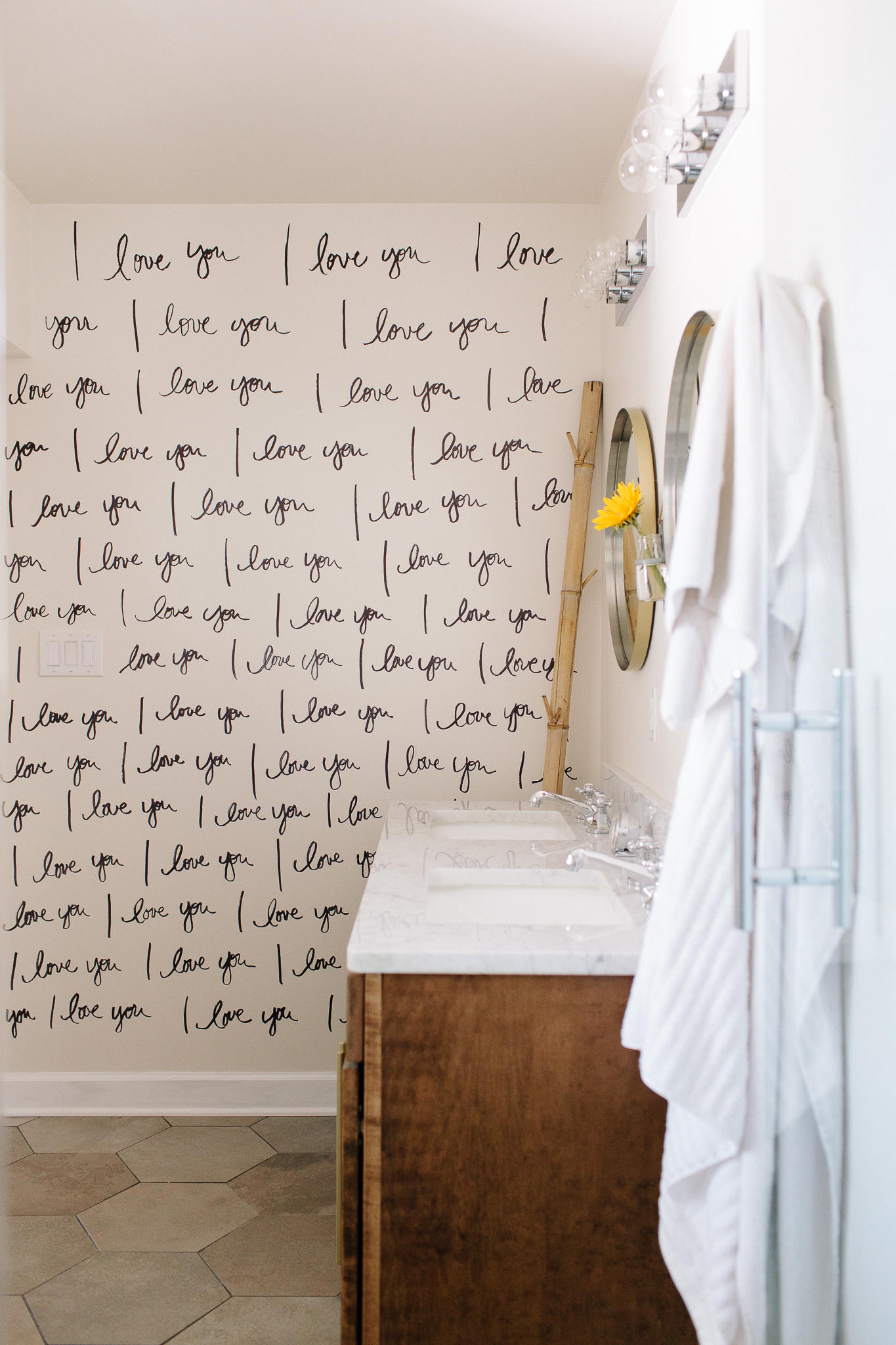
That came to life in the bathroom, where Miranda actually made her own wallpaper with nothing but the wall and a Sharpie. Yes, those "I love yous" specially covering the wall were handwritten by Miranda. If only we all had hands that steady! 

The bedroom is simply beautiful - a relaxing place to lay your head at night after caring for your family. It's actually the newest addition to the home and replaced the original space which was small and dark. Miranda captured the airiness and brightness she was missing in the new space while still ensuring it "went" with the rest of the house. 

It captures her mindset perfectly. 

My approach to decorating is two-fold: 1) it doesn’t have to be expensive, just intentional. 2) it’s all about the people inside this home. Whether you live here and I see you every day, or you’re just visiting for the weekend or coming over to share a meal, you should always feel like there’s a place for you, and that you are welcomed, enjoyed, and loved.

Miranda, thank you for bringing us in to share your home with you today. It is a truly gorgeous space. Mutts, be sure to follow Miranda along on Instagram @thehousethatmercybuilt

See you all next week!

Styling with Heirlooms ||And 2016 Flip List Item No.5||

Show of hands: how many of you have inherited a piece of furniture or decor that you're not sure will translate across generations and fit seamless into your style?

Chelsea and I have both been blessed by (free) heirloom pieces from family members.  These pieces represent our family history - and are usually of a much higher quality than what's for sale in the big box stores (that I can afford anyway).  So do we compromise a fresh young style for dated decor that has better bones?  Luckily it's not always a one-or-the-other situation.

As style mutts, we've learned that there are ways to mix old and new styles that still feels fresh, hip, and most importantly like you.

Take Chelsea's heirloom headboard for example.  I bet if we looked at a slide of Chelsea's blood under a microscope we would see mid century modern sprinkled with bohemian, rustic, and maybe a touch industrial.  And yet, when she was offered a gorgeously ornate bedroom set, Chelsea didn't turn it down just because it was on the traditional side.  She said thankyouverymuch to Grandma and welcomed home a bedroom set with rich family history (her great great grandma was born in that bed - can't get any "richer" than that ;).

image.jpg

She found a way to take a piece with such formal presence and make it feel ...dare-I-say-it... casual.  The modern stencil (that's right, I said STENCIL) paired with  a floating nightstand, a modern brass sconce, and some fun pillows has this vignette speaking fluent boho-chic instead of in a thick formal accent.

Now recently I had the opportunity to play with some heirloom pieces myself: a pair of rather large and stately ginger jar lamps.  I don't often gravitate towards the Asian flare of chinoserie-style pieces, but these babies have some beautiful details and just the right shade of red for a piece I just finished... 

Remember this guy?

image.jpg

As you may know, I set out to refinish a dresser in another jewel tone (I just can't help myself) for this year's Furniture Flip Bucket List.  And back in January I asked you all to help me figure out what color I should choose for this mid-century fella.   I thought that by polling you, I would 1) be able to determine what bold color would most attract a buyer and 2) get some clarity on what I my color-loving self really wanted deep deep down...


 You know when you ask your mom to help you decide between two outfits?  And after she gives you her opinion, you go with the opposite of her suggestion?  I did this repeatedly in my teenage years and my mom would always throw her hands up and walk away saying "Why did you even ask me in the first place?!" Well my friends (and mom) - I ask because sometimes I need you to activate my emotional-decision barometer.  If I feel even the slightest twinge of disappointment when I hear your suggestion, then I can finally get some clarity on what I really really want.  When I asked you all which bold color should I refinish with, I was surprised that Emerald won with Teal and Navy in a close race for second.  But the more I thought about it, the more I realized doing another teal or navy piece or trying to follow up Chelsea's knock-out emerald tall boy  wouldn't satisfy my jewel-tone craving.

Soooooo I went with my gut and chose one of the underdog colors...

image.jpg

Poppy Red

Did you see that coming?  I'm so sorry if I let any of you down who were rooting for a different color.  But rest assured, my jewel-tone days aren't done so you can expect some future fun projects.

image.jpg

How does he compare to the original rendering?  Close no? 

image.jpg

Let's loop back to the lamps really quick.  This staging sesh was a total alignment of the stars.  I had a bold piece to style that really needed to be balanced by a strong pair of  lamps.  My father-in-law had recently decided to shed some office decor he had inherited from his folks and asked Chelsea to help him photograph some oriental lamps for resale.  While loading up for our latest design project, I happened to spot grandma's vintage but in-impeccable-condition lamps (with the PERFECT color scheme and scale no less) in Chelsea's garage. 

image.jpg

And in the spirit of killing two birds with one stone, I borrowed the lamps in hopes that Big Red and his lamp arm candy could help each other find new homes with a fun photoshoot.

image.jpg

I accidentally stumbled on this color scheme: poppy red + hunter green.  And I'm really digging it.  Red and green are opposite each other on the color wheel so they really make each other pop.  But a red with an orange tint countered by a saturated green keeps it from going too...Christmasy.

image.jpg
image.jpg

I decorating with brass to bring out those gorgeous bow tie handles.

image.jpg
image.jpg

The impromptu moss & candlestick topiaries are both classy and whimsical which keeps this vignette fresh instead of stuffy.

image.jpg

Now I'm kind of hoping someone will buy all three so they can stay together forever.

image.jpg

Poppy Red Dresser
64"W x 19"D x 31"H
Now available for sale
$545

If you are interested in this piece, a custom order like it, or if you're local and are looking for some immaculate antique ginger jar lamps, please contact cate@stylemutthome.com.  

image.jpg

If you want to catch up with my progress so far on the 2016 Flip List, here's where I'm at: