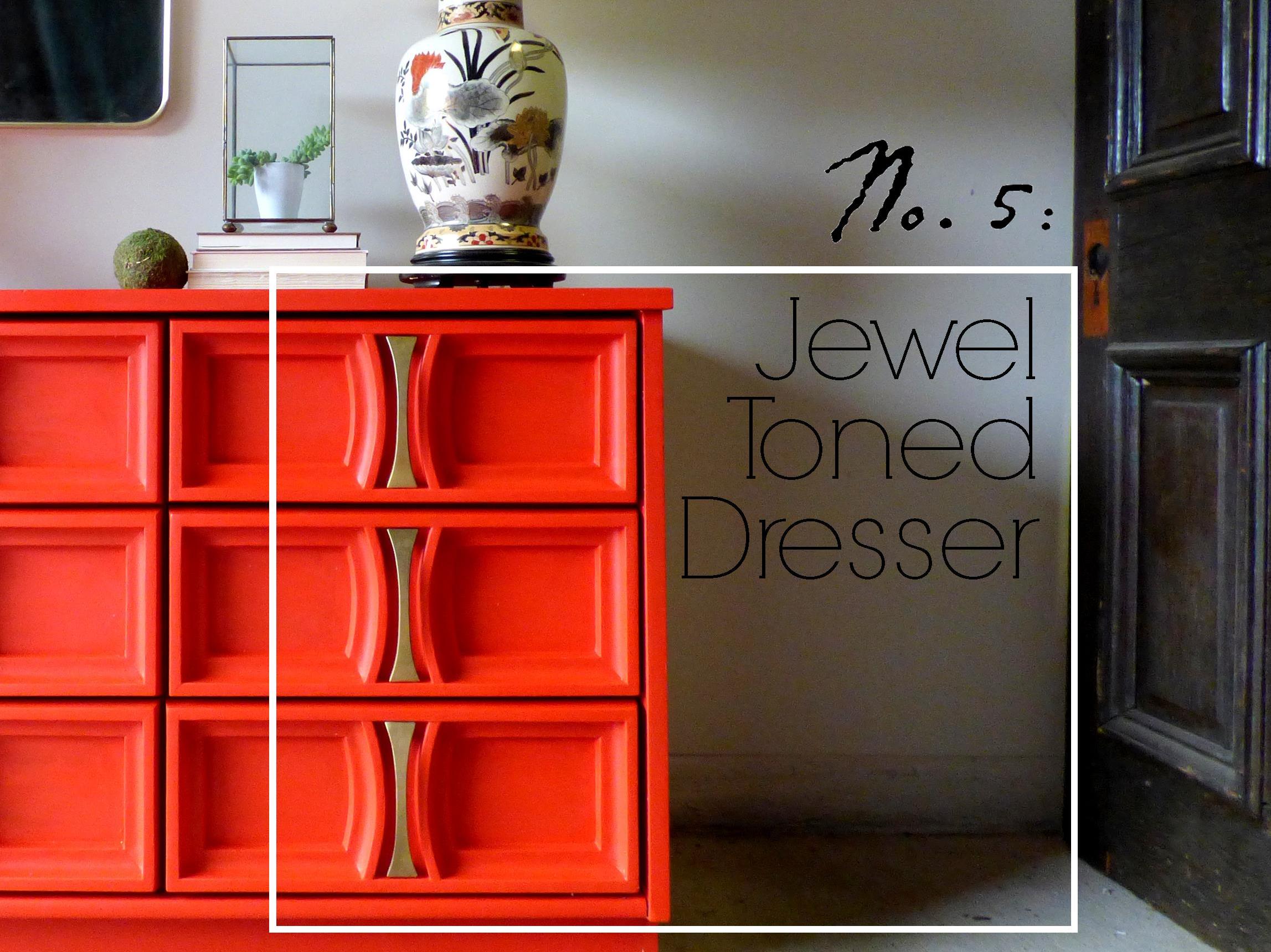
Reader Design: Amanda's Meaningful Home

This. Pad. 

Before I dive in, I'm going to give you the words of wisdom from today's Reader Design genius to start things off:

In a time when everything is getting bigger, we love that our little home is a constant reminder that you can live with less and thrive, just as many generations of families have lived in our home before us.

Today is such a treat. I have been following along with Amanda, of both Cashmere & Clover and the Rustic Owl on IG, from Kansas City, Missouri for some time now. And she is AMAZING - as are her animals that you'll see scattered throughout these photos. 

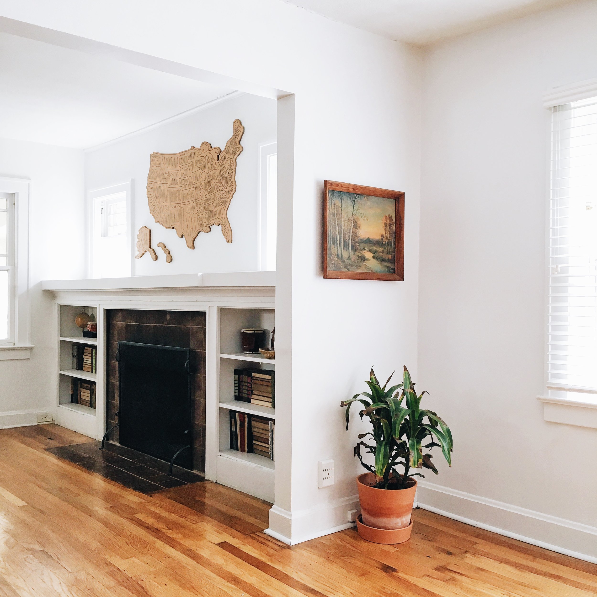
Her home is chalk full of antiques and treasured pieces. 

Amanda and her husband bought this 2 bedroom, 1 bathroom 1922 home ten years ago. They are not afraid of projects! Since the purchase, they've finished the attic to include a master bedroom and are currently renovating a master bathroom. Each room is masterfully done, serving a purpose while also being filled with only the most curated items. 

From Amanda: 

We love the character of older homes and tried to match everything from the trim to the color of the hardwood floors upstairs with the original style of the downstairs.

Several years ago we made the decision to declutter our home and simplify. We found we were buying mass produced furniture and decorating our home with things we didn’t love. Once we removed those things and painted the walls white, we were able to highlight and make the focal point in our home the things we loved that told a story.


Could you guys not sit in this place forever? Now, I'm not a cat person, but with those plants and that lighting, I would be willing to change my ways! Seems like Amanda agrees... 

We’re lucky to have lots of large windows throughout the house to give us lots of light, and the combination of the white walls and bright light really makes the space seem larger.

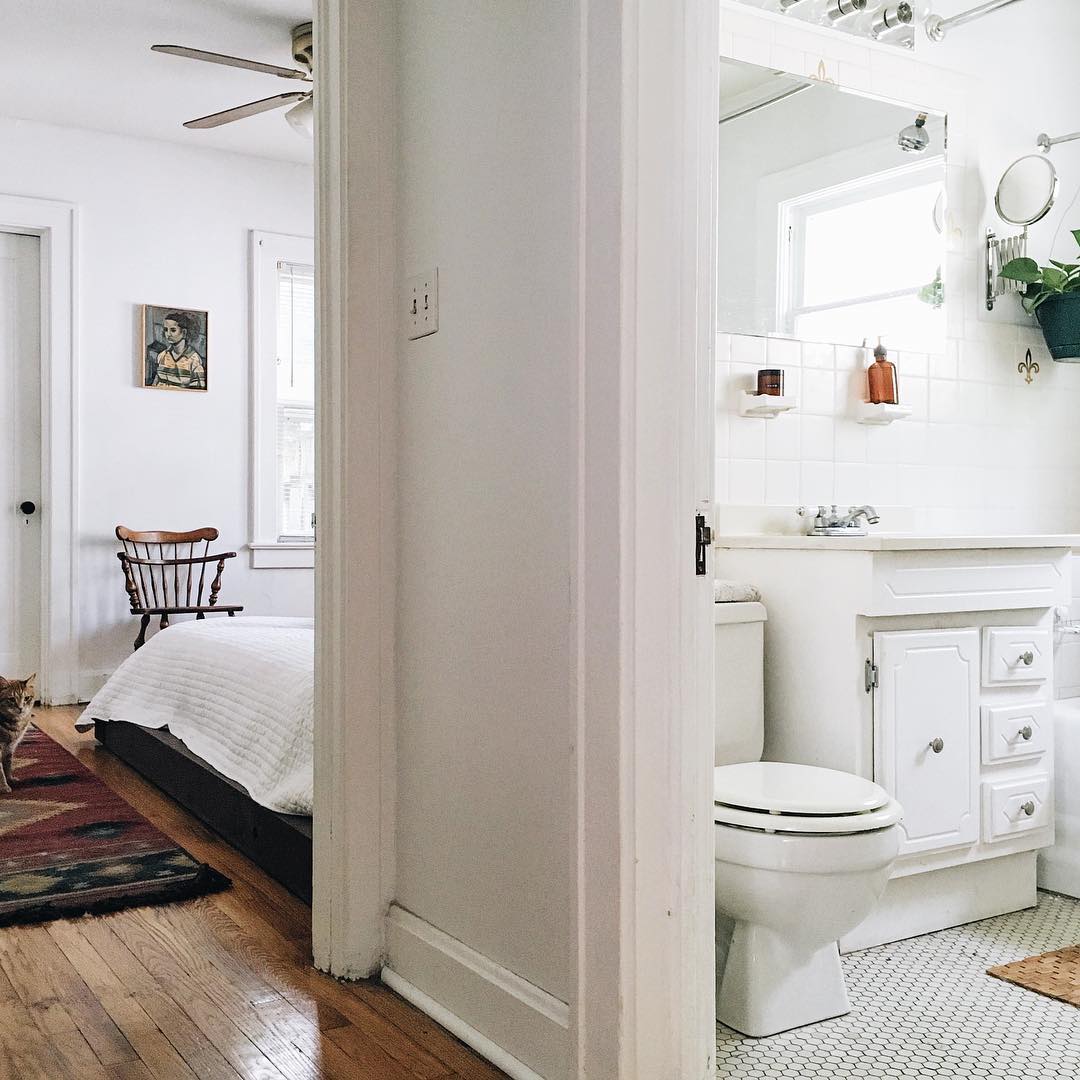
Amanda did such a great job with her master bedroom - which obviously, the pets also love! 

Our downstairs guest room was our bedroom before we finished the upstairs, and our elderly dog ended up injuring his back jumping down off of our tall bed. My husband [SMH interjection: the SWEETEST husband] decided to build a bed on the floor that our dog could easily get in and out of.

Our home was built in 1922, and the rooms were not designed with the idea that a bed larger than a double would ever reside in it. It takes up a majority of the room, but it’s one of my favorite pieces in the house because of the intention and story behind it.

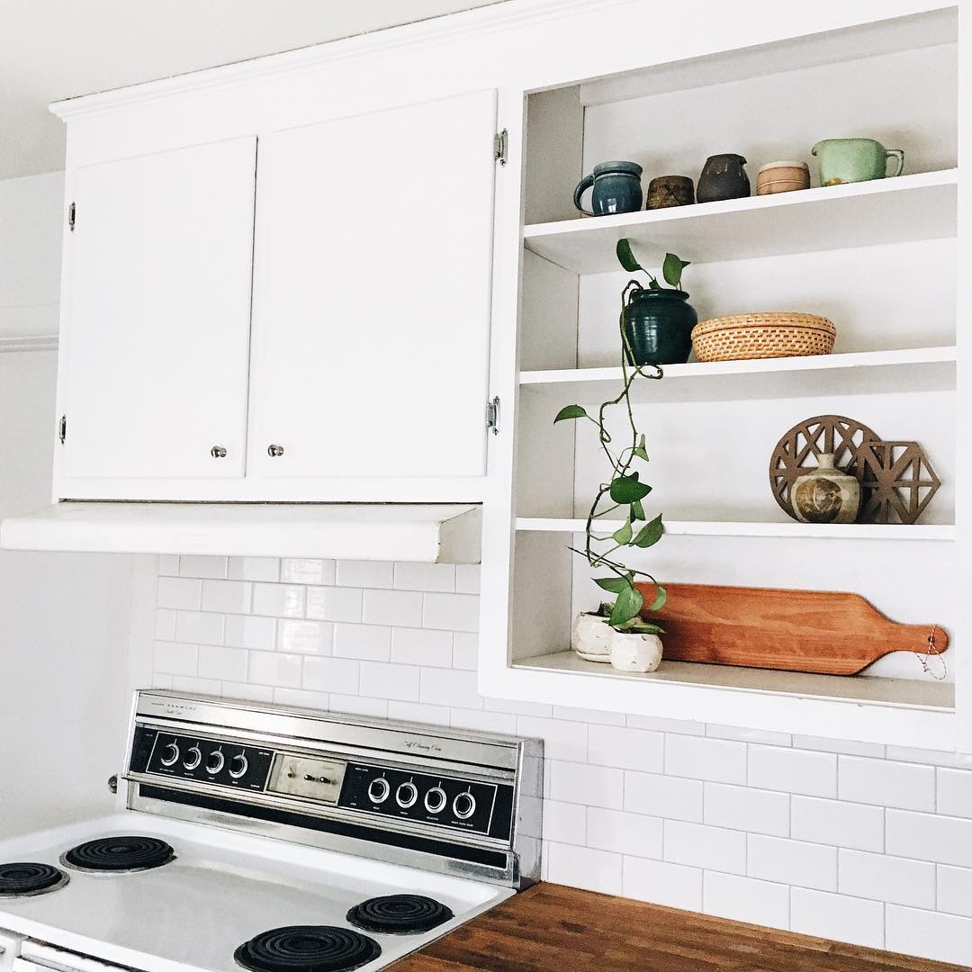
Y'all... even the appliances are beautifully styled. Amanda is seriously on to something with this simplicity thing. 

Amanda, you're a true talent. Thank you for sharing your home with us! And give those pet babies a big style mutt squeeze for us! 

Mariella's Glamorous Home Base

Our next StyleMutt Spaces feature is a true treat. Mariella, originally from Lima, Peru, has graciously welcomed us into her home. And it could not be any clearer that this is Mariella's sanctuary. That is, if said sanctuary were black, white, and BOLD. 

If you take some time to look closely at the way Mariella has put together her house, one thing will become very clear. Her style is seriously her own. I asked Mariella a couple of questions about how she finds inspiration, and let me tell you - she does not disappoint. 

My decor is a mix of influences, places I’ve visited, dramatic color palettes and mostly the places where we come from. I’m Peruvian and my husband is Persian. Mirrors and gold are part of our cultural heritage!

There is no fear in this space. I don't see a single ounce of hesitation, or trepidation, or 'but is this what everyone is doing these?' concerns. 

I don’t believe in trends - except for wallpaper being back, which is just wonderful! When we moved into this apartment, there was a huge red ‘accent wall’ covering the dining and living room. It was awful, and I immediately knew we needed to start with a neutral palette and build the room from there. Everything can and should be adapted to create a space that feels truly yours. Paint is one of your best allies.

Now, time for three rhetorical questions that I just need to throw into the universe: (1) How can black possibly look so bright? I know I live in a basement but STILL. (2) Can we talk about the rope art? You know that Chelsea and Cate are the masters of DIY, and I think this is something we need to quickly add to our StyleMutt roster! (3) Is anyone else sad that watermelon season is almost over? See: those cocktails on the table. Nailed it, Mariella! 

At the end of the day, this space is timeless - and Mariella's final words are some to live by. 

I adore sophisticated glamorous spaces. I believe everyday is important and should be celebrated.

Thank you for inviting us into your home. For more inspiration on how to 'Hollywood glamify' (I made that up... does it work?) your own home, follow Mariella along on Instagram at @splendorstyling or on her blog.

See you next week!

Oh Grow Up... Art ||Flip List Item No.4||

For a few months now, my collection of original abstract artwork has felt...off.  It's like you're trying to copy your mom's crowd-pleasing artichoke dip and yet it just doesn't taste the same when you do it - you feel me?

image.jpg

In an effort to solve this art conundrum, I declared "Grown-Up Abstract Art" as item No.4 on my furniture flip bucket list and began to do some research on what ingredients may be missing from my art collection.  After consulting pinterest, I kept stumbling on some delicious abstract art showcased in gorgeous, minimal floating frames.  

Source: Ellen Dodd

Source: Ellen Dodd

And so my first theory was formed.  I rummaged up some spare wood trim to fashion a make-shift gold frame for one of my smaller pieces, but when I finished it still felt juvenile somehow.  

After mulling over it for a little while longer, I began to think that perhaps my portions were off.  I love to paint but I'm no professional artist - when I paint, I can't help myself: I love ALL THE COLORSSSSSS.  But perhaps I need to balance out the generous helpings of bold pops of color with some graphic patterns and white elements like this large piece I painted to help stage the cowprint bench.  [It actually sold at our Pop-Up Shop at Sweet Clover Barn so I never got the chance to mix it into my new abstract art recipe.]   And interestingly enough, despite my obsession with large-scale abstract art, I don't actually have any pieces hanging in our apartment. 

Ok so let's meet the "art ingredients" I do have in stock and let's see if we can mix them together for a winning combo.

Meet Art.jpg
Van Gogh's Les Alyscamps

Van Gogh's Les Alyscamps

  • "Les Ales Camps" - a 3rd Grader made this piece at a school I worked for.  The elementary art program was doing a series on Van Gogh and this young artist was studing Van Gogh's Les Alyscamps (which she mistakenly labeled as "Les Ales Camps" in the top right corner lol.  I loved the playful take so much that I had it printed on a canvas to hang in my office.
  • "Unnamed" - this is the largest piece of abstract art I've done and yet I haven't found a place for it.  I think I feel like it would overpower any of our small spaces so I've never hung it in our home.
  • "Hadley" - this is the piece I tried to give a floating frame.  I think the proportions are off and I would like it better if the frame were thinner and little daintier.
  • "Picasso" - this is another piece I can't take credit for.  I just love this line drawing so much that I traced it on some paper and popped it in a frame - forgive me Pablo P.
  • "A Riot of Color [in a dreary world]" - name that movie!  I painted this poppy-inspired piece while watching a Heath Ledger favorite (may he rest in piece).  You may recognize this pop of red from staging this piece here

For plating purposes, I've enlisted the help of a fresh flip who'll be heading to his new home in DC soon [I removed the original toe-kick and added tapered legs with the nickle caps cut off and painted the top and sides a glossy white].

P1010468-001b.JPG
image.jpg
image.jpg

Art Recipe No.1:

image.jpg

Playful "Les Ales Camps" with a side of "Picasso" garnished with plant, brass candlesticks and record player served on a Mid-Century Record Console Table with storage for your vintage record collection.

image.jpg

[How cool is that rolling door for space-saving storage?!  And there are four compartments inside with removable vertical dividers.] 

image.jpg

To combat my tendancy to over-saturate with color, my thought here was to pair the two "lighter colored" art pieces on a white-wall background.  The smaller graphic "Picasso" cuts the intensity of the color in "Les Ales Camps" and the record player.

Art Recipe No.2:

image.jpg

A large helping of "Unnamed" abstract with a side of "Picasso" drizzled with candle sticks and a fern for garnish.  Since "Unnamed" is such a powerful flavor, I also tried to soften it with the dainty print and anchor it with a large plant. 

Art Recipe No.3:

image.jpg

Spiced "Riot of Color" and "Hadley" with creamy "Picasso" served with natural elements encased in glass cloches and garnished with a potted fern.

image.jpg

[Look at that gorgeous wood grain in the slats of the console table's rolling front.]

image.jpg

Since I was using two bold paintings, I again employed the "Picasso"print and accented with the airiness of the glass cloches.

image.jpg

[Fun fact: the stand for the raw mineral is just one of my fluted candlesticks turned upside down].

image.jpg

Which recipe hit the spot for you?  Any suggestions on how to make my art collection more flavorful/ refined/ spicy?  Leave your tips in the comments below!

image.jpg

Mid-Century Record Console Table
48"W X 18"D X 29.5"H
SOLD
$525

If you are interested in a custom order like this piece, please contact me at  cate@stylemutthome.com

image.jpg

Check in on the progress of this year's furniture flip bucket list: